Feminine Cards & Gift Packaging
Welcome to Part Two of my AECP Level 1 Final Challenge!
In the first part, I shared my set of masculine cards, where I played with darker tones, rougher textures, and elegant finishes — all tied together with a cohesive color story.
Now it’s time for something completely different: the feminine side of this challenge!
Here I wanted to bring in different colors, flowers, and a touch of sparkle — but still keep that same sense of balance and unity. You’ll see how the sets connect through color and detail, yet each card has its own personality and story.
And of course, there’s the gift packaging that ties it all together — because a beautiful set deserves an equally lovely wrap-up! ✨
So, let’s dive right in and start with Card Number One of the feminine set!

Card number 1.


Inspiration & Idea
For my first feminine card, I wanted sweet colors, flowers, and shine — just the way I love them most. Lol.
Before really starting on this card, I prepared most of the backgrounds for all my feminine cards. I also die-cut and ink-blended all the flowers and foliage I thought I would need for the cards and the gift packaging. Strangely enough, I worked more organized on the feminine set than on the masculine one — I think I finally got the hang of it! 🤭


Creating the Background
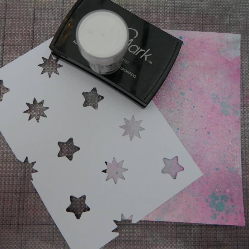
I made the background with ink sprays and mica sprays for a beautiful, shimmery effect, using tints of pink and blue.
Tips for ink sprays or mica powders:
- Use watercolor cardstock — it handles the liquids much better.
- Always dry your cardstock between layers. This prevents the colors from turning muddy.
- Pay attention to color combinations: mixing warm and cool tones can turn muddy quickly. I used pink and blue, which isn’t the easiest combo, but drying well between layers and using minimal water worked beautifully.
- Don’t worry if your background looks dull at first — keep going, and a gorgeous pattern will appear before you know it. Then it’s wise to stop.
Once the background was fully dry, I added white embossed stars through a self-made stencil for extra texture. I also ink-blended the edges of the card with dark blue to add depth and dimension.

Die Cutting & Ink Blending
I cut out a variety of flowers and foliage on Neenah Solar White cardstock, using:
- Poinsettia 3D Die Set (same as masculine card)
- Just Leaves Die Set
- Zero-Waste: Ornamental Winter Pattern Die
- A small Christmas tree branch and pinecone from my stash
- 3D Star Die from rose gold mirror cardstock
Next, I ink-blended all the pieces on my sticky mat (what would I do without it, lol). Flowers got different shades of pink and foliage got different greens. After drying, I selected what I needed for this card and stored the rest for the next one.
Assembling the Card
I took out my dancing shoes and started my dance with all the components — moving pieces around until I was completely happy with the layout.
I also added a few tiny stars, cut for my self-made stencil and heat-embossed with silver snow embossing powder. These added just a little extra magic.
For the sentiment, I stamped on rose gold mirror cardstock, cut it into a small rectangle with a diagonal right edge, and layered it over a thin vellum strip, also cut diagonally, slightly offset — similar to one of the masculine cards.
As a final flourish, I added tiny white balls and some glitter for extra sparkle.
I mounted this creation on a pink glitter cardstock piece and then placed it on a white card base.


Techniques Used
- Ink spray & mica spray background
- Stenciling with white embossing powder
- Edge ink-blending for depth
- Layered die cutting and ink-blending on flowers and foliage
- Heat embossing on stars and sentiment
- Vellum layering and finishing embellishments
My Thoughts
I was really happy with this card — it turned out just as I imagined: sweet, warm, and full of shine. A perfect way to start the feminine set!
The next card will be even sweeter — and I don’t just mean the colors… 😉
Card number 2.


Inspiration & Idea
This second card combines two of my favorite things — a beautiful flower and a touch of sweetness. I’d been wanting to use that fun cookie die set for ages, and this was finally the perfect opportunity!
Just like my first feminine card, I started with an ink-sprayed background, but this time I used slightly darker tones of pink and blue. I created a pink diagonal stripe across the middle of the card, leaving the two corners blue. That was intentional — I wanted to add some blue stenciling on the pink areas for a lovely contrast.


Creating the Background
I used the Lattice Blossoms Stencil, placing it diagonally over both pink corners. Then I tinted some white embossing paste with a few drops of blue ink, mixing it until the color was smooth and even. The result was a beautiful soft blue paste that looked amazing on the cardstock!
Once done, I set the background aside to dry completely.
Die Cutting & Details
For the flower, I used one of my previously ink-blended poinsettias and added a snowy touch by brushing the petal edges with embossing ink and heat-embossing them with Silver Snow embossing powder.
Then came the cookies — the real stars of this card! 🍪
I used the Sweet Treats Layering Die Set, cutting all the pieces from colored and partly white cardstock. I ink-blended them in soft tones and added Glossy Accents on some for a realistic, delicious shine.
I also die-cut the little wood piece from the Cardinal Love Layering Die Set and ink-blended it for a warm, cozy touch.


Assembling the Card
When it was time to put everything together, I already had a clear picture in my mind — and for once, it all came together exactly how I imagined!
I stamped the sentiment on a strip of rose gold mirror cardstock, cut it into a long rectangle, and placed it across the center of the poinsettia.
As finishing touches, I sprinkled some glitter that looks like sugar on one of the biscuits and added a bit of Stickles glitter glue to the edges of the greenery for a frosty, icy look.
Finally, I mounted everything on a piece of rose gold mirror cardstock and adhered it to a white card base.

Techniques Used
- Ink spray background with diagonal design
- Tinted embossing paste through stencil
- Heat-embossed flower edges
- Layered die cutting and ink blending with Glossy Accents
My Thoughts
This card turned out exactly how I envisioned it — soft, sweet, and full of sparkle! The combination of the flower and cookies makes me smile every time I look at it.
For the next card, we’re taking a little step away from the sugary side — something a bit calmer, but still with that cohesive, feminine touch. 🌸
Card number 3.

Inspiration & Idea
For this card, I wanted something a little different. Just like in my masculine set, I aimed to show variety in techniques, look, and feel, while keeping the color palette as the main cohesive factor.
This design feels calmer and softer — less sparkle, but still with that festive shimmer I love!
Creating the Background
I made the background with ink sprays and mica sprays in shades of blue and green.
Once the cardstock was dry, I used the Classic Pinecones Slim 3D Embossing Folder. Since this folder doesn’t fully cover a 5x7" panel, I centered it by eye and ran it through my die-cut machine.
Next, I carefully swiped a white ink pad over the raised areas so that only the higher details caught the ink. The result was a soft, snowy texture — perfectly subtle and elegant.
To give the panel a neat finish, I added two thin strips of rose gold brushed cardstock on the sides.


Die Cutting & Inlaid Ornament
For the foliage, I used the Berry Branch Layering Die Set, cutting it twice. On my trusty sticky mat, I ink-blended the pieces in green, brown, and soft pink, and used a white gel pen to add tiny highlights to the berries for extra definition.
Then came the ornament — a beautiful inlaid die-cut design using the Zero-Waste: Ornamental Winter Pattern Die.
First, I die-cut a white glitter circle, then ran the detailed die on the circle through my machine using an embossing mat instead of a cutting plate, so the design was pressed in but not cut through.
That gave me perfect outlines to place the next layer!
TIP: You can also use your dies for embossing — just replace one of your plates with a soft embossing mat. It makes your dies much more versatile! (Check your machine’s manual for the correct sandwich; mine came with my Spellbinders.)
Next, I die-cut the same detailed die from pink glitter cardstock, carefully keeping all those tiny pieces intact. Then, one by one, I inlaid the pink pieces into the white glitter circle. The result looked like a large shimmering Christmas ornament — so pretty!


Adding the Tag & Assembly
I used the Best Wishes Tags Die Set again, this time choosing the rectangle tag. I cut it from a piece of ink-sprayed cardstock and added a small circle topper from rose-gold brushed cardstock.
For the sentiment, I die-cut “Best Wishes” — the shadow in rose gold and the letters in white glitter — and adhered it to the tag, along with a small branch and berries.
To assemble the card, I made a tiny hole at the top of the white glitter ornament and threaded a ribbon through both the ornament and the tag. I secured the ribbon ends behind the background panel, leaving space at the top for the branches.
The ornament was attached with foam tape, and after a bit of fiddling (of course 😄), I glued one branch flat and layered a large piece of the other with foam tape for dimension.
Finally, I tucked a small hidden sentiment behind the tag — visible only when you lift it. I decided to skip any extra glitter here to keep the design clean and elegant.


Techniques Used
- Ink & mica spray background
- 3D embossing with soft inking highlights
- Inlaid die-cutting technique
- Ink-blended foliage with white gel pen accents
My Thoughts
I’m really pleased with how this card turned out. It’s always a bit of a challenge for me to keep things calmer, with less glitter and a cleaner style — but this one feels just right. 😁
And just wait for Card Number 4 — another tidy, fun-fold design with (believe it or not) minimal glitter! Yes, truly shocking, I know! Oh well, it has a few tiny embellishments.
Card number 4.


For this card, I wanted a fun fold design — clean (well, clean for my terms 😉), with minimal glitter and a darker, cozy background. A bit like the beginning of a winter evening — calm, soft, and full of warmth.
Creating the Background
I started by making the background with mica powders in several colors. I spread the powders across a large piece of watercolor cardstock and sprayed plenty of water over them until the whole surface was covered. Then I placed the cardstock aside to fully dry.
Since I wanted to make a Z-fold card, I created the base from sturdy white cardstock and also cut the extra strip that would later go across the card front. On this strip, I adhered white glitter cardstock for a touch of snow sparkle. When folded, the card measures 5 by 7 inches, only a bit thicker.
When my mica background was dry, I trimmed it to size and ink-blended darker blue around the edges, keeping the middle lighter to let the colors shine through.
To adhere the panels, I used both liquid glue and double-sided tape, because the paper had slightly warped — and this combo keeps everything perfectly flat.


Die Cutting and Details
Next came the die cutting part. I used:
- Cozy Homes Layering Die Set
- Nesting Triangles Die Set (various sizes)
I cut everything from colored cardstock and heat embossed one triangle with a pretty pattern.
From my own stash, I also die cut two deer — a mother and baby — from white cardstock. I ink-blended them and gave them soft white spots with a gel pen for a sweet touch. 🦌
Putting It All Together
Assembly went smoothly; I already had the design in mind. I glued the die-cut elements onto the white glitter strip and then adhered the strip to the card base. The rest of the pieces were glued directly to the background — no foam tape this time, as the card was thick enough already.


Sentiment and Finishing Touches
For the sentiment, I wanted it to stay hidden when the card was folded. I stamped it in black on white cardstock, die cut it, and adhered it inside the card. Beneath the sentiment, I added a tiny bow made with the Elegant Bows Embossing Folder and shimmer relief paste.
Finally, I couldn’t resist adding a few clear iridescent sequins (Stellar Sequins) on the background — they look just like stars in an evening sky.
Techniques Used
- Mica powder background
- Ink blending
- Z-fold card construction
- Die cutting
- Sequins embellishing
My Thoughts
This card feels calm, clean, and softly glowing — exactly the effect I wanted.
It has a quiet kind of beauty, and I’m happy how the balance of shimmer and simplicity turned out.
Card number 5.

For this last card, I’m almost a little sad — I really loved this challenge! I enjoyed the repetitive pattern on the masculine card so much, I wanted to try something similar here, but in feminine colors with a touch of shine.
Creating the Background
I used my fabulous Patchwork Pathways Die Set, which I bought for the last retreat. The large background die in the set is perfect for my slightly smaller 5 by 7" cardstock, so the pattern covers the entire background. I started with a soft pink background panel.
Next, I die-cut six sets of layers, each consisting of:
- a dark pink square with an open center
- a rose-gold mirror eight-pointed piece
- a soft pink pearlescent square with four tiny squares around it and an open square in the middle
(Pardon my description of these layers form the patchwork design!)
I placed them carefully along the lines above and below on the background. Finally, I added tiny white splatters mostly in the empty spaces for subtle texture.


Adding Festive Elements
For a festive touch, I die-cut three baubles from light blue cardstock. The decorative designs on the baubles were cut from rose-gold brushed cardstock — just enough shine without overpowering the feminine patchwork.
I adhered two baubles to the left and right below the upper patchwork piece in the middle. The third was raised with foam tape between the other two, slightly lower. All three hang from a string, which I attached behind the background. I added three tiny bows from the same string above the baubles for extra charm. I also used stickles glitter glue to give some extra festive details on the baubles.
Sentiment and Finishing Touches
I stamped a sentiment in black and heat-embossed with clear embossing powder on a strip of vellum. I attached it at the back of the background and wrapped the same string around the vellum a few times for a playful detail.

Techniques Used
- Die cutting Patchwork layering die
- Splattering
- Heat embossing
- String and bow embellishments
My Thoughts
I’m so happy with this card! It’s playful, feminine, and ties beautifully with the rest of the set. This final card really made me smile, and it feels like a perfect ending to my Level One AECP challenge!
Gift Packaging — Wrapping It All Up
For my final touch, I wanted the card sets to have matching, beautiful gift packaging. Since I used masculine and feminine colors for the cards, I kept the packaging cohesive, fun, and slightly festive.


Now it’s time for some behind-the-scenes photos of the packaging! You’ll also spot the recycled parts I used and how I gave them a new life.


Final Thoughts
This Level One AECP journey has been such a joyful adventure! I’ve learned so much, tried techniques I never thought I would, and laughed at my own messy hands more than once. It’s been a wonderful mix of learning, experimenting, and simply having fun.
Seeing both the masculine and feminine sets finished — complete with their matching packaging — truly made me smile. Each card has its own character, yet together they tell one story full of color, shine, and heart.
I hope this post inspires you to play, experiment, and create without holding back. Try new things, mix your styles, and enjoy every bit of the creative mess along the way. And if a little extra glitter sneaks in? Well, that just means your project is smiling too. 😉
With love,
Angelique
Add comment
Comments
Your work is truly outstanding! Both the sets are absolutely incredible, and the attention to detail is just brilliant. Great job, Angelique! You should be really proud of yourself.
Thank you so much for your kind comment! I really appreciate it. 🫶
What a labour of love, such dedication, stunning results! <3 <3 <3
Thank you so much for your sweet comment! And thank you for your encouragement, it really means a lot. 🫶
Wow! You knocked this final project out of the park! So many beautiful details! And even a wonderful fun fold and a card with a hidden message! Fantastic work, my friend!
Thank you so much, my sweet friend! And thank you so much for your encouragement. 🥰
Wow! Amazing! Those cookies with the poinsettia, the teal foliage, the pink & white bulb, the backgrounds. So much amazing work here!! I am in awe.
That is so sweet of you, Jill! Thank you so much. 😘