Hello, my crafty friends!
Today, I’m so happy to share my final projects for the Level One Altenew Educator Certification Program (AECP).
Fair warning — this might just be the longest blog post I’ve ever written! 😅 So grab a comfy chair, pour yourself something nice to drink, and let’s dive in.
The Challenge
For this final challenge, I was asked to create:
- one set of masculine cards, and
- one set of feminine cards,
using at least three techniques from the AECP Level 1 courses.
Both sets had to be presented in gift packaging, and as an extra twist, I needed to include something recycled, either in the packaging or on the cards themselves.
My Experience
I had an absolute blast working on this! The entire AECP journey has been such a joy, but this challenge really made me stretch my creativity (in the best way!).
Writing about it, however… well, that’s another challenge on its own. 😄
The theme for my cards was an easy choice: Christmas and Holiday cards!


Techniques That Inspired Me
Before I dive into the details, I want to thank all the wonderful AECP Educators who created these courses. They were all truly fabulous!
I used many techniques from the Level 1 classes throughout my cards, but these are the ones that stood out most for me:
Let It Shine
Anyone who knows me knows I love glitter and shine! Not just with embellishments, but also through cardstock, paste, and heat embossing — you name it.
Especially Christmas cards deserve that extra sparkle. Thanks @Carissa Wiley, I absolutely loved your class!
Easy Die Cutting
I use die cutting all the time, and @Yana Smakula shared so many fantastic tips and tricks in her class — like embossing and stenciling with dies, negative die cutting, and inlaid die cutting.
I tried all of them!
Irresistible Inking Techniques
Thanks to @Amy Lee, I learned (or maybe relearned) some great inking methods, such as stamp block inking, direct-to-paper inking, and adding color with a brayer.
So much fun!
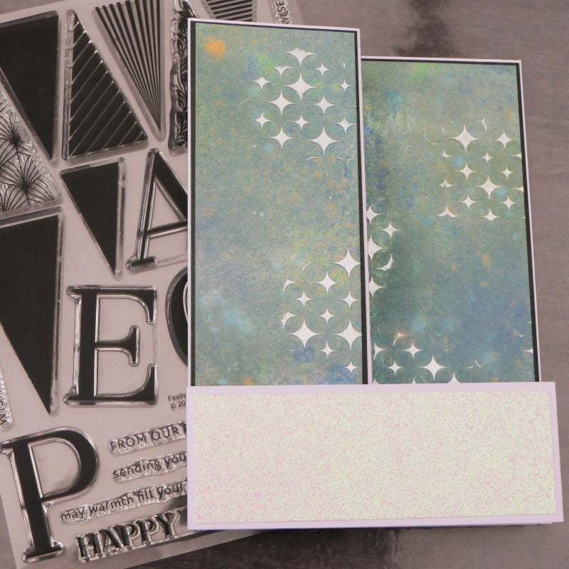
Celebration Stencil Techniques
Stencils have become one of my favorite ways to add texture and dimension to my backgrounds.
@Laurel Beard’s enthusiasm in her class was contagious, and I found myself reaching for stencils more and more!
You’ll see these techniques pop up throughout the 10 cards I created and even on the packaging.
Color Choices
Next, I decided on the color palettes for both the masculine and feminine sets to give each a cohesive look.
At first, I thought about going for non-traditional colors… but in the end, I went classic — blue for men and pink for women.
(I know, shocking! 😂)
But I’m so happy with how they turned out.
- Masculine cards: blue, black, and gold as main colors, with touches of red and green.
- Feminine cards: pink, blue, and rose gold as main colors, accented by green and brown.
Time to Create!
And now… let’s get to the fun part!
I’ll walk you through each card and share the details.
Keep in mind that I worked on some elements — like the backgrounds and flowers — simultaneously (because who doesn’t love a little crafty multitasking?). 😉
All my cards measure 5 by 7". When I use a different size, I will mention that.
Let’s kick things off with the masculine cards!
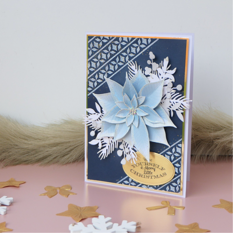
Card number 1.
Inspiration & Idea
For this card, I wanted a dark, moody background paired with a big, light-colored poinsettia and some stenciling with crackle paste. I think masculine cards can definitely have flowers too — just a bit “tougher” or more restrained than the feminine versions.


Making the Background
I started with a piece of Nimbus cardstock for the background and masked off two corners where I applied crackle paste through a stencil. Once the paste dried, I ink-blended Nimbus over the entire cardstock, then added Dark Night ink on the edges while leaving the middle lighter. This extra layer of color really made the crackle texture stand out.
Die Cutting & Coloring
Next came the die cutting: a big poinsettia surrounded by leaves, twigs, and berries.
- Some twigs were ink-blended in a very light grey.
- The poinsettia was colored with soft blues from the Tranquility color family, keeping it light.
To add a snowy effect, I applied embossing ink to the edges of the petals and sprinkled silver snow embossing powder.
The sentiment was stamped on a piece of brushed gold cardstock and cut into an oval shape.

Assembling the Card
Then came my favorite part — the dance of arranging all the pieces until I was happy with the composition! I added a brushed gold layer behind the dark blue panel for an elegant touch, and finally adhered everything onto a white card base.
Techniques Used
- Crackle paste with stencil
- Ink-blending (Nimbus and Dark Night)
- Die cutting and coloring (poinsettia, leaves, twigs, berries)
- Heat embossing with silver snow powder
- Stamping and die-cut sentiment on gold cardstock
My Thoughts
I am very pleased with how this card came out — the contrast between the dark background and the soft blues of the poinsettia looks just right. It feels elegant but still a bit masculine.
Card number 2.


Inspiration & Idea
For this card, I wanted a black background with just a touch of inking techniques, letting the rest of the sparkle come from the inlaid die cutting. It’s such a fun technique — a little fiddly, but so worth it!


Creating the Background
I started with a piece of black cardstock and used a brayer to apply a thin, uneven layer of Antique Gold pigment ink. I rolled the brayer in different directions to get a natural look. Once it dried, I added small gold splatters for extra texture and shimmer.
Tips for Perfect Gold Splatters:
-
My favorite splatters come from Perfect Pearls Gold — just mix a little powder with water until it’s thin and smooth.
-
The Altenew Metallic Watercolors also create gorgeous splatters; that set includes a stunning gold.
-
For tiny splatters, use a small brush for better control. A fan brush also gives small splatters, but in my experience, it’s less predictable. For bigger splatters, use a larger brush and keep your mix slightly thicker.
Finally, I used the same gold inkpad to gently ink the edges of my cardstock, holding the pad straight for a fine gold border. Then I set the background aside to dry completely.
Die Cutting & Inlay Work
Next, I grabbed the Botanical Harmony die set and made two full sets — one for this card and one for the gift packaging.
- I used Nimbus cardstock for the shadow layer and black cardstock for the frame.
- I kept all the tiny black pieces in place, gluing the frame (and pieces) directly onto the Nimbus layer so nothing could escape!
Then I die-cut the same design from light blue glitter cardstock and gold glitter cardstock.
For the blue glitter piece, I added a double-sided adhesive sheet on the back, while I left the gold glitter cardstock as is. I wanted to see which worked better — adhesive sheet or glue from a fine-tip bottle.
Conclusion: for tiny pieces like these, both methods work equally well. For larger intricate designs, the adhesive sheet definitely wins!
I inlaid both sets, mixing blue glitter and gold pieces on one panel for contrast. The second one had the colors reversed, of course. I even used the leftover frames from the glitter cardstock — we crafters waste nothing!

Assembling the Card
For this card, I used the blue glitter frame, adhering a piece to each corner.
I started with one corner, trimmed the overhanging part, and reused that trimmed piece on the next corner — repeating until all corners had a touch of sparkle.
The inlaid panel was adhered to the center of the card using foam tape for dimension.
For the sentiment, I heat-embossed on Nimbus cardstock with gold embossing powder, then cut it into a small rectangle and trimmed the right side diagonally for interest.
Underneath, I added a smaller strip of vellum, also cut diagonally on the right side, and adhered it slightly off-set under the Nimbus piece. This I attached with foam tape.
To finish, I mounted the design on a blue glitter cardstock mat, and then onto a white card base.
Techniques Used
- Brayer inking with gold pigment ink
- Gold splattering (Perfect Pearls / Metallic Watercolors)
- Edge inking for highlight
- Die cutting & inlaid die cutting
- Heat embossing on cardstock & vellum layering

My Thoughts
I love how sleek and festive this card looks! The contrast between the black background, gold glitter, blue glitter and this graphic image gives it a modern holiday vibe — definitely masculine.
Card number 3.


Inspiration & Idea
For this card, I wanted to try something a little different — using shimmer relief paste on brushed gold cardstock, combined with lots of die cutting and ink blending. I also decided to make this one a slimline card for a sleek and rough format.
Creating the Background
I started with a piece of brushed gold cardstock, trimmed to a slimline size, and placed it in the Classic Pinecones Slim 3D embossing folder. After running it through my die-cut machine, it looked absolutely stunning — but also a bit too shiny and not quite masculine enough.
To tone it down and give it a rougher, more rugged look, I gently sanded the raised areas with fine sandpaper. After brushing away the dust, I applied Shimmer Relief Paste in Smoky Quartz over the embossed surface, focusing on the raised parts first.
I repeated this step about three times, each layer slightly wider than the one before, to create more texture and depth. When it finally looked perfectly “tough and shiny” in just the right balance, I set the panel aside to dry.

Die Cutting & Ink Blending
While the background dried, I started on the die cutting. I used pieces from the following sets:
- Cardinal Love Layering Die Set
- Berry Branch Layering Die Set
- Branched Frames Die Set (almost all the pieces!)
Once all the elements were cut, I began ink blending each piece in the colors I wanted for my wintery arrangement.
Then came the fun part — arranging all the die cuts into a balanced composition. When I was happy with the layout, I glued everything down. For the Cardinals I used foamtape.
To add a little shine, I colored the berries with blue Stickles glitter glue. For that final wintery touch, I used a snow pen to add tiny, natural-looking snow accents here and there.
Tips for adding snow or white/translucent products:
As you can see, the snow transforms in some places to color of the ink below. In this case, I like it because I wanted that rougher, not too polished look. But if you don't want this, apply a protective layer like a spray varnish or top coating and allow it to dry completely. After this you can apply the snow and it will keep its own color.

Sentiment
For the sentiment and sub-sentiment, I used Nimbus cardstock again and heat embossed both with gold embossing powder.
I cut them out and adhered them with foam tape for extra dimension and shadow.
Techniques Used
- Dry embossing with a 3D folder
- Sanding metallic cardstock for a distressed look
- Applying shimmer relief paste in layers
- Ink blending die cuts
- Heat embossing on Nimbus cardstock
- Adding a rough looking texture with Stickles and a snow pen
My Thoughts
I’m really pleased with how the background turned out — it’s beautifully textured, masculine, and full of depth. Even though this isn’t my favorite card of the set, it still belongs here. Every project teaches something new, and I’m glad I followed this idea through.
Card number 4.


Inspiration & Idea
For this card, I wanted a different look — something more elegant but still masculine. So I decided to create a Z-fold card, keeping the design cleaner while making my own background and adding some die cutting and heat-embossed stamping for detail.
Creating the Card Base & Background
I started by making the Z-fold base from sturdy white cardstock. When folded, it measures 5" × 7", just a bit thicker than a regular card. I added dark green mats to each panel for contrast and structure.
For the background, I used ink sprays in shades of blue, white, yellow/gold and green on a full piece of watercolor cardstock. This way, I could cut it to the exact sizes later. I also added a few spritzes of mica spray for a subtle shimmer — it’s tricky to capture that sparkle in a photo!
Once everything was dry, I added clusters of tiny stars using Shimmer Relief Paste in Pearl, which gave the background a lovely textured touch.
After letting it dry completely, I trimmed the panels to size and adhered them to the card base.
The narrow front strip got a white glitter paper mat, keeping the design light and balanced. I didn’t adhere it yet, as I wanted to see where the die-cut elements would go first.


Die Cutting & Embossing Details
For this design, I chose die sets that mix a festive and modern feel and I used colored cardstock for all the die cuts this time:
- Timeless Sled Layering Die Set
- Festive Triangles Die Set – cut in different sizes
- A few stamped trees, heat embossed in gold for extra sparkle
Next I glued the layers together to create depth and structure.
When arranging the layout, I adhered a few trees behind the front strip, then attached the strip to the card using glue (no foam tape this time — the card was already thick enough!). After that, I added the rest of the die cuts to complete the scene.


Sentiment
I wanted a sentiment that would peek out when folded and reveal more when opened — a little surprise element!
Using the same dark green cardstock as the mats, I heat embossed two phrases in gold:
“Wishing you” on a small rectangle
“Happy Holidays,” which I cut out with the matching die
Both were glued directly to the card for a sleek finish.
Finishing Touches
As a final detail, I added a few tiny circles left over from the white glitter paper — they look like soft snowflakes and tie the whole design together beautifully.
Techniques Used
- Ink spray background with mica shimmer
- 3D texture using shimmer relief paste
- Heat embossing
- Layered die cutting
- Z-fold card construction
My Thoughts
I’m really happy with how this card turned out — it has that clean and masculine look I was going for. I wanted my masculine set to include different styles: some a bit rougher, others more refined or clean, yet all still connected by the same cohesive color palette. And that’s exactly what I see coming together here.
Now it’s time for the last card of this masculine set — and while it’s not my absolute favorite (that honor still goes to the first one!), it’s definitely one of them. Sadly, there won’t be any making-of photos this time — my enthusiastic husband accidentally cleaned the card off my camera after he thought I’d already taken all the pictures. 😂
Card number 5.


Inspiration & Idea
For this final card, I wanted to pick something from the AECP courses that felt perfect for the guys — a repeating pattern design! In this case, it became a playful repetition of Christmas baubles.
I also realized I hadn’t done an ink-blended background yet, so this was the perfect chance.
Creating the Background
I started by ink blending on a piece of Neenah Solar White cardstock, trimmed slightly smaller than 5" × 7".
Using the Sweet Dreams Fresh Dye Ink collection, I blended from light to dark with a large blending brush, creating a smooth gradient.
Once dry, I added subtle texture by applying Shimmer Relief Paste in Pearl through the Sweater Knits stencil. After that dried, it was time for one of my favorite steps — splatters!
I added fine gold and white splatters to give the background extra depth and festive sparkle.
Die Cutting & Assembly
For the ornaments, I used the Festive Ornaments Layering Die Set and cut five baubles in three colors: red, black, and blue.
Each design detail was die-cut from mirror gold cardstock, adding that perfect holiday shine.
For a fun sixth element, I used the Best Wishes Tags Die Set, cutting the round tag and the small circular pieces.
The back circle and small accents were cut from gold mirror cardstock.
The front circle was cut from the same blue cardstock as one of the baubles.
On the blue circle, I stamped a warm sentiment, and on the gold layer behind it, I stamped “Special Delivery” in dark blue ink for a playful touch.
After gluing all the bauble layers together, I tied the tag pieces with a light-colored string and secured them with a tiny gold brad, allowing the top circle to rotate — a fun, interactive detail!
I adhered all the baubles to the background using foam tape for dimension.
The tag was also attached with foam tape, with the string tucked behind the bauble above it. For a finishing detail, I glued a small white glitter twig on the tag for decoration.
To finish, I mounted the design on a gold mirror cardstock mat, and then onto a white card base.


Techniques Used
- Ink blending with gradient transition
- Stenciling with shimmer relief paste
- Gold and white splattering for texture
- Layered die cutting
My Thoughts
And there you have it — my final masculine card! I’m so happy with how it turned out; it looks exactly how I imagined.
The repeating pattern gives it that strong, graphic look, while the gold details add a festive warmth. A perfect finale for this masculine set!
If you’ve enjoyed this first half of my AECP Level 1 Final Challenge, I’d love for you to visit Part Two, where I’ll share my feminine card set and the gift packaging that ties everything together. See you there! 🎁
Add comment
Comments
I am speechless. Incredible, incredible! I am amazed at your talent!
I don't know what to say, Erum! You make me speechless. Thank you so much for this great compliment. 😘
These cards are so far beyond amazing that I have no words to express my awe. Absolutely outstanding, Angel! <3
Caroline, you are so so sweet! Thank you so much! ❤️
These cards simply blow me away! Stunning!
You are so sweet, Carrie! Thank you so much.
These cards are so gorgeous! I can’t take my eyes off the soft blue poinsettia on the dark background!!
That is so sweet of you, Jill! Thanks so much. ❤️. The card you mention is my favorite of the masculine cards, too.