Hello crafty friends!
Today I’m sharing my projects for AECP Level 2, Class 2: In the Mood for Color by Stephanie Klauck. This class focused on how color influences the mood and emotion of a project, and how we can use color intentionally in our cardmaking.
What I Learned
This class really made me think about why I instinctively choose certain colors for specific types of cards. It was fascinating to learn how strongly color is connected to emotion and atmosphere.
Some color associations are very obvious, like red, which often represents love, passion, and energy. But other colors surprised me more. Purple, for example, can evoke feelings of compassion, positivity, and wisdom. Every color carries its own emotion and visual message.
I don’t think we always consciously think about this while creating, but understanding color psychology is a beautiful way to strengthen the emotion we want a card to convey.
My Cards
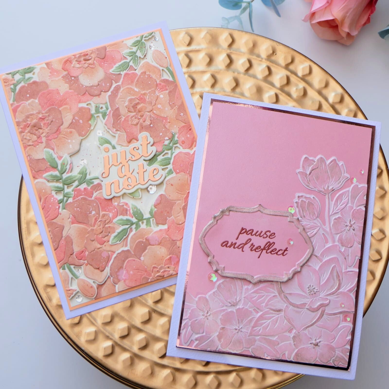
For this class I created two cards focused mainly on pink tones, while using color in different ways. I also wanted to include a third card with a completely different color palette to show how strongly color can change the overall feeling of a design.
Pink is often associated with kindness, softness, sensitivity, and care. Looking at my own work, I realized why I naturally gravitate toward pinks and purples when making encouragement or “thinking of you” cards.
Card 1
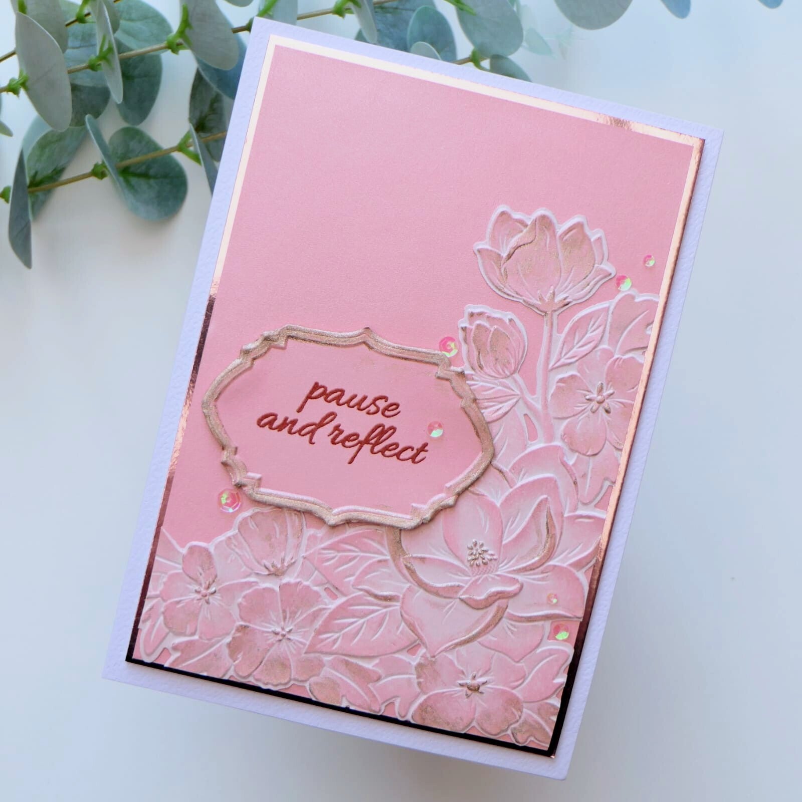
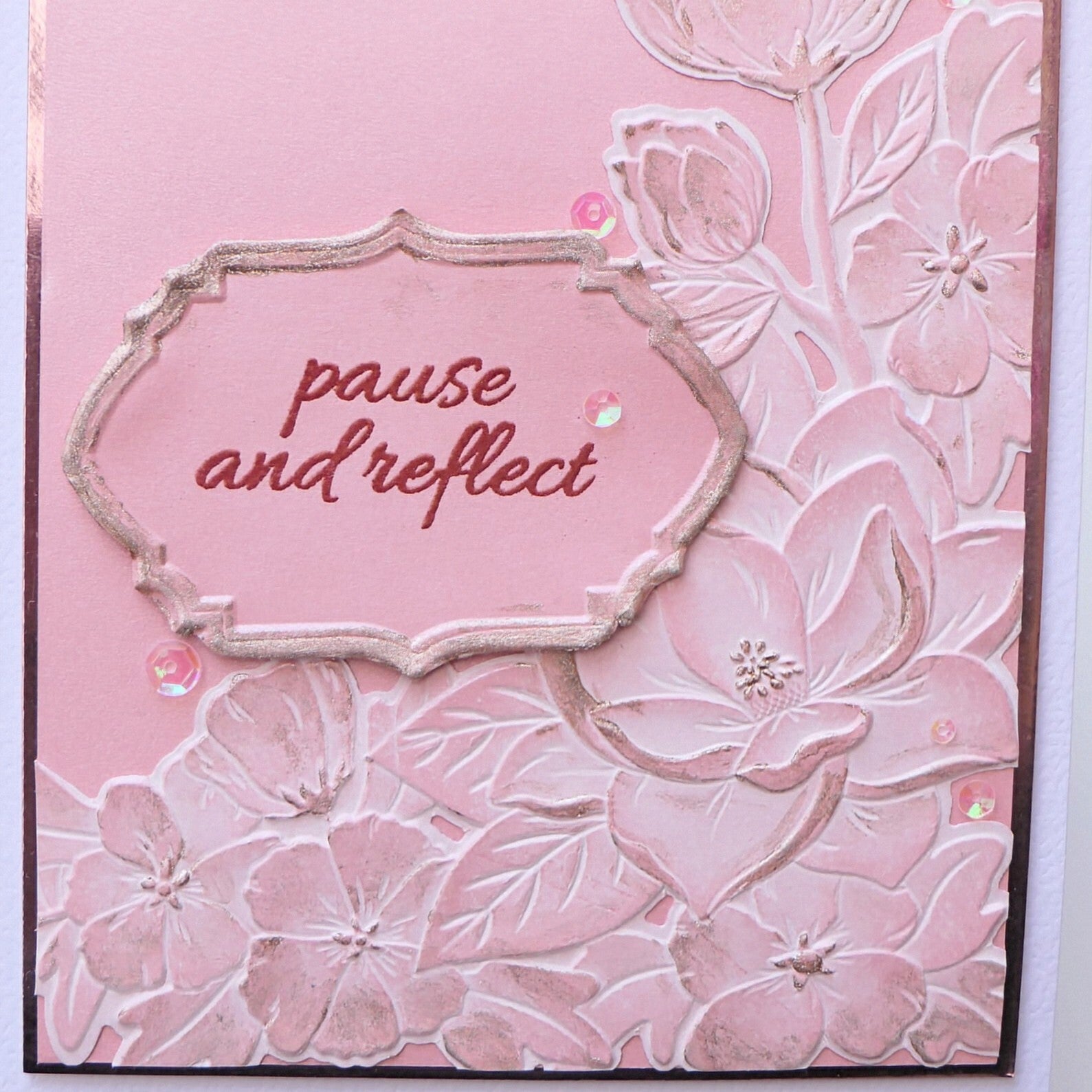
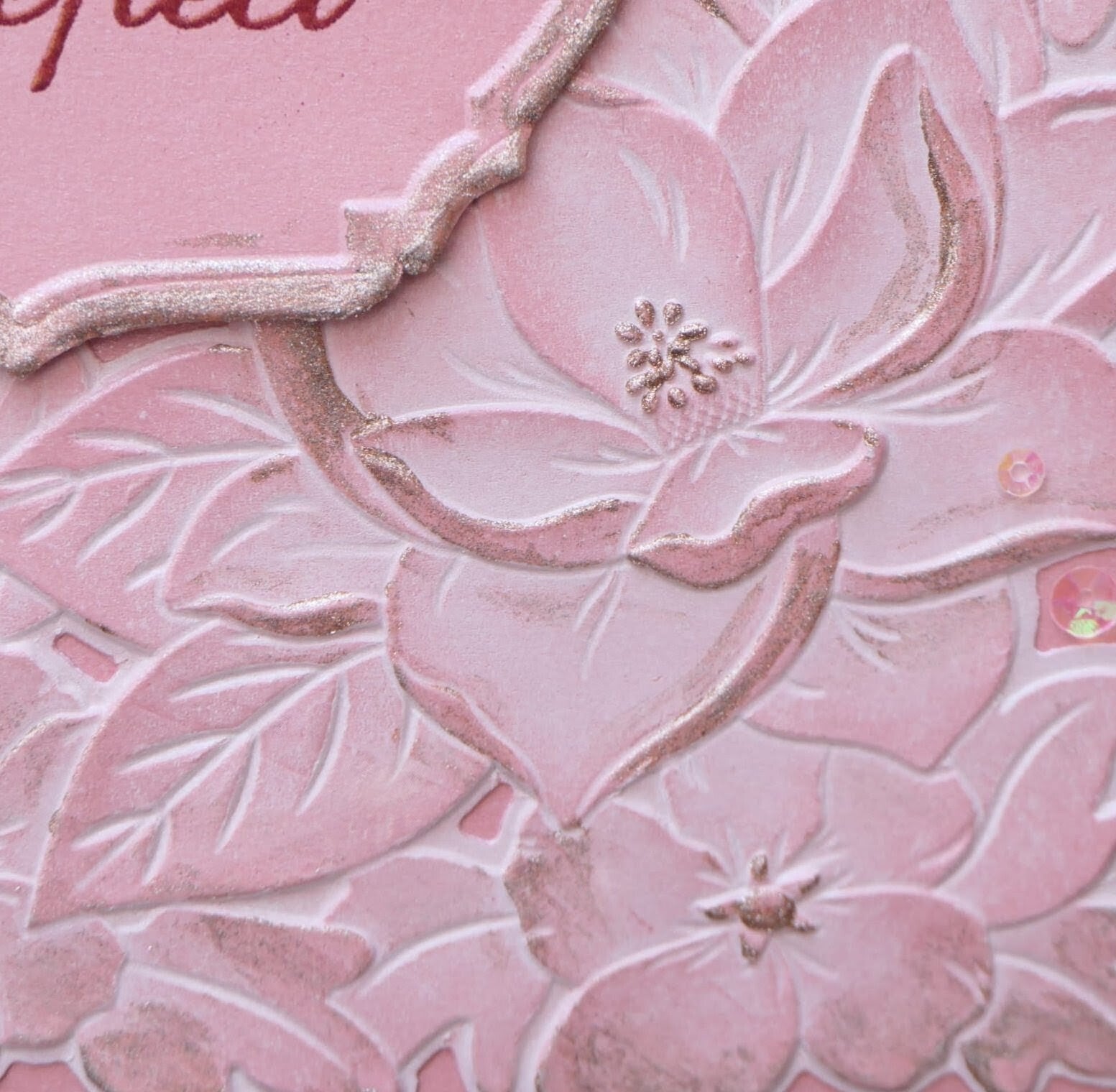
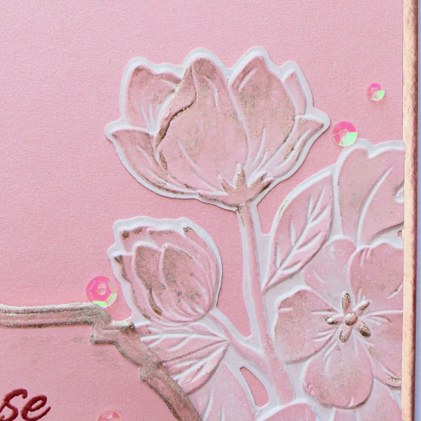
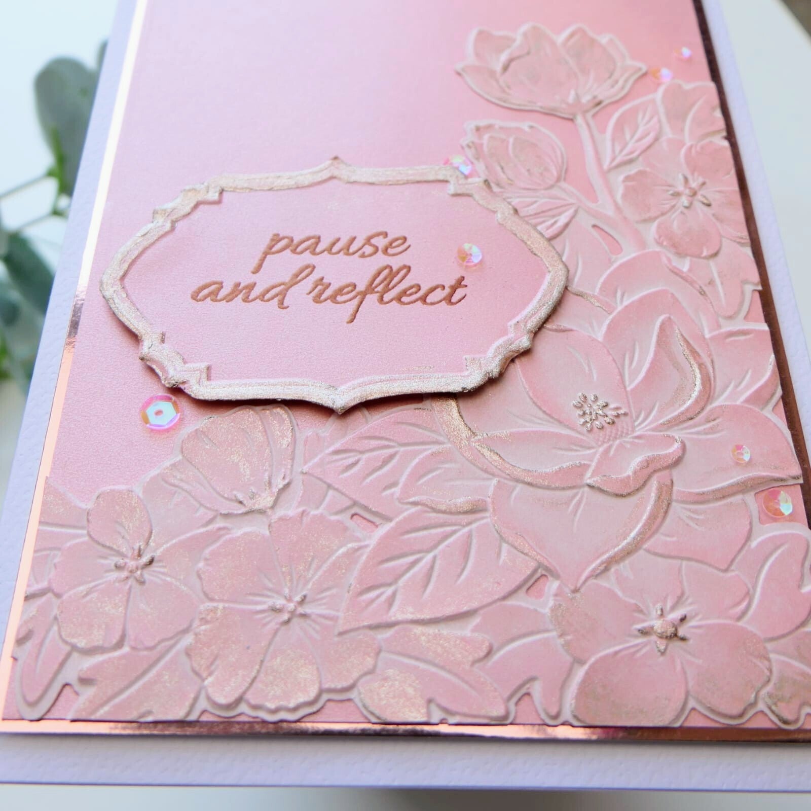
For my first card, I created a monochromatic pink design with soft rose gold accents. I kept the layout fairly clean and simple so the emotion of the color could really stand out.
The combination of pink with the sentiment creates a warm and caring feeling, especially because this card was made for a close friend. The rose gold details add shine and elegance without distracting from the softness of the design.
To finish the card, I added a few pink iridescent sequins for subtle sparkle.
Card 2
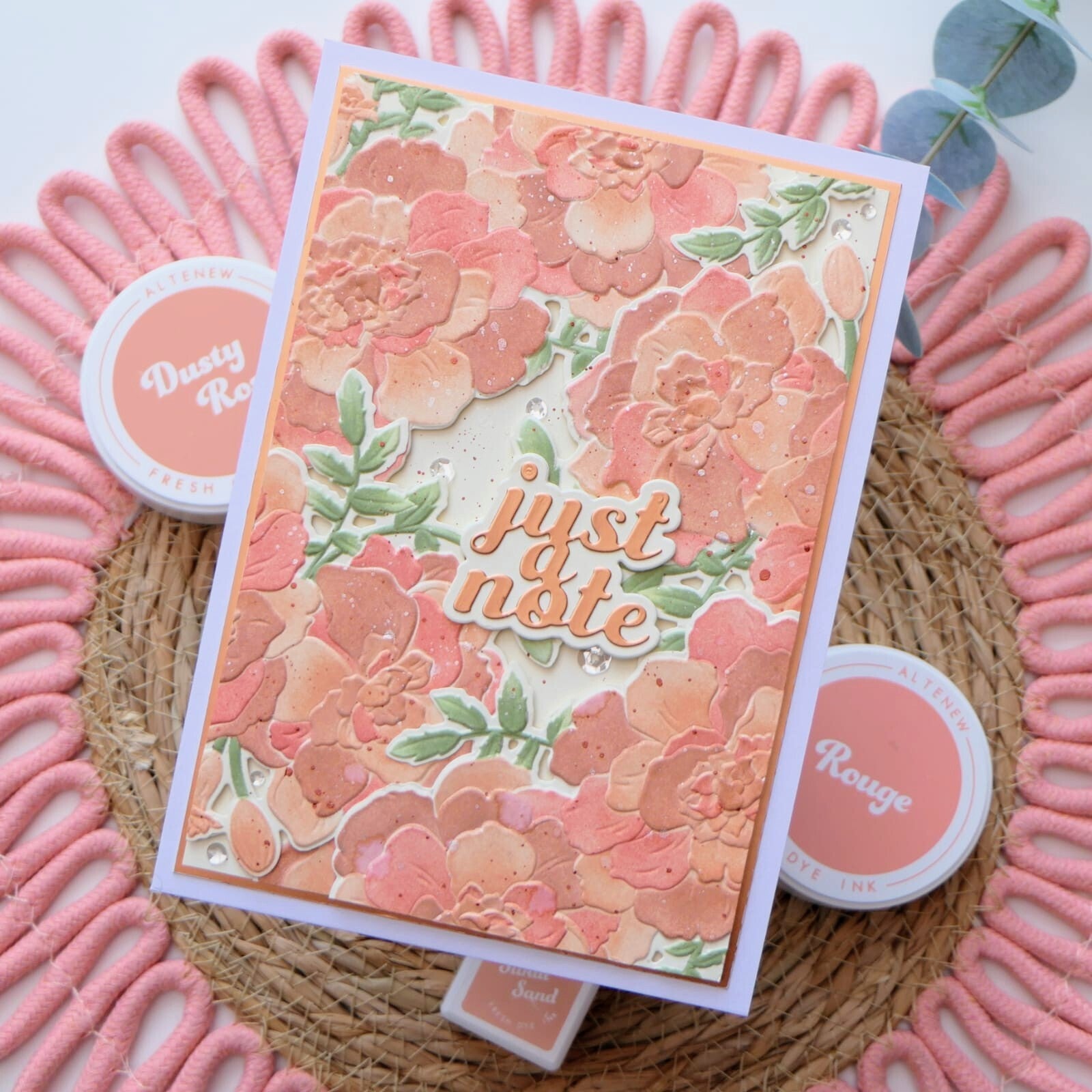
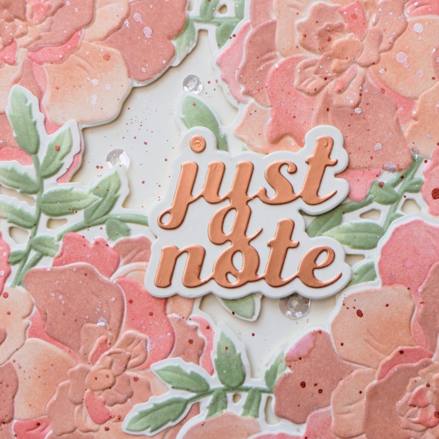
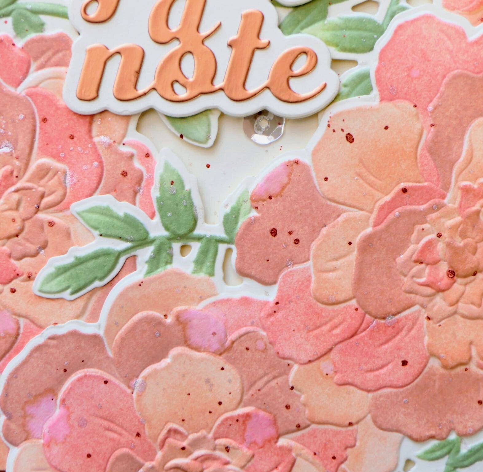
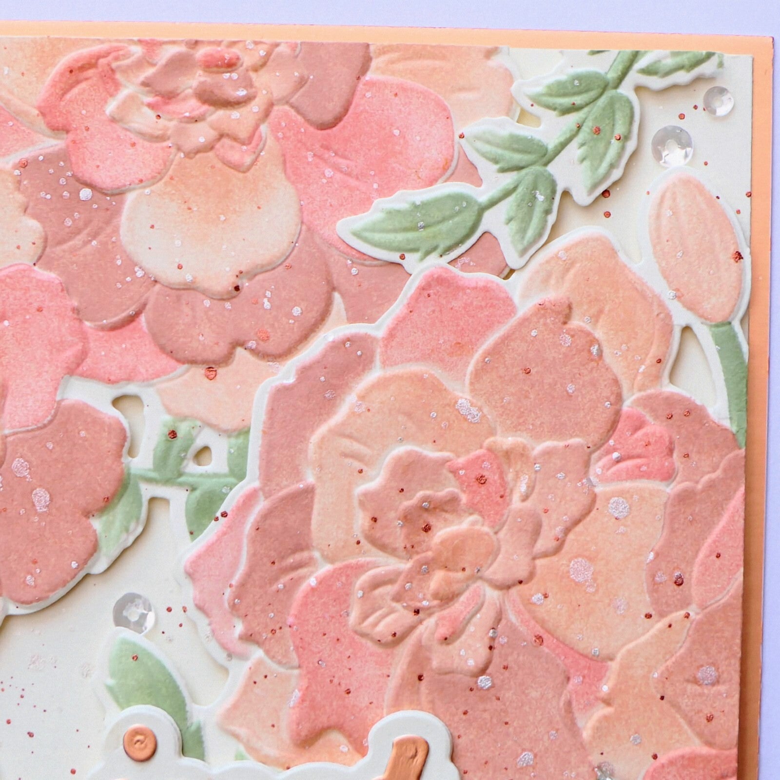
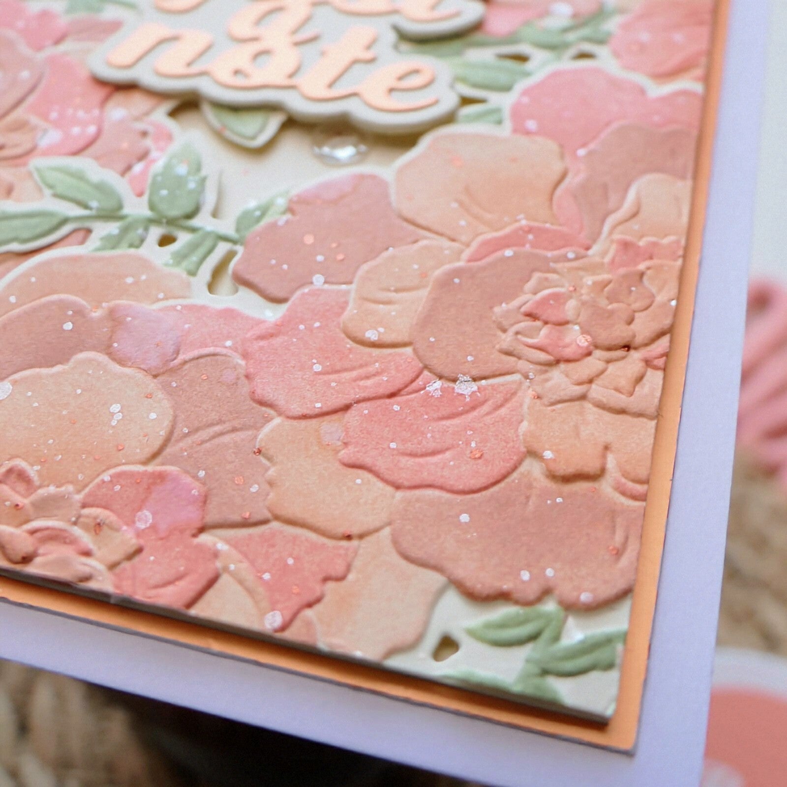
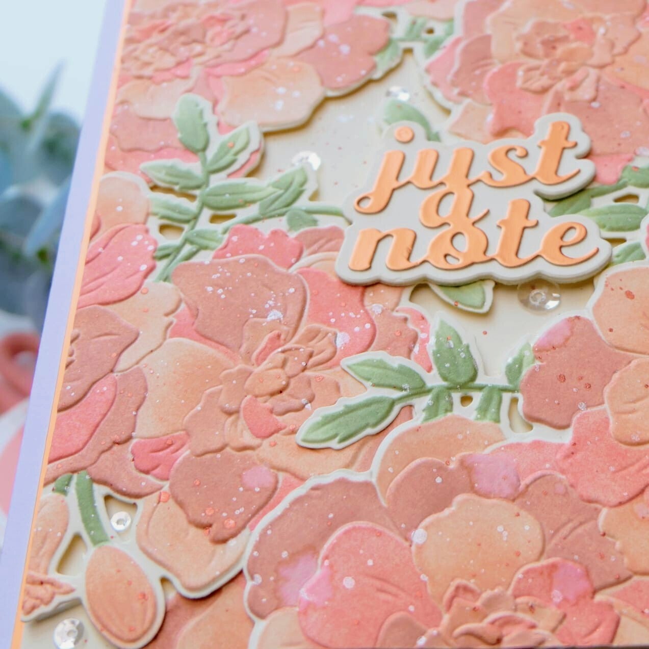
For the second card, I again used pink tones, but this time combined them with peach and soft orange shades. Compared to the first card, this design feels lighter, brighter, and more cheerful.
Orange is often connected to happiness, warmth, courage, and positivity. Mixed with the softer pink tones, it creates a playful and uplifting feeling.
To enhance that playful atmosphere, I cut apart the embossed floral images and arranged them in smaller sections across the card. I also added water- and metallic watercolor splatters for extra texture and movement.
A few sequins complete the design with a soft touch of shine.
Card 3
For my final example, I wanted to show how different the emotional impact becomes when using blue tones instead.
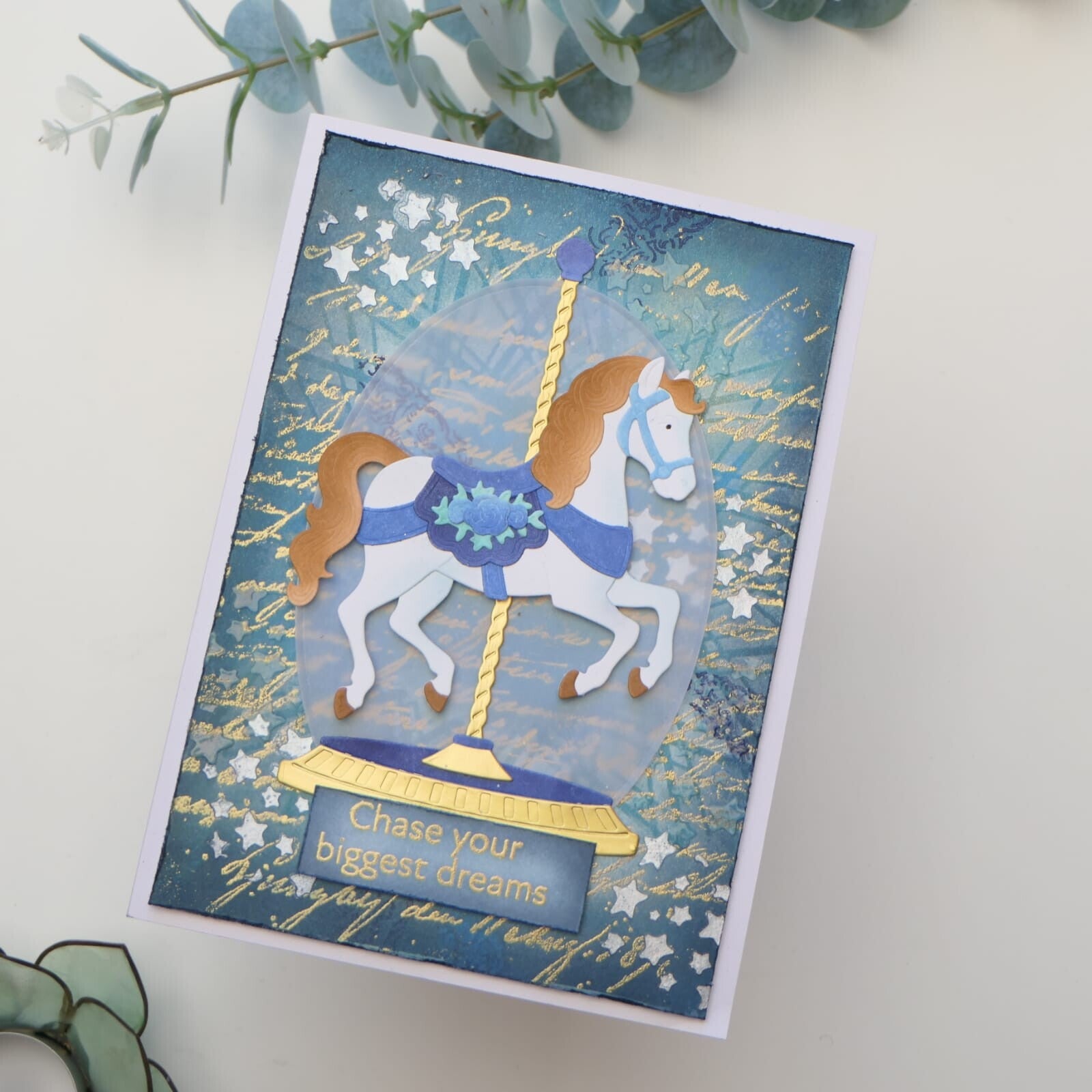
This card was not originally created for this lesson, but I thought it was a good example of how color alone can completely change the atmosphere of a design.
Blue is often associated with tranquility, calmness, trust, and stability. Combined with white and gold accents, the card feels elegant and peaceful to me. It reminds me a bit of how the ocean can instantly create a calming feeling.
It was interesting to look back at an older project and suddenly recognize how strongly color already influenced my design choices, even before consciously studying color theory.
Final Thoughts
This class taught me that color is much more than simply choosing beautiful combinations. Color helps communicate emotion and can strengthen the message we want to send through a handmade card.
I now understand better why I instinctively reach for certain colors depending on the occasion or recipient. Color truly becomes part of the storytelling of a card.
Used Products
All products used on these cards are from Altenew.
Card 1
- Craft Your Life Project Kit: Magnolia and Blooms
- Craft Your Life Project Kit: Never Stop Dreaming
- Rose Gold Shimmer Relief Paste
- White Pigment Ink
- Stellar Sequins: Twinkling Pink
Card 2
- Craft Your Life Project Kit: Marigold Butterflies
- Scripty Sentiments Die Set
- Earthy Embrace Fresh Dye Ink
- Rouge Fresh Dye Ink
- Dusty Rose Fresh Dye Ink
- Sage Stone Fresh Dye Ink
- Olive Fresh Dye Ink
- Metallic Watercolor 14 Pan Set
Thank you so much for visiting my blog today and I hope to see you for the next class.
With love and creative joy,
Angelique 🪷
Add comment
Comments