Hello, crafty friends!
Welcome to another project from my Altenew Educator Certification Program (AECP) journey. This time I completed Beautiful Details, given by Marika Rahtu.
When I first watched the class, I have to admit I felt a little intimidated. Marika creates such beautiful, refined details that my first thought was, "I'll never be able to do that." But as the lesson continued, I realized something important. The class wasn't about recreating her projects—it was about discovering our own way of adding thoughtful details that make a design feel complete.
That simple realization completely changed the way I approached these two cards.
What I learned
Throughout the class, Marika shared wonderful ideas for adding extra interest to a project, stretching your stamps, drawing additional details with pencils or markers, creating soft monochromatic designs, and even colouring on vellum. Rather than changing the overall design, these techniques focus on refining the little details that quietly elevate a card.
Inspired by the class, I created two cards, each exploring beautiful details in a different way.
My Cards
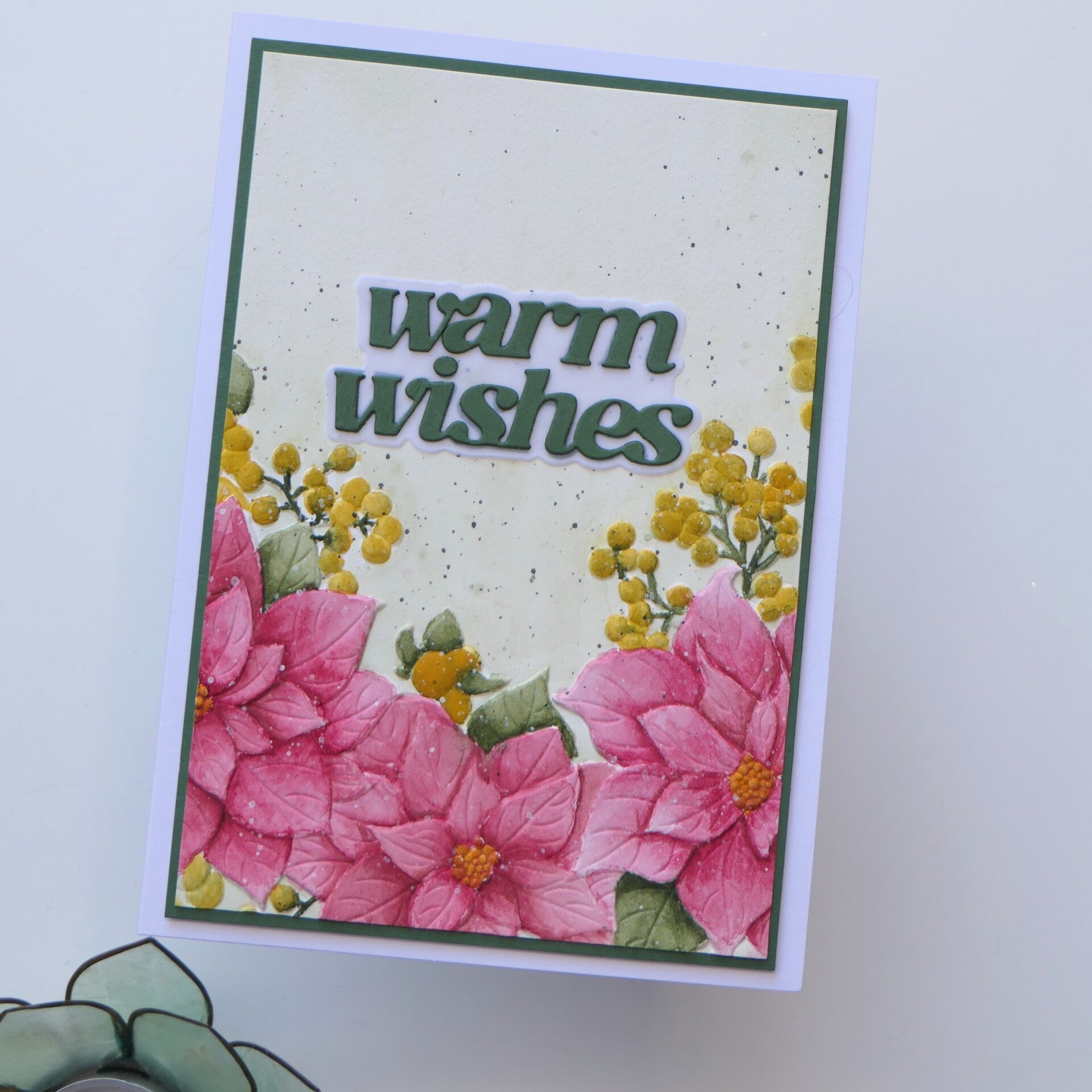
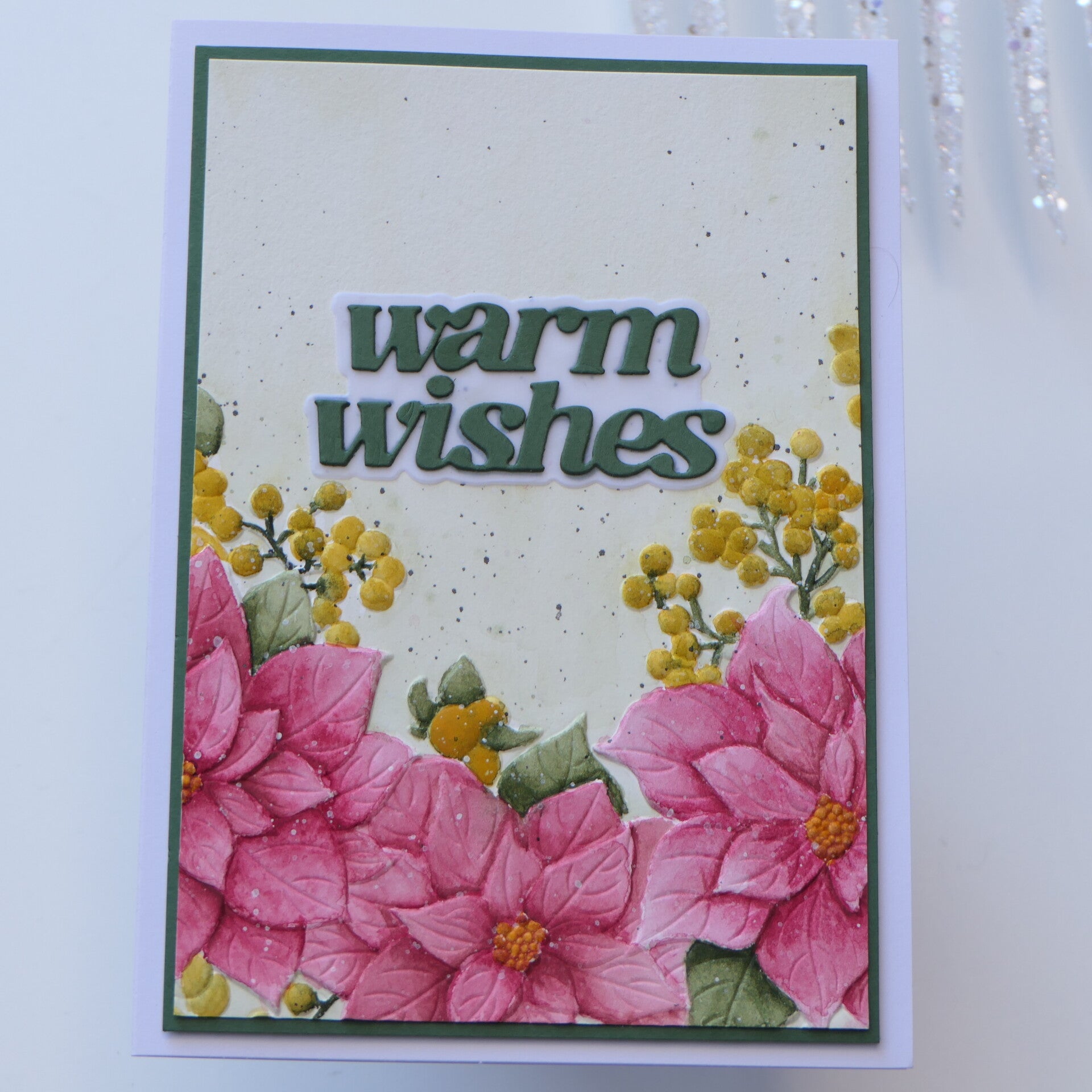
Card 1 Watercolor details
I decided to challenge myself once again with watercolor.
If you've been following my AECP journey, you'll know that watercolor has always been one of the techniques I found the most intimidating. This beautiful Winterberry Poinsettias image was inspired by a tutorial from the incredibly talented Erum Tasneem, who is also my wonderful AECP mentor.
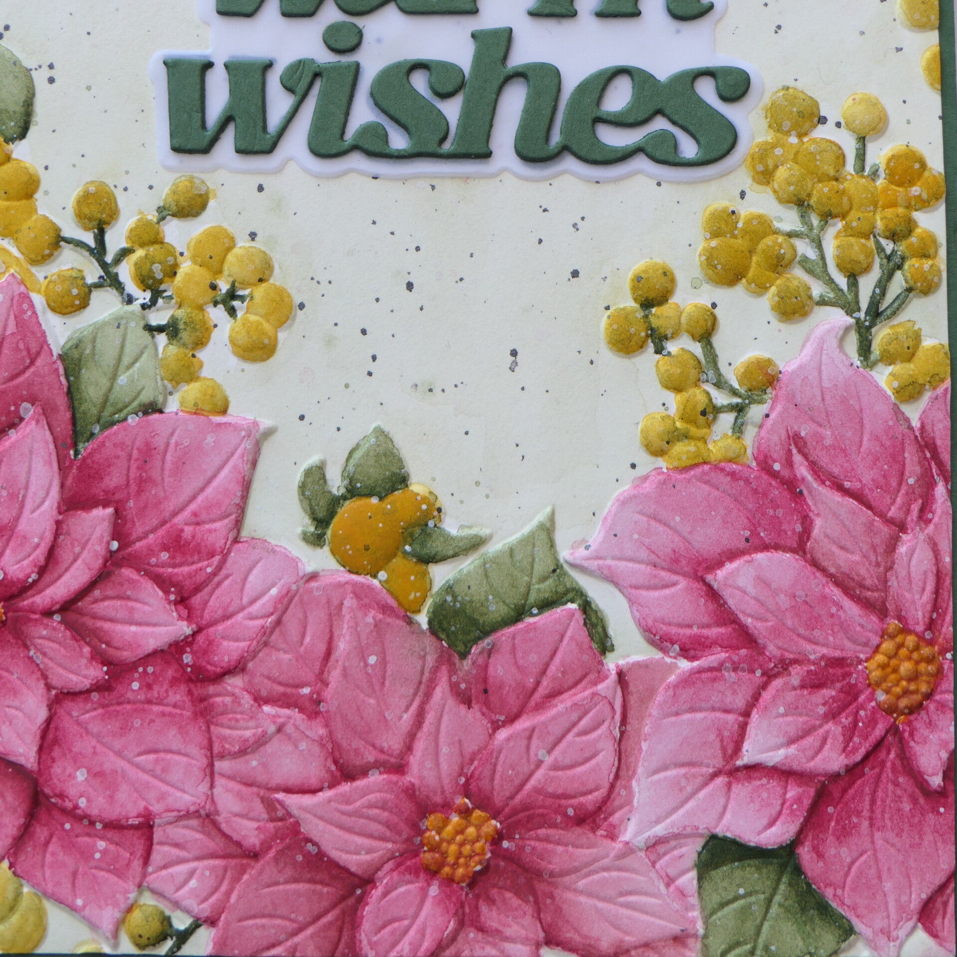
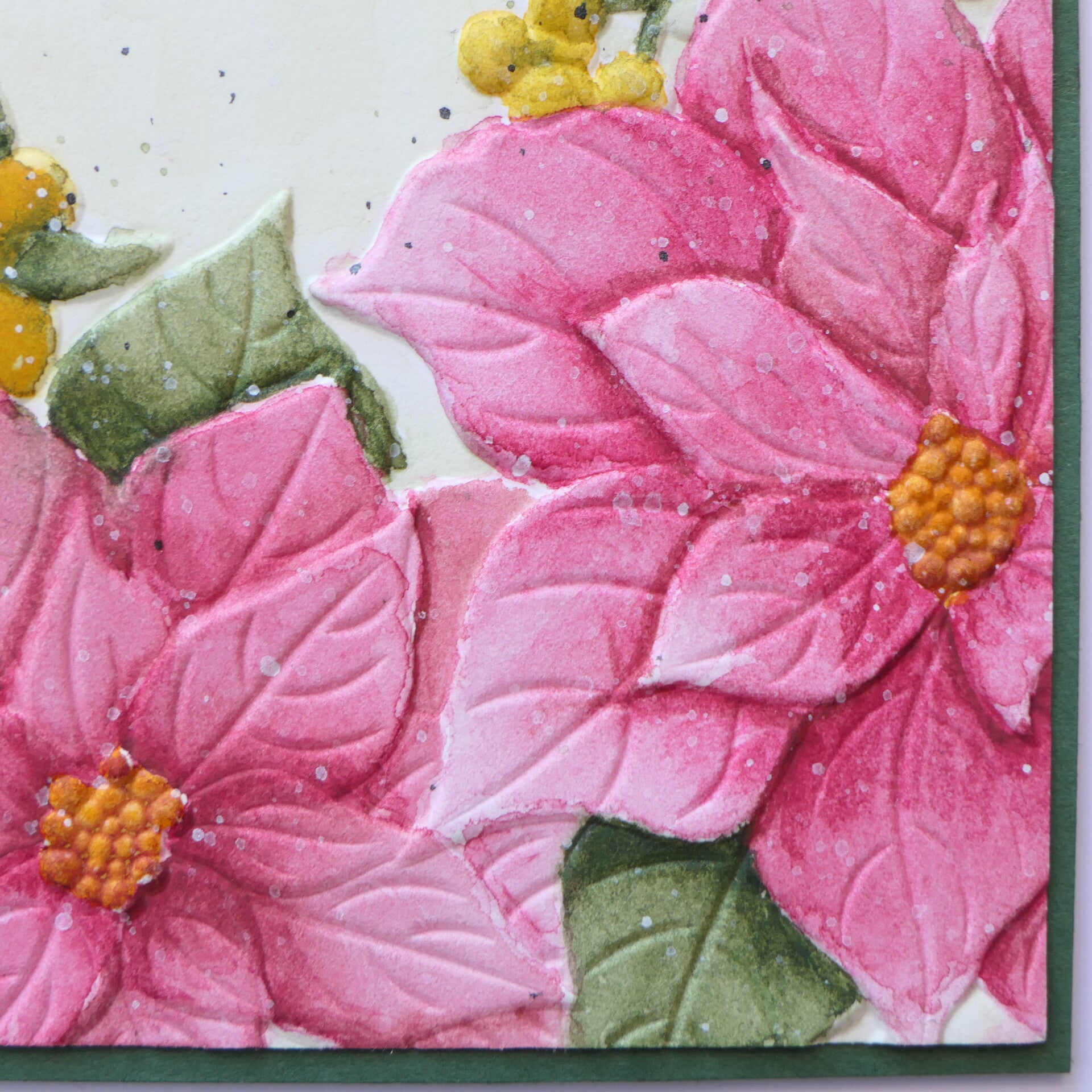
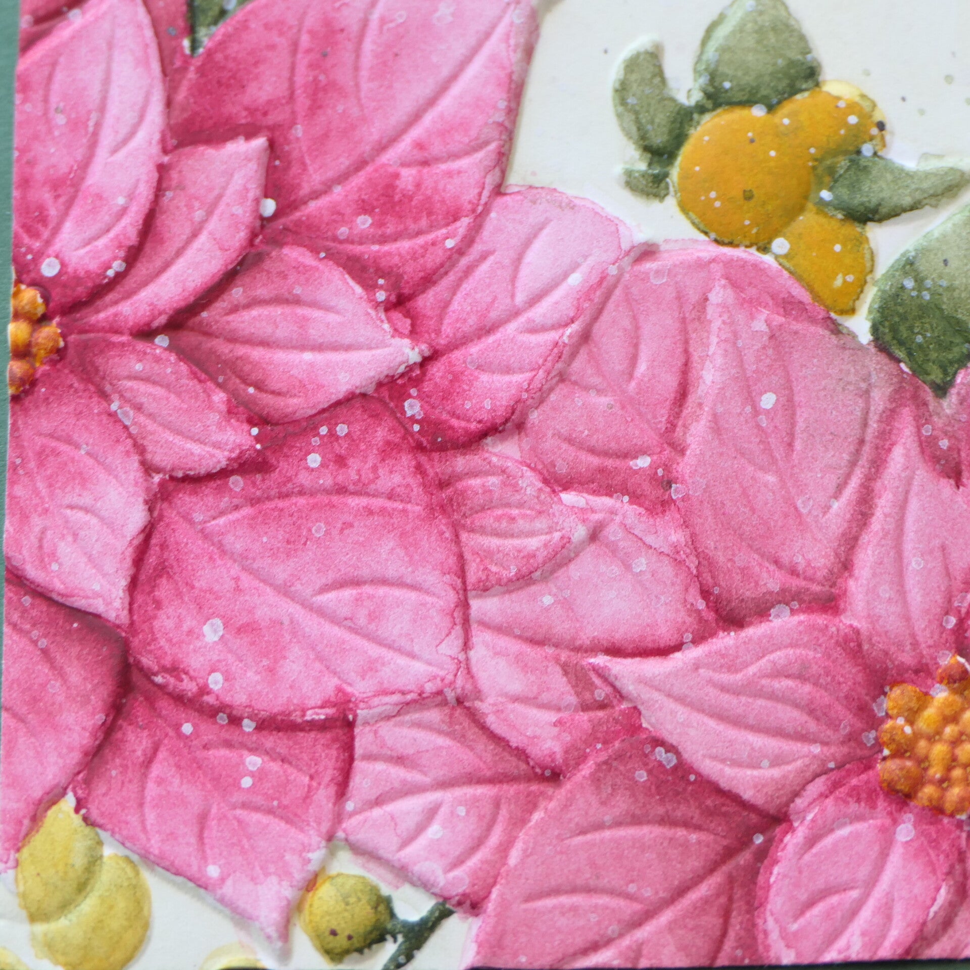
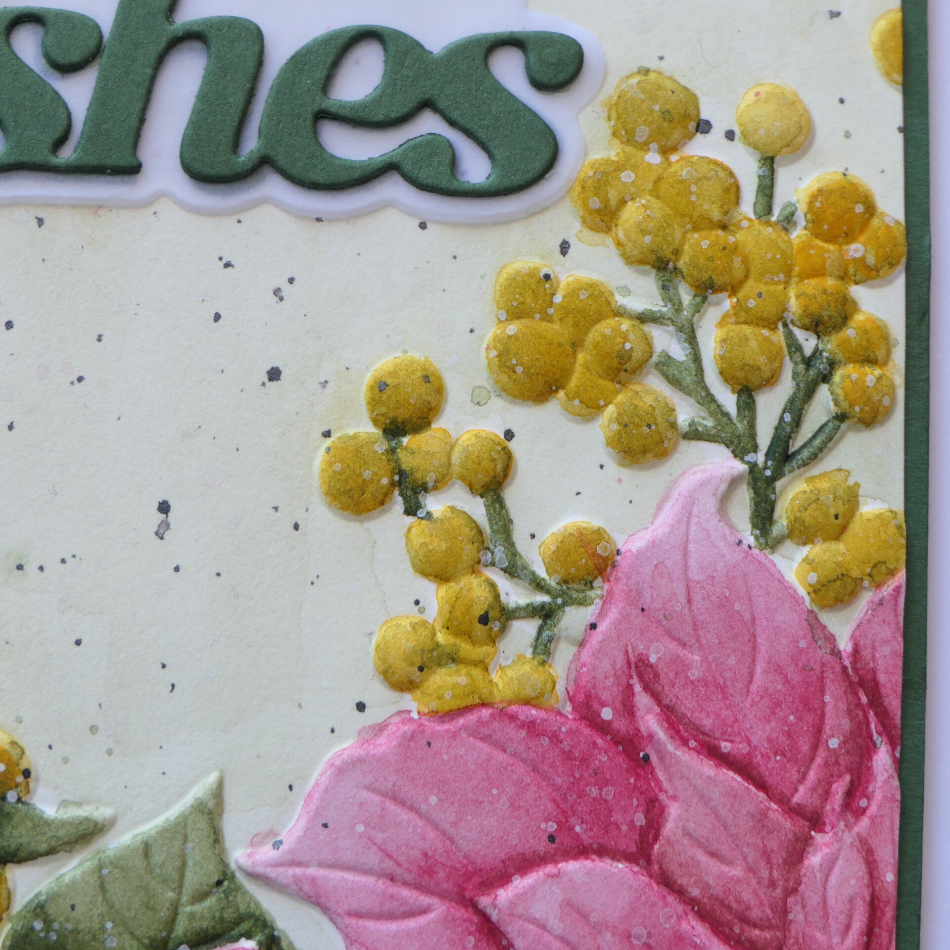
I embossed the floral image before watercoloring to help guide my brush and create crisp edges. Once the painting was completely dry, I embossed the image again to restore those clean embossed lines, giving the finished card a fresh and polished appearance.
Rather than focusing only on colouring the flowers, I paid close attention to the small details within each petal. Building gentle shadows and subtle colour variations helped create more dimension while still keeping the flowers soft and elegant.
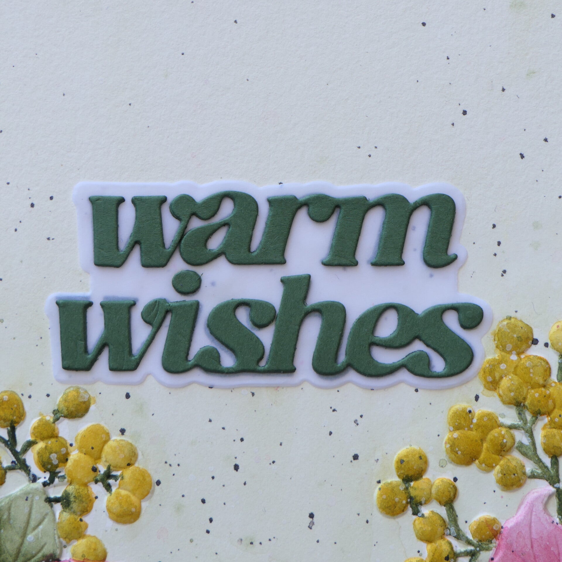
The background received only a very light olive-green watercolor wash to avoid distracting from the floral arrangement. To add extra interest, I splattered slightly diluted green watercolor while the background was still damp. This allowed the green splatters to softly blend into the paper, creating delicate texture without becoming overpowering. When completely dry I splattered I splattered black and white gouache.
To finish the design, I added a vellum shadow behind the sentiment so it would stand out while still keeping the overall look light and airy.
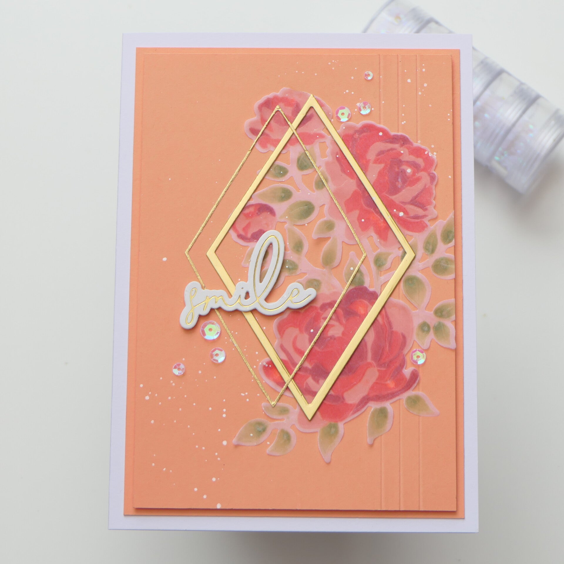
Card 2 Soft details with vellum
For this card, I explored beautiful details in a completely different way.
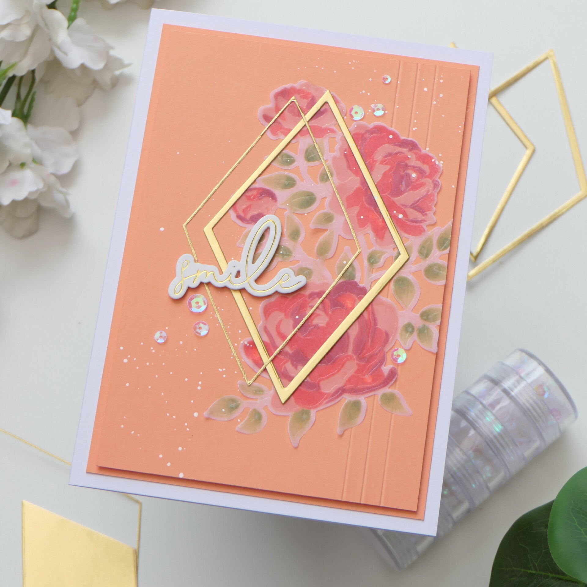
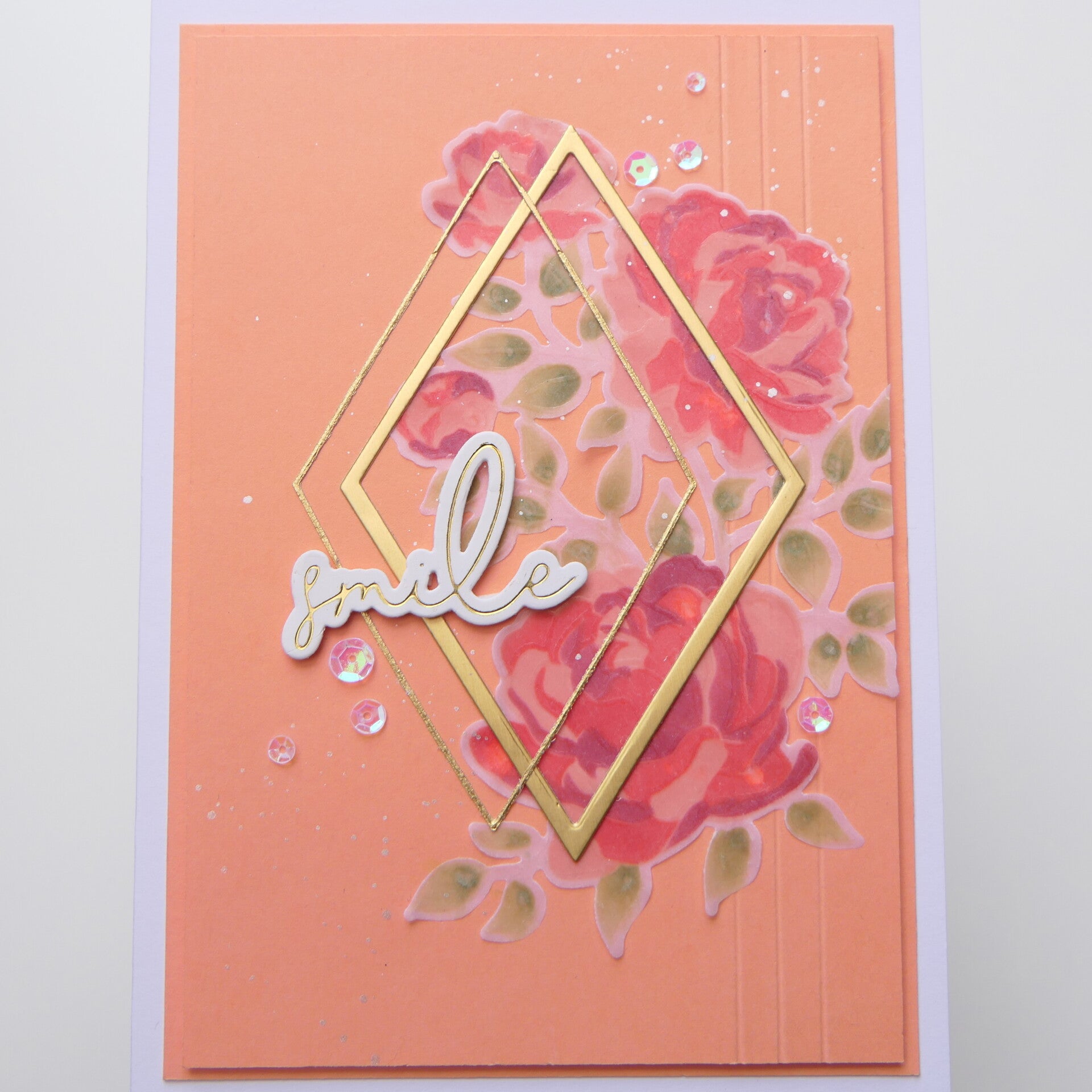
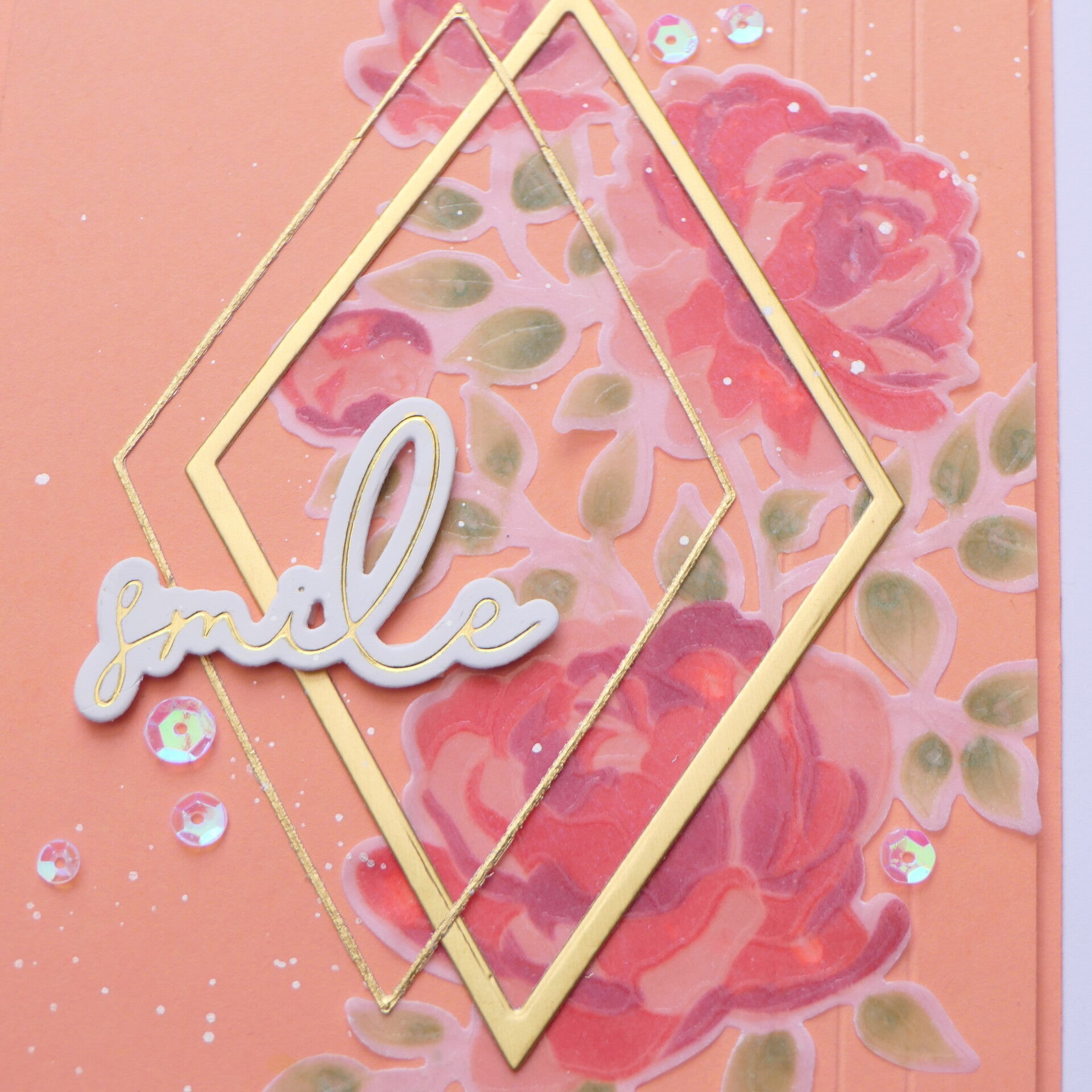
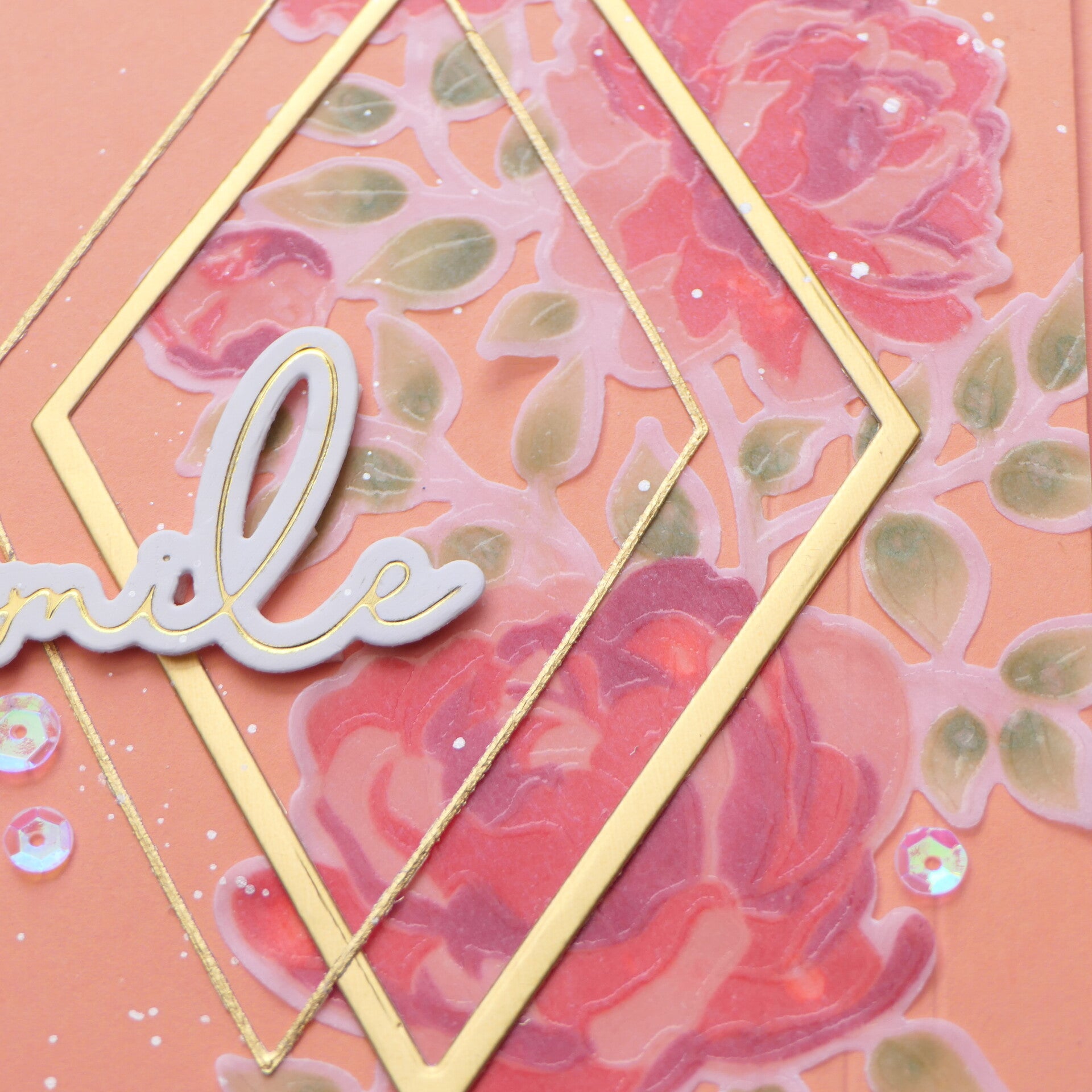
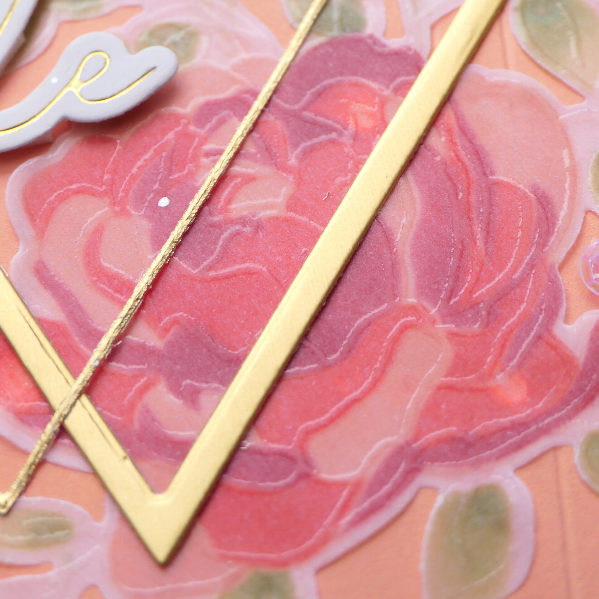
Instead of watercolor, I chose to color on the back of embossed vellum, making different color nuances. This technique creates such a soft, dreamy appearance while allowing the embossed outlines to remain beautifully crisp.
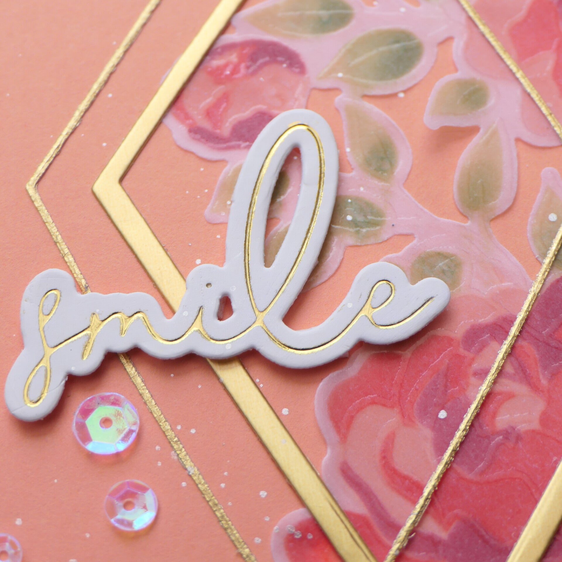
Because the vellum itself is already delicate, I intentionally kept the design clean. I framed the floral arrangement with two overlapping diamond frames. One frame was left shiny, while I softened the finish of the thinner frame so it wouldn't compete with the vellum. Sometimes reducing the shine creates even more elegance.
To add subtle interest without overwhelming the design, I incorporated three score lines into the background, a few metallic ink splatters, and several clear iridescent sequins. These quiet details support the overall composition without taking attention away from the vellum flowers.
Final Thoughts
This class taught me something much bigger than a new technique.
At first, I thought the lesson was about learning how Marika creates beautiful details. Instead, I discovered that beautiful details can look different for every card maker.
Sometimes they're found in carefully painted petals.
Sometimes they're hidden in soft vellum coloring.
Sometimes they're as simple as a few score lines, subtle splatters, or choosing to soften the shine of a gold frame.
Beautiful details don't have to demand attention. Often, they're the quiet choices that make a card feel balanced, elegant, and complete.
That is the lesson I'll carry with me into future projects.
Used products
Card 1:
- Winterberry Poinsettias
- Fine Watercolor Brushes
- Warm & Cozy Sentiments Die Set
- Titanium White Artists' Gouache
- Carbon Black Artists' Gouache
- Artists' Watercolor Tube – Olive Green
- Artists' Watercolor Tube – Quinacridone Magenta
- Artists' Watercolor Tube – Toluidine Red
- Artists' Watercolor Tube – Mars Red
- Artists' Watercolor Tube – Payne's Grey
- Artists' Watercolor Tube – Gold Ochre
Affiliate Note
The links in this post are affiliate links. If you choose to shop through them, I may receive a small commission at no extra cost to you. Thank you so much for supporting my creative journey. 🤍
Thank you so much for visiting my blog and for following my AECP journey. I truly appreciate every visit and every comment.
Next time, lemons will be the star of my card and blog. 😃
With love and creative joy,
Angelique
Add comment
Comments