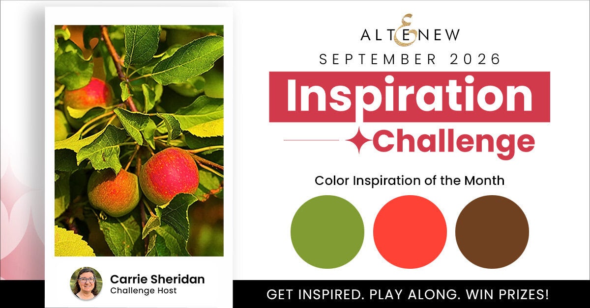
This month's Altenew Inspiration Challenge was hosted by my dear friend Carrie, and she chose such a beautiful color combination: red, brown and green.
Carrie's inspiration photo was taken in an apple orchard, with those beautiful, deep colors of autumn. I loved the combination immediately, but when I looked through my supplies, I didn't have a die or stamp that made me think of apples or an orchard.
But I did have a lot of Christmas still floating around in my head after the Altenew Fan Group takeover. 😂
So… red, brown and green became Christmas!
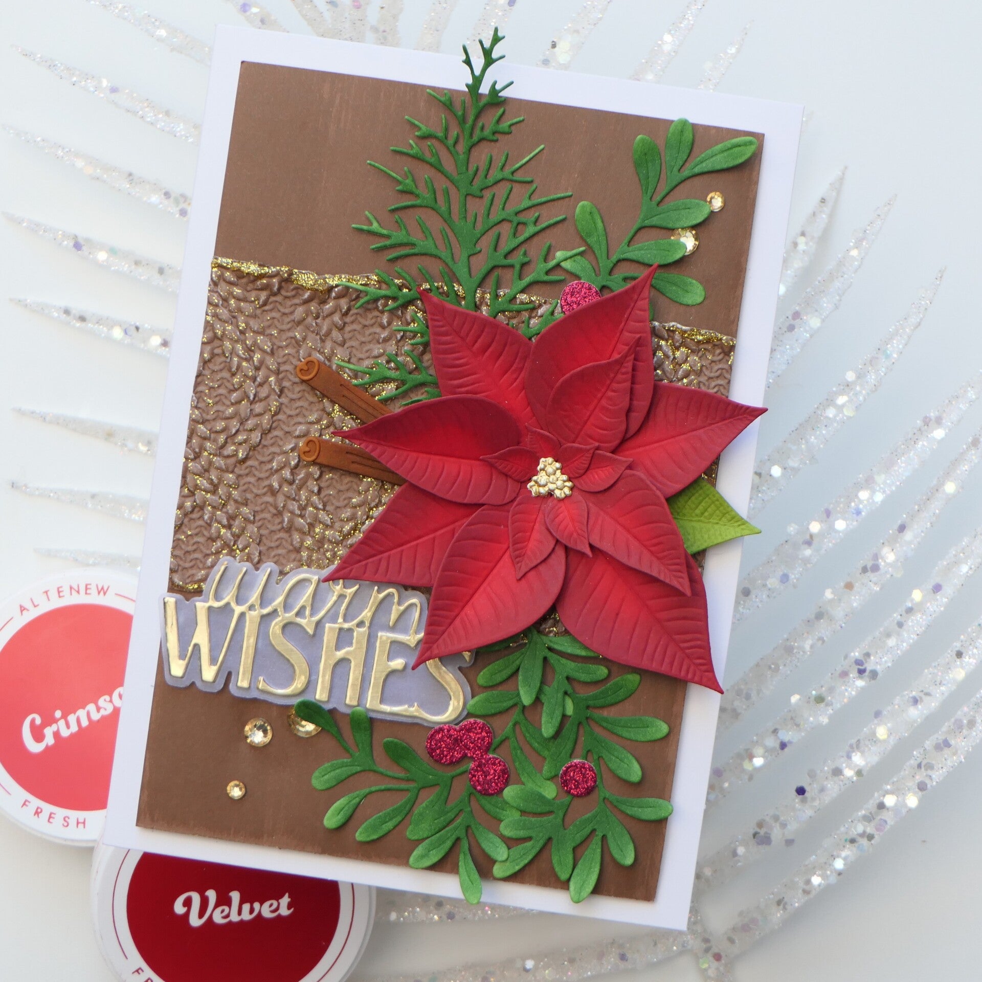
Maybe red poinsettias are a little bit of a cliché, but sometimes a cliché works for a reason. For me, red immediately makes me think of poinsettias, so that was where I started.
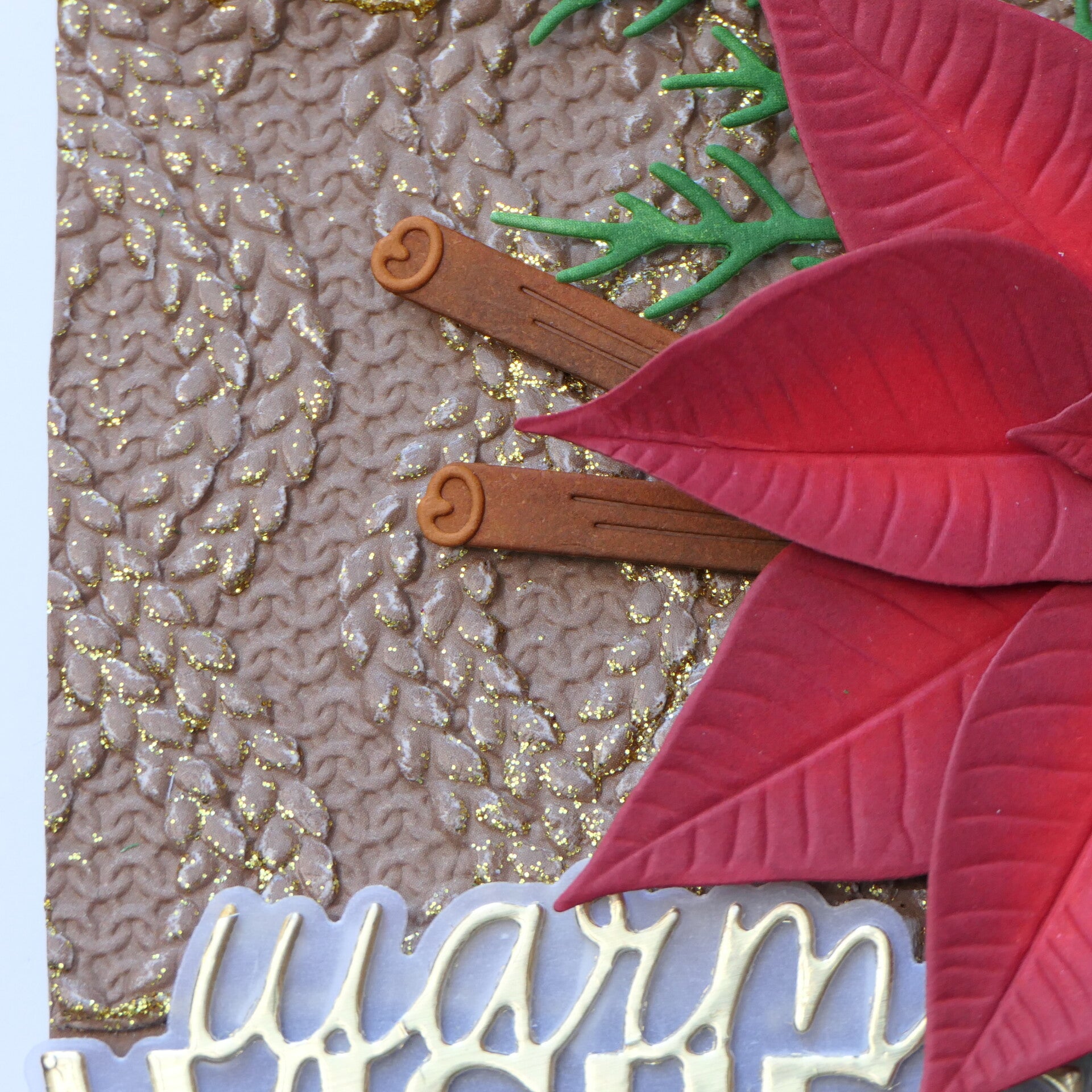
I recently received the Twist Cable Knit 3D Embossing Folder for the Cozy Comfort Retreat, and I really wanted to use it on this card. But I didn't want to emboss the whole background. With such a large poinsettia as the focal point, I felt that would simply be too much.
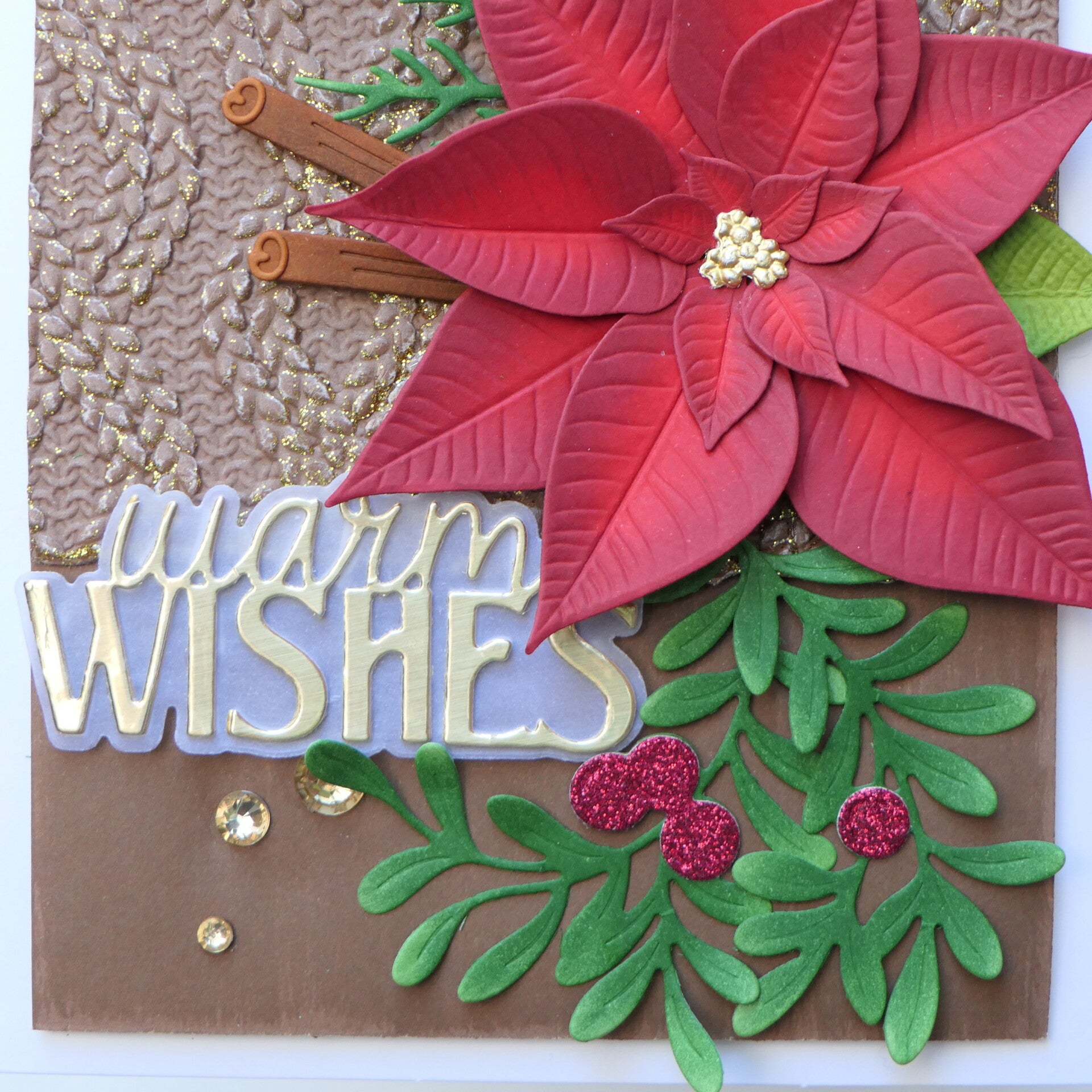
Instead, I used a strip of cardstock across the card and embossed that. I added Gold Glitter Relief Paste over the raised areas of the embossing, and then also added it along the edges of the strip. I love how this creates a little bit of sparkle without turning the entire card into a glitter explosion.
For the main background, I started with brown cardstock and then swiped over it with my Ginger Root Fresh Dye Ink cube. This added subtle color variations and kept the brown from looking completely flat.
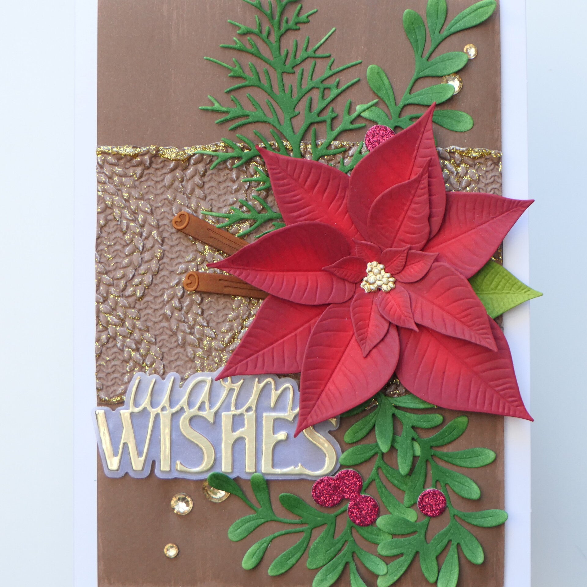
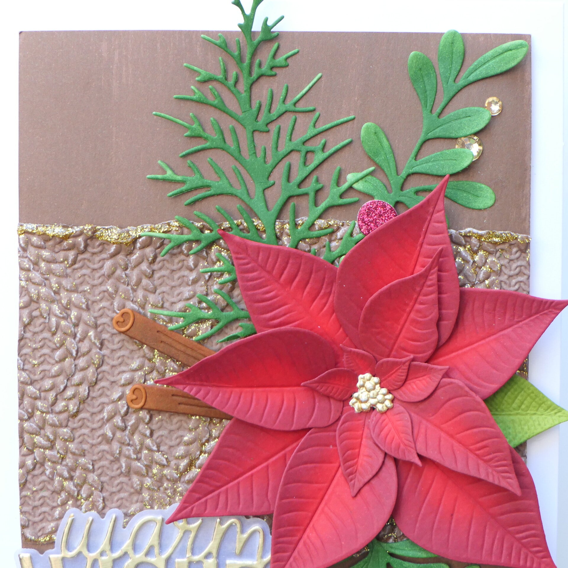
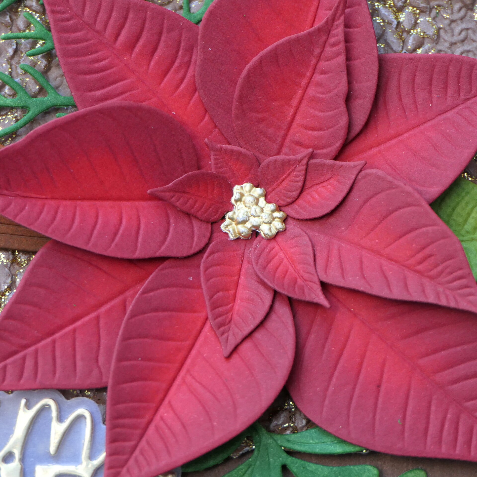
The poinsettia was created using the Lush Botanicals Poinsettia dies. I used several shades of red to give the flower more depth instead of using just one color. The greenery was also ink blended with different shades of green. I wanted some variation there as well, rather than having one solid dark green throughout the card.
The little berries are cut from red glitter paper, which brings some of the red back into the greenery and creates another small connection with the poinsettia.
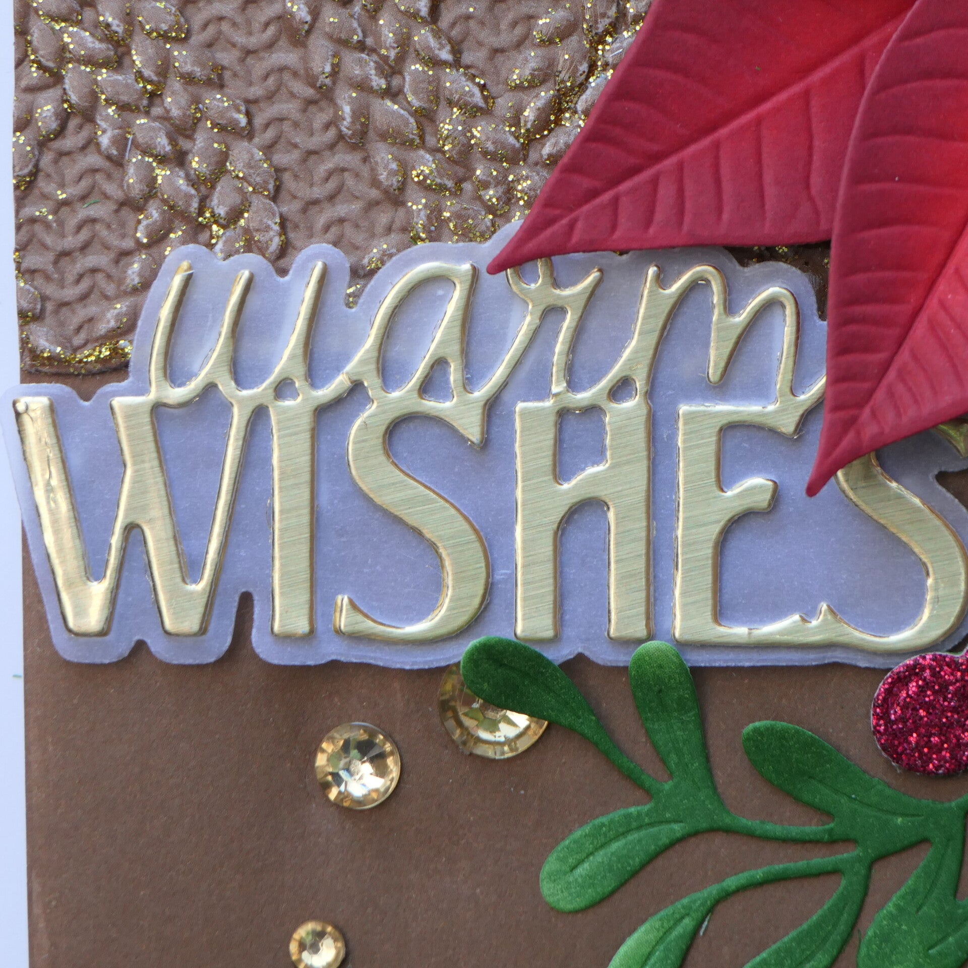
For the sentiment, I used a softly brushed gold finish with a vellum shadow. I also added an extra layer underneath the sentiment and shadow. This gives the sentiment the illusion of floating slightly above the card and, at the same time, gives this rather large element a little more breathing room.
Finally, I added a few Sicilian Amber Gem Sparkles as finishing touches.
Final Thoughts
One thing I have learned over the last year is that I don't always have to make my cards restrained. Christmas cards, in particular, seem to make that a little more difficult! There is something about Christmas that makes me want to add layers, texture, warmth and sparkle.
The difference for me now is that I am much more aware of why I am adding those things.
This card is definitely not a reflection of how I want every card I make to look. It is full, dimensional and sparkly. But every element has a purpose, from the gold that lightens the color combination to the greenery that frames the poinsettia.
Sometimes the right choice is to leave something out.
And sometimes, for this particular card, the right choice is to say: yes, let's add that bit of sparkle.
And honestly? I think Christmas gave me permission. 😍
Used Products
- Lush Botanicals Poinsettia
- Holiday Essentials Die Set
- Festive Greenery Die Set
- Twist Cable Knit 3D Embossing Folder
- Gold Glitter Relief Paste
- Coral Red Fresh Dye Ink
- Burnt Red Fresh Dye Ink
- Velvet Fresh Dye Ink
- Crimson Fresh Dye Ink
- Ginger Root Fresh Dye Ink
- Green Valley Fresh Dye Ink
- Sicilian Amber Gem Sparkles
- Glitter Gradient Cardstock Set - Brilliant Red
Affiliate Note
The links in this post are affiliate links. If you choose to shop through them, I may receive a small commission at no extra cost to you. Thank you so much for supporting my creative journey. 🤍
Thank you so much for visiting my blog and for following my journey. I truly appreciate every visit and every comment.
With love and creative joy,
Angelique
Add comment
Comments