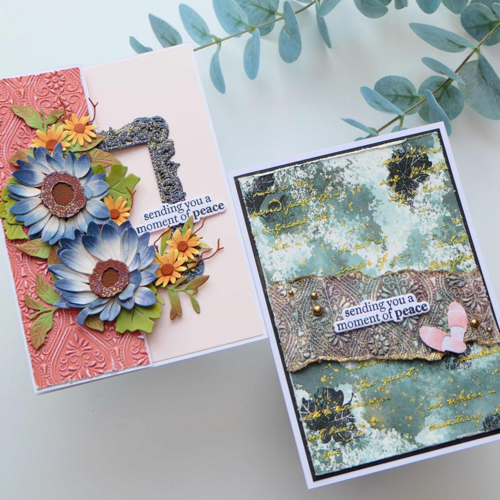
When I started this class, I thought I was going to make one card.
Of course, that didn't quite happen.
This class, Impressive Heat Embossing by Svetlana Marchenka, gave me a lot of ideas about the different ways to use heat embossing. But while making my first card, I started wondering what would happen if I used the technique in a much smaller and more subtle way.
So one card became two.
And honestly, the second card may not be the most beautiful card I've ever made, but it became a very valuable card for me. It taught me something about restraint, intentional design, and letting the background have its moment.
And that is exactly why it belongs in this blog.
What I Learned About Heat Embossing
Svetlana started the class with the basics, including a few things that are always important when heat embossing.
First, use an anti-static tool on your cardstock before adding embossing ink. This helps prevent the embossing powder from sticking where you don't want it.
Another good tip is to heat your heat tool before bringing it to your project. This means you spend less time heating the paper itself, which can help prevent warping.
But the class quickly moved beyond the traditional use of heat embossing.
There are so many possibilities!
We looked at using heat embossing as a way of adding color, using clear embossing powder over colored cardstock, creating a resist effect, embossing with layered stamps, creating an ombré effect and even heat embossing through a stencil.
And there are many more possibilities beyond those examples.
What I found most interesting, though, was that I started thinking less about what Svetlana showed us and more about what I could do with the technique myself.
That is something I notice happening more and more during my AECP classes.
I don't just want to repeat the technique anymore.
I want to investigate it.
My Cards
Card 1 – A Little Embossing Goes a Long Way
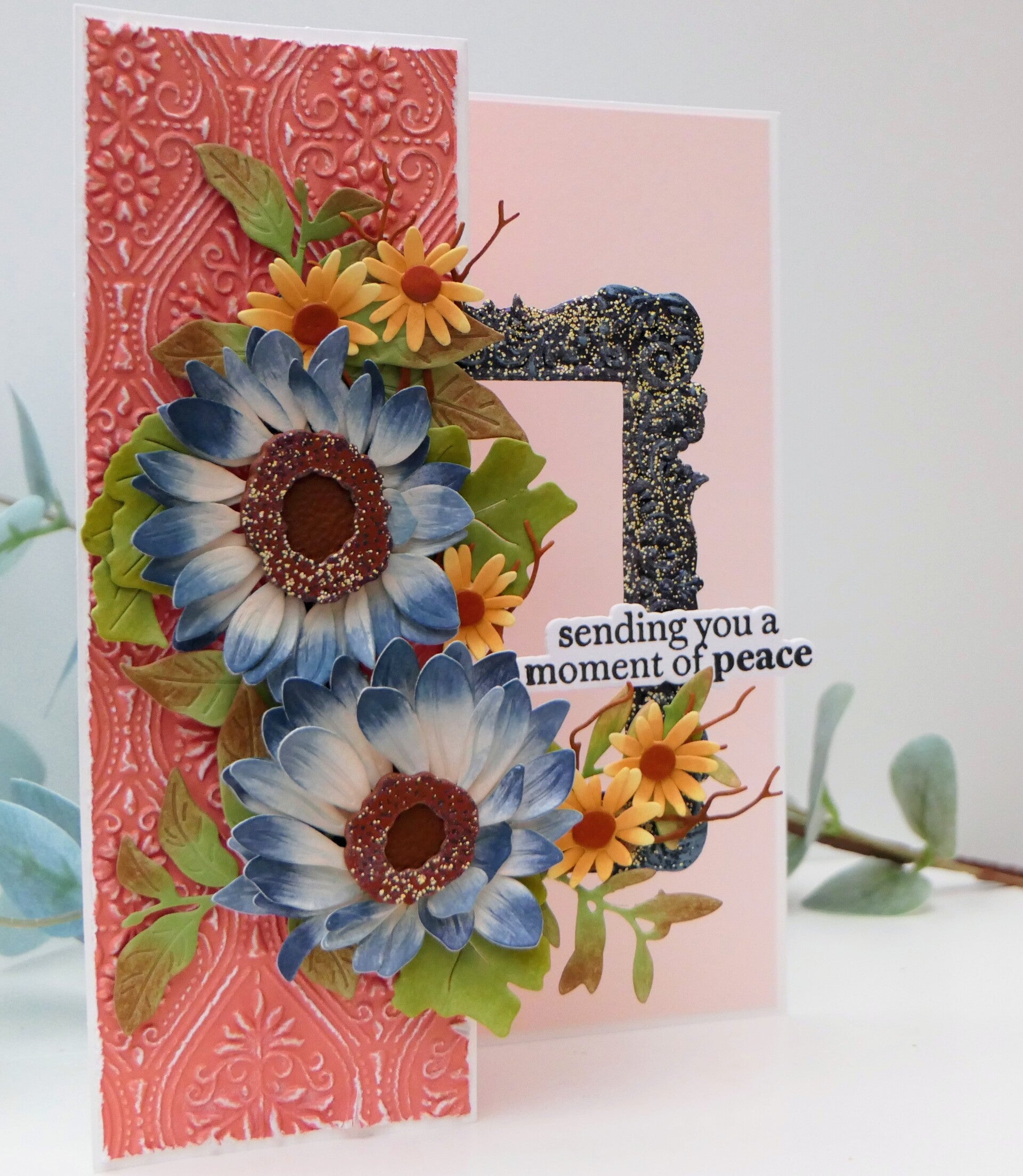
My first card started as the card I actually intended to make.
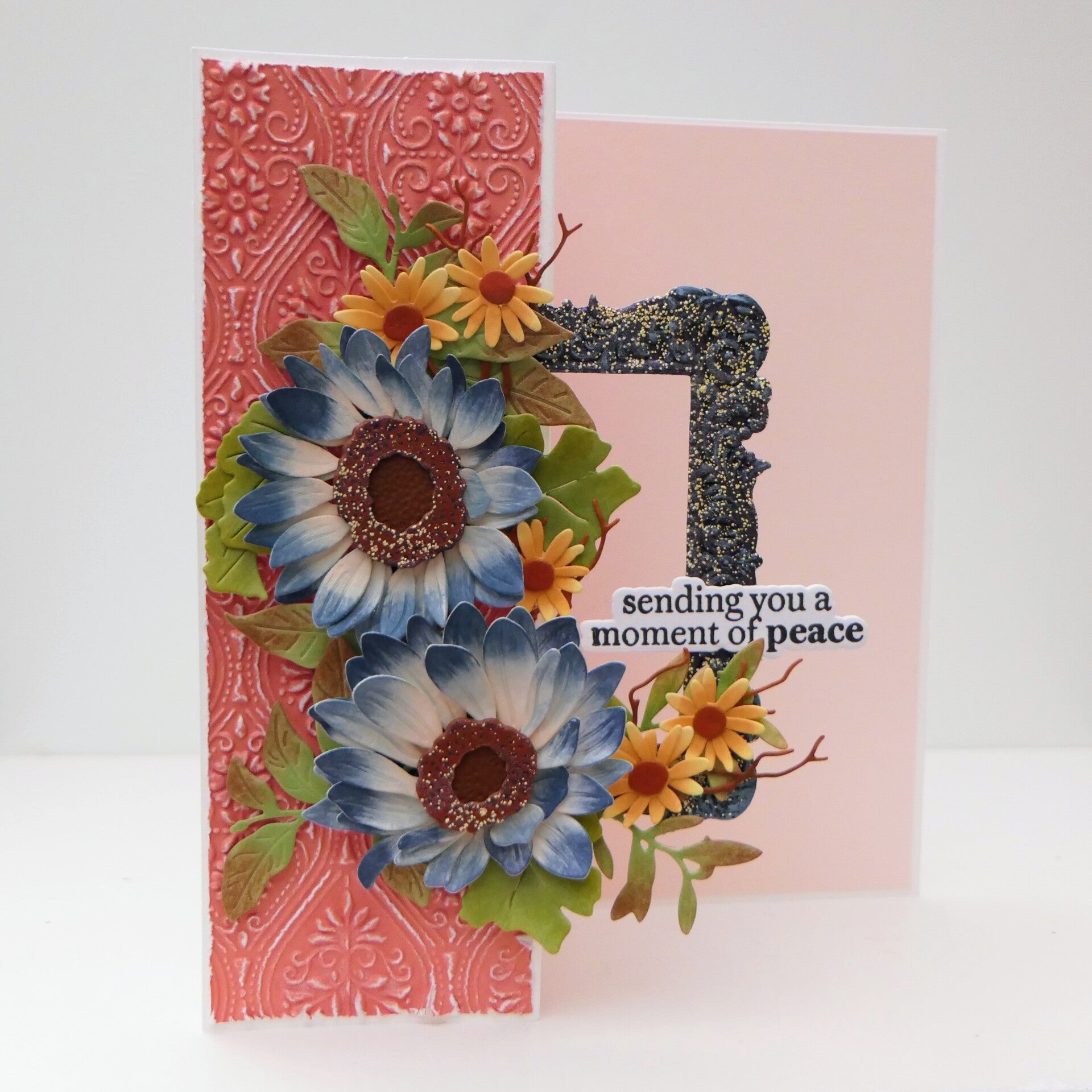
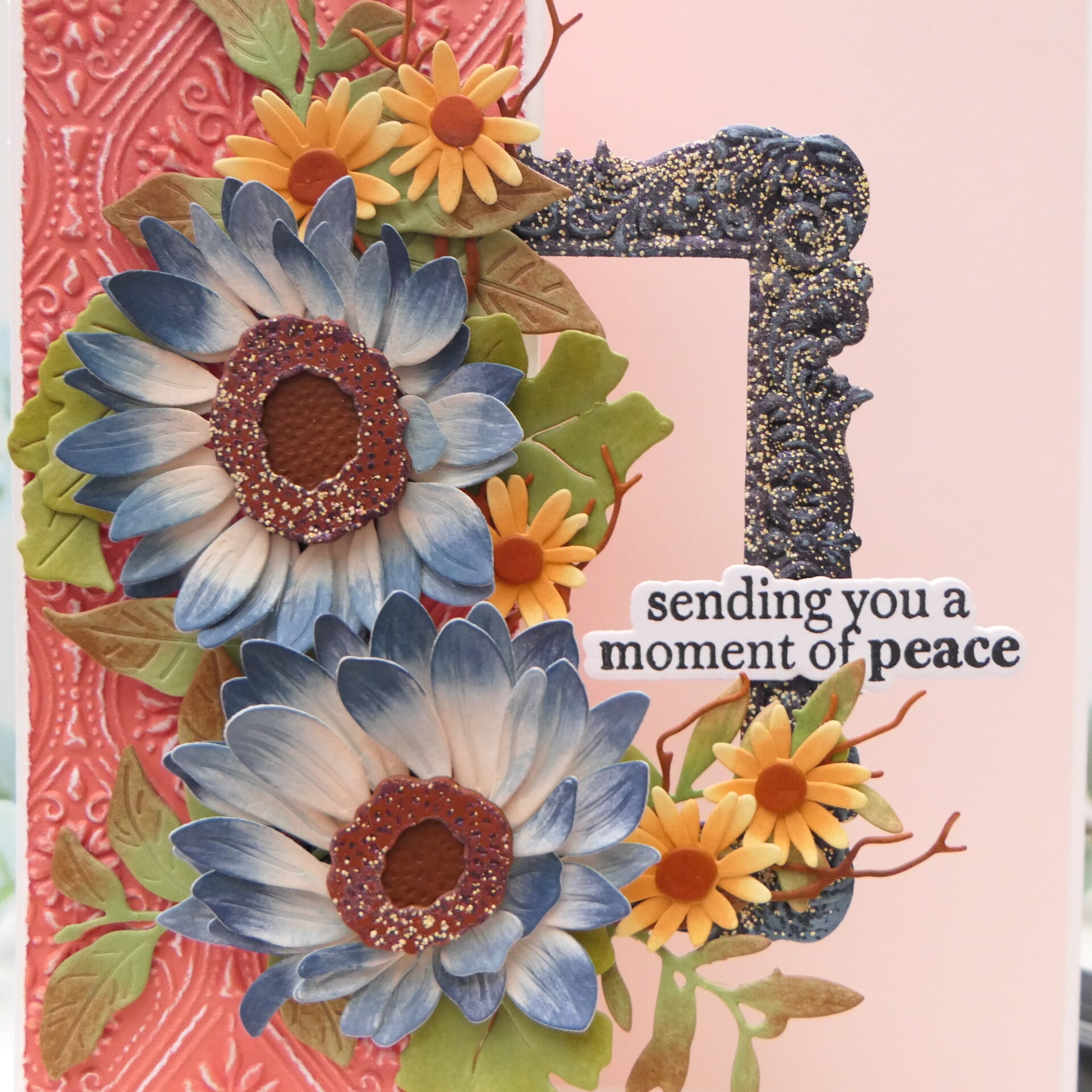
I wanted to use heat embossing, but I didn't want it to be the first thing you noticed. I wanted it to add texture and detail without taking over the card.
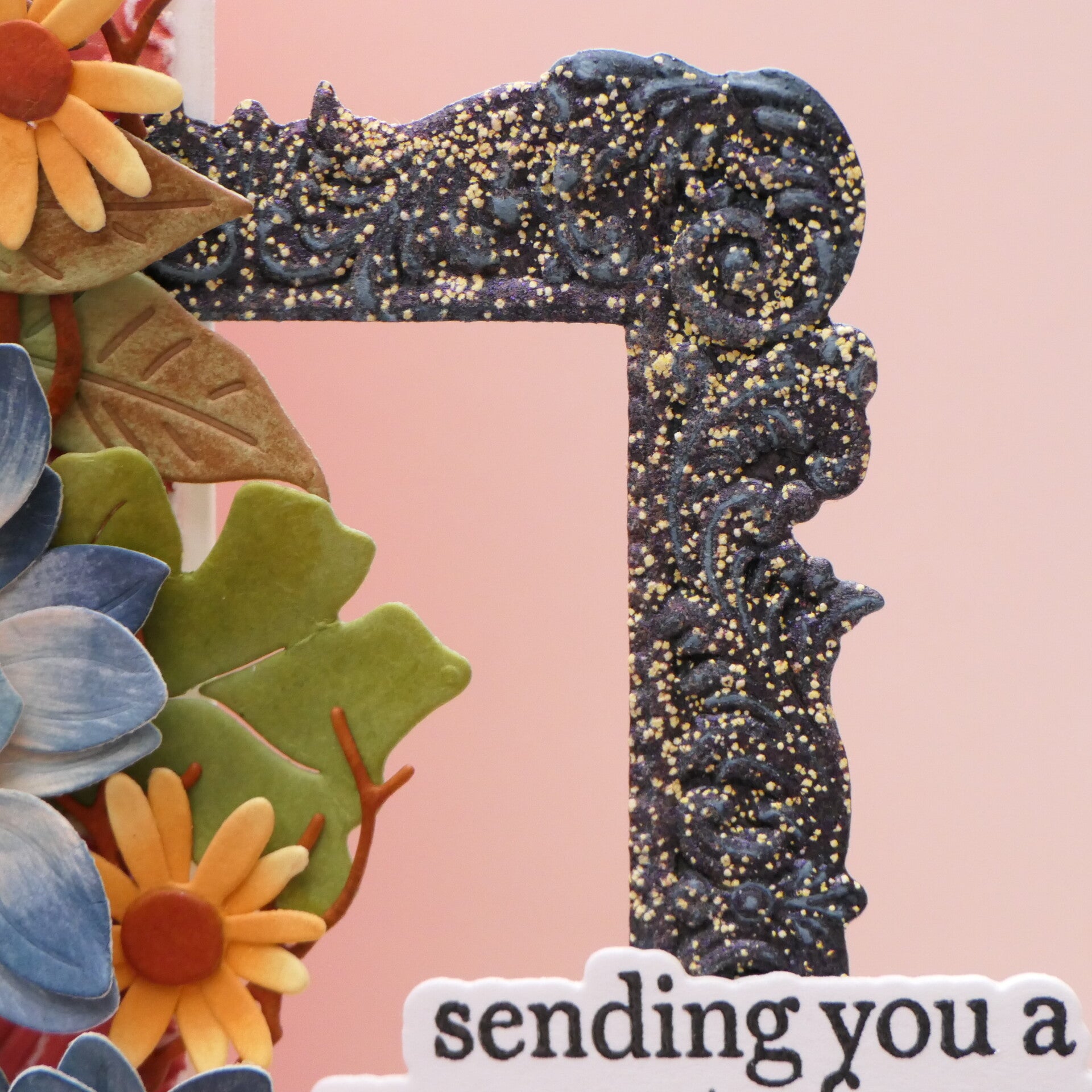
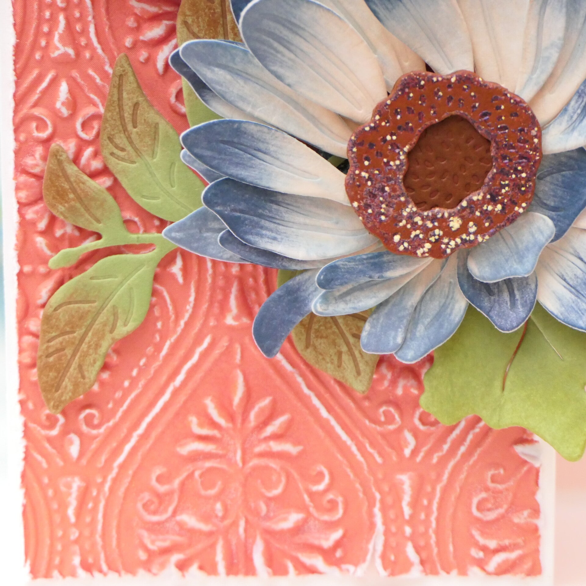
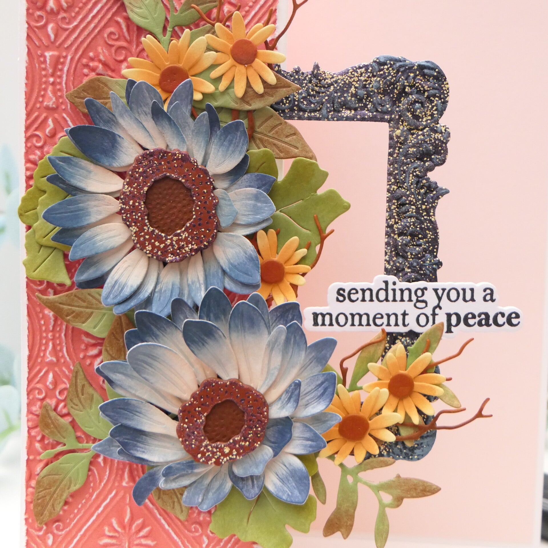
I started with the Heirloom Frame 3D Embossing Folder. I applied embossing ink to the inside of the embossing folder and then ran my cardstock through it. This meant that the embossing ink was pressed into all those little nooks and crannies of the embossed design.
I then added Coffee Grounds embossing powder from WOW.
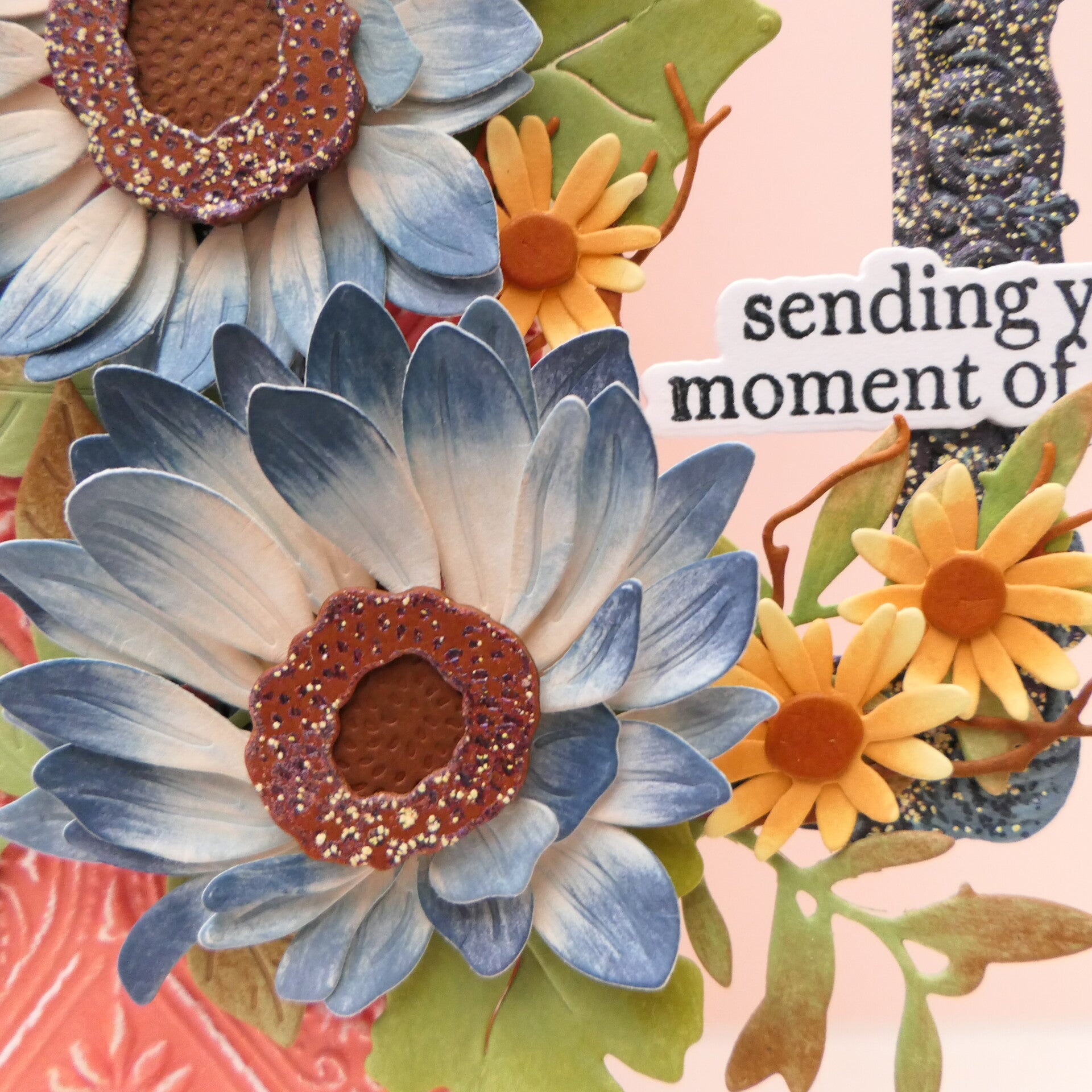
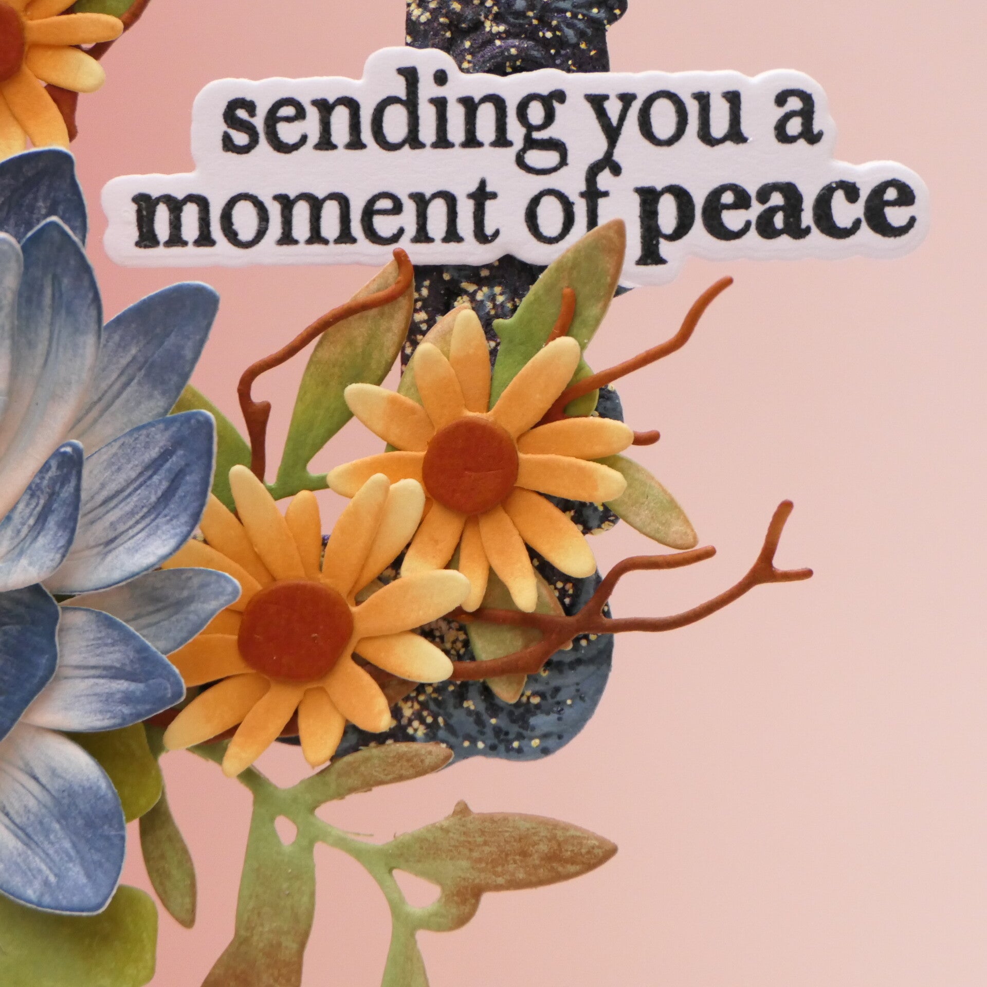
I deliberately didn't cover the entire piece evenly. I wanted some of the Nimbus cardstock to remain visible underneath the dark embossing powder. The Coffee Grounds powder is a beautiful dark color with a tiny bit of sparkle, so it gave the frame texture without completely hiding the embossed pattern.
I used the same idea on the outer ring of the flower centers. I ink blended the rings first, added embossing ink and then sprinkled on the same embossing powder, but more lightly than on the frame.
That small difference in intensity helped connect the two elements while keeping the frame as the stronger textured element.
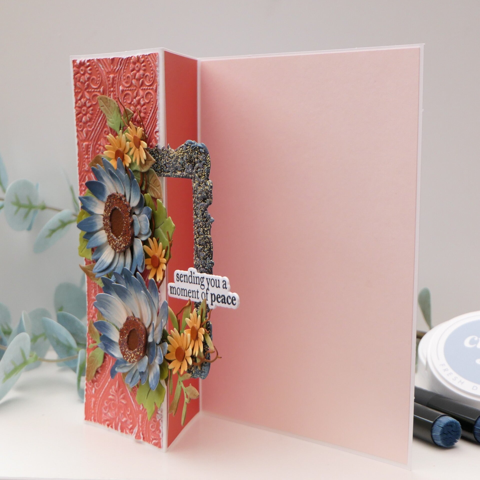
And because this card became a fun fold, the frame sits a little more loosely away from the card when it is opened. I actually really loved that unexpected extra dimension.
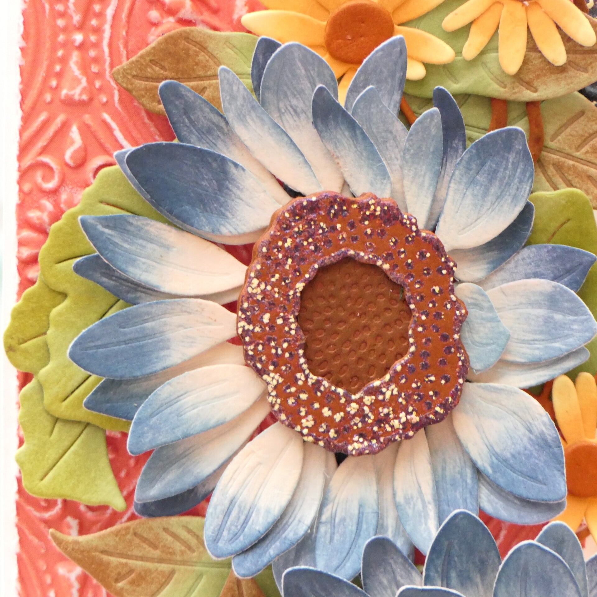
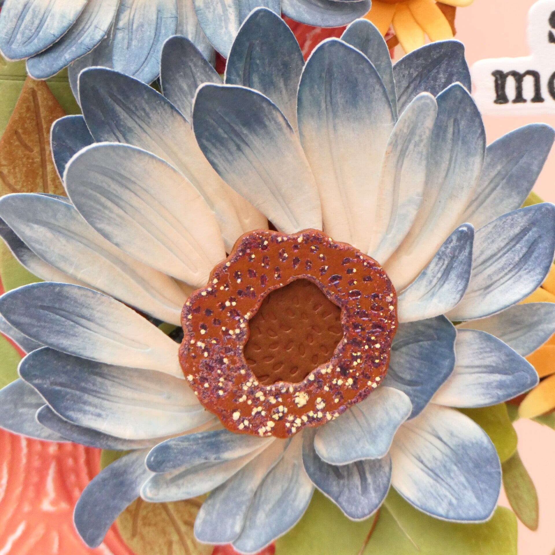
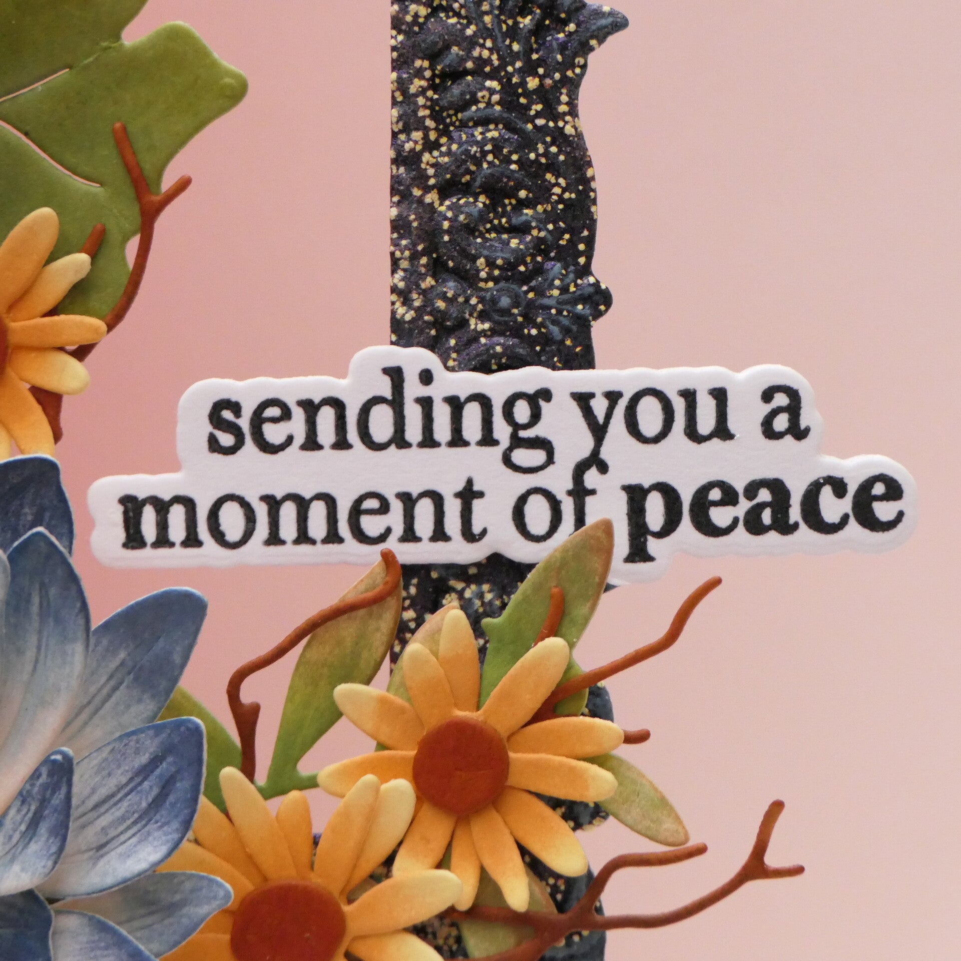
The flowers were created with the Sunflowers Bouquet Layering Die Set, together with smaller flowers from the Candlelight Charm Layering Die Set.
The embossing is not immediately obvious when you look at the finished card. But when I shared it online, people immediately commented on the frame and the flower centers and wanted to know what I had done.
That was exactly what I was hoping for.
The heat embossing is small, but it has an impact.
And I think that is something I will remember from this class.
Card 2 – The Background Gets to Shine
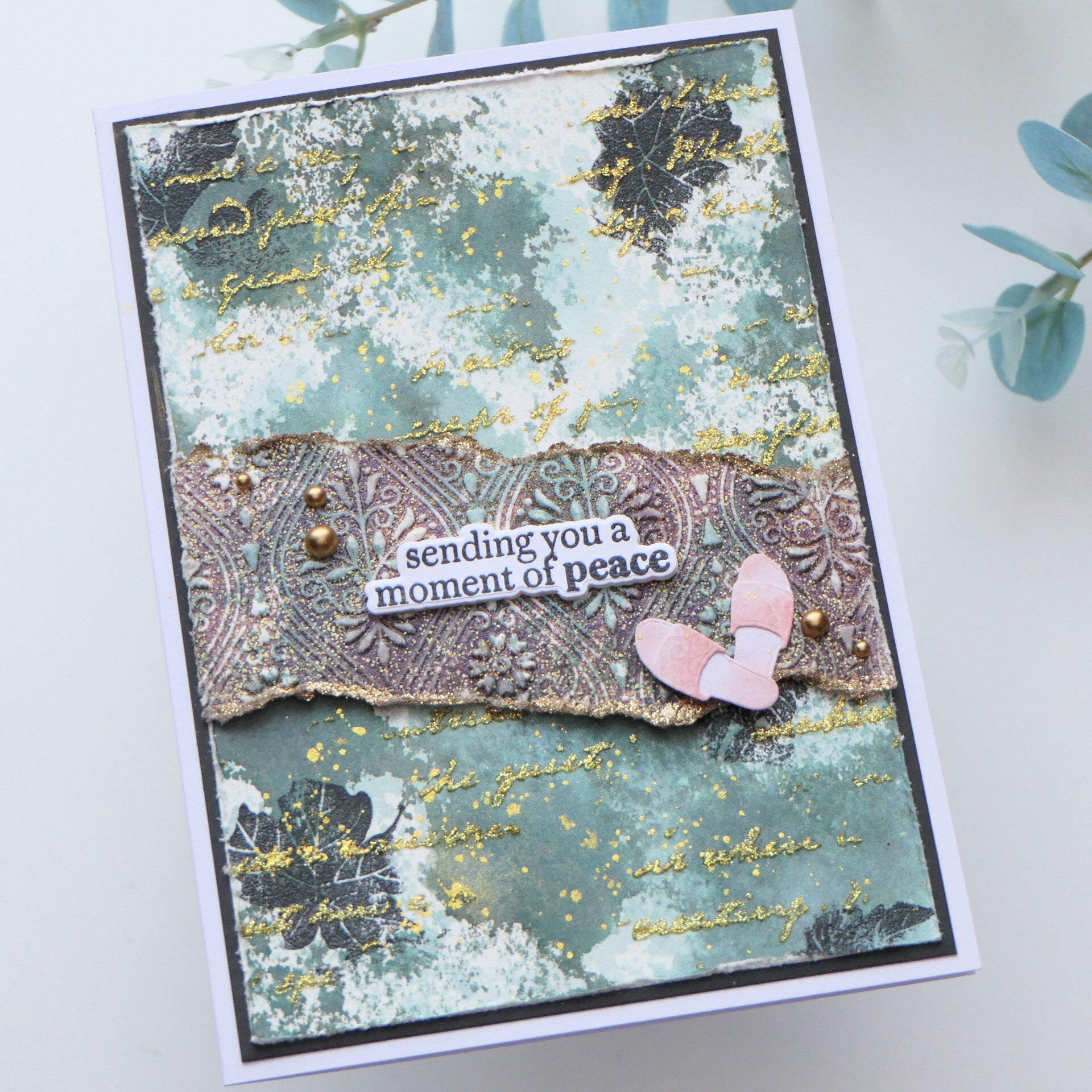
And then there was Card 2.
This card was not planned. It happened because I wasn't finished exploring the technique.
I wanted to see how far I could take the idea of using heat embossing in smaller ways and, more importantly, what would happen if I didn't cover the background with a large focal point. That last part was much harder for me than I expected.
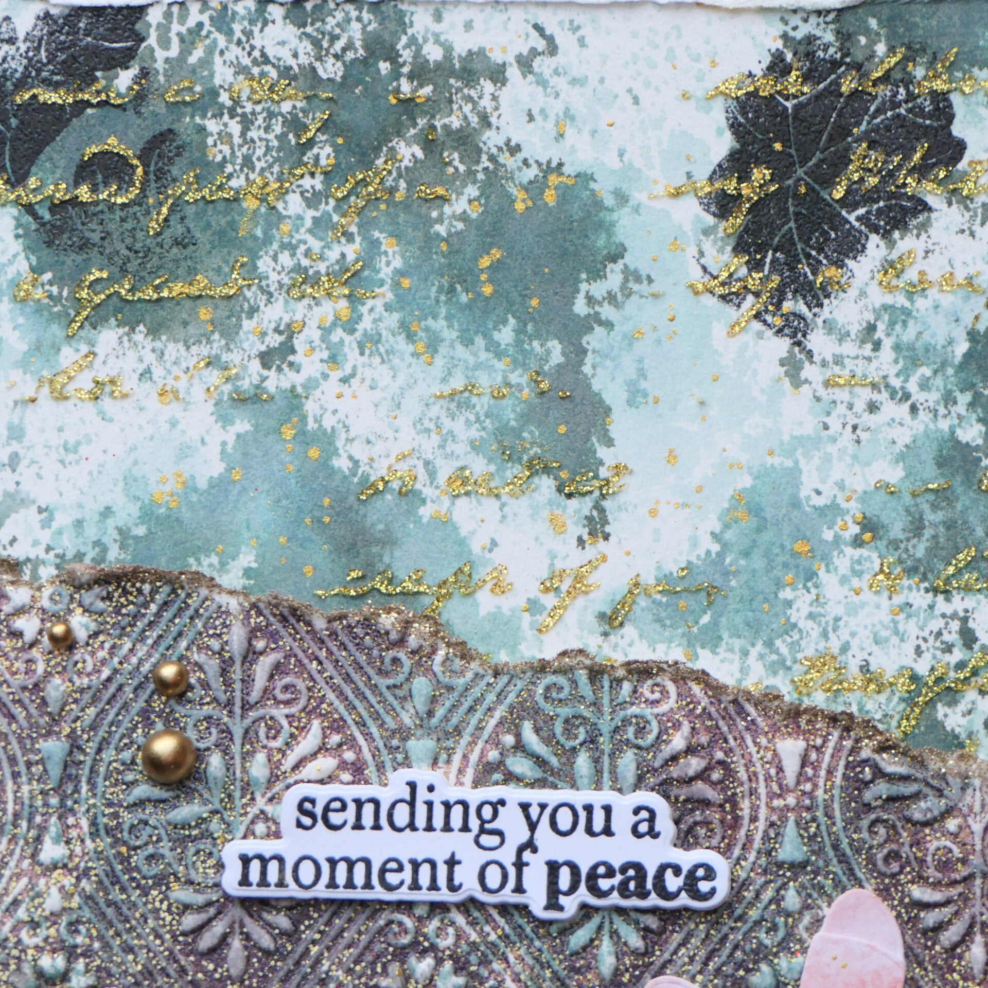
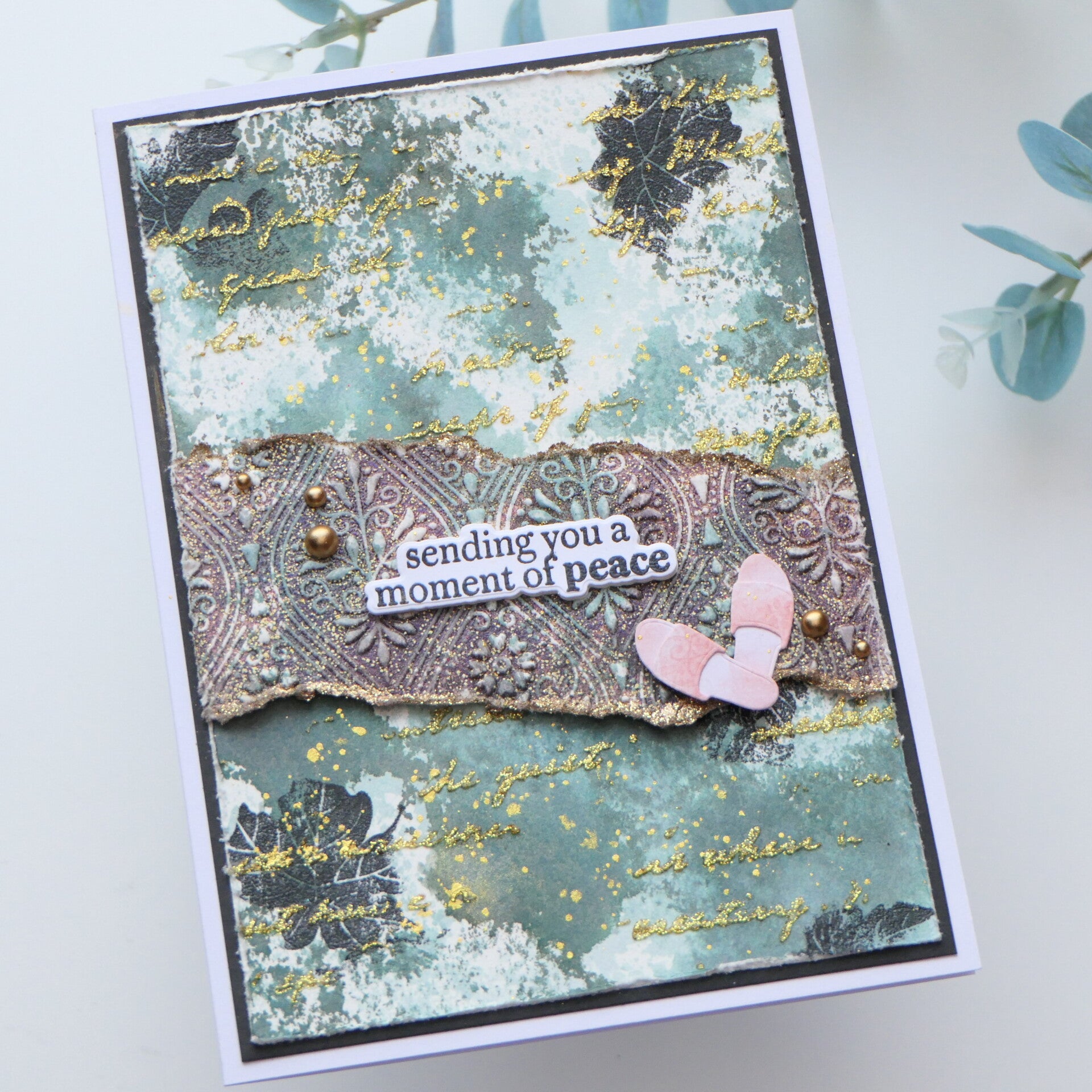
I started with an ink-smooshed background. The idea for the ink smooshing actually came from a mixed media workshop I had taken with Aditi Mahajan, and I loved the background so much that I wanted to build on it.
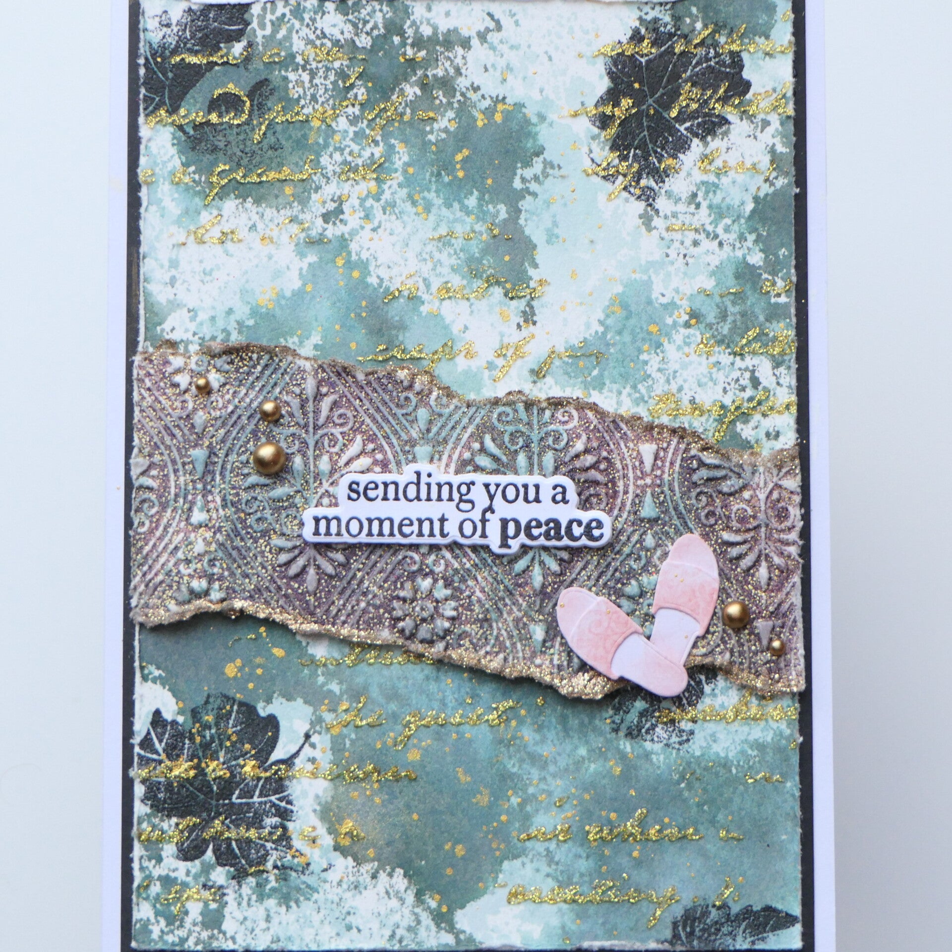
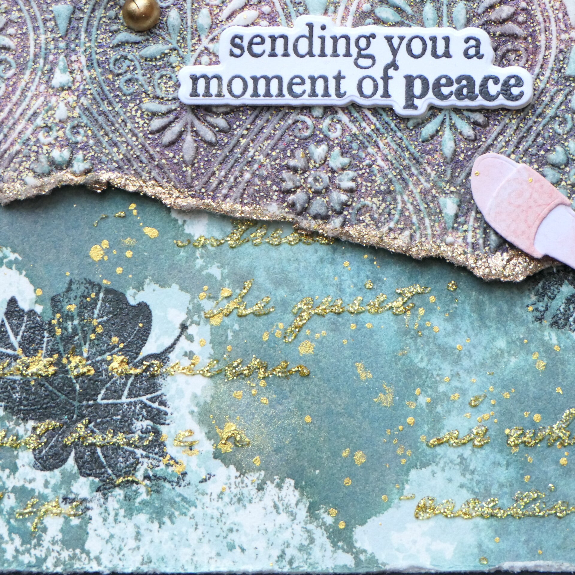
I then used a leaf stamp from the Craft Your Life Project Kit: Expressive Flora, stamped it in black and heat embossed it with clear embossing powder. This gave the leaves a soft, glossy appearance.
A little tip: make sure your ink-smooshed background is completely dry before doing this! Otherwise, the embossing powder will happily stick to places where you really don't want it. And yes, the anti-static tool is your friend.
For the next layer, I used the Paper Echoes Stencil and Gold Glitter Relief Paste. I had considered heat embossing through the stencil, but decided to use the paste instead. For me, it was much easier to apply it in separate areas rather than trying to control embossing powder through the entire stencil.
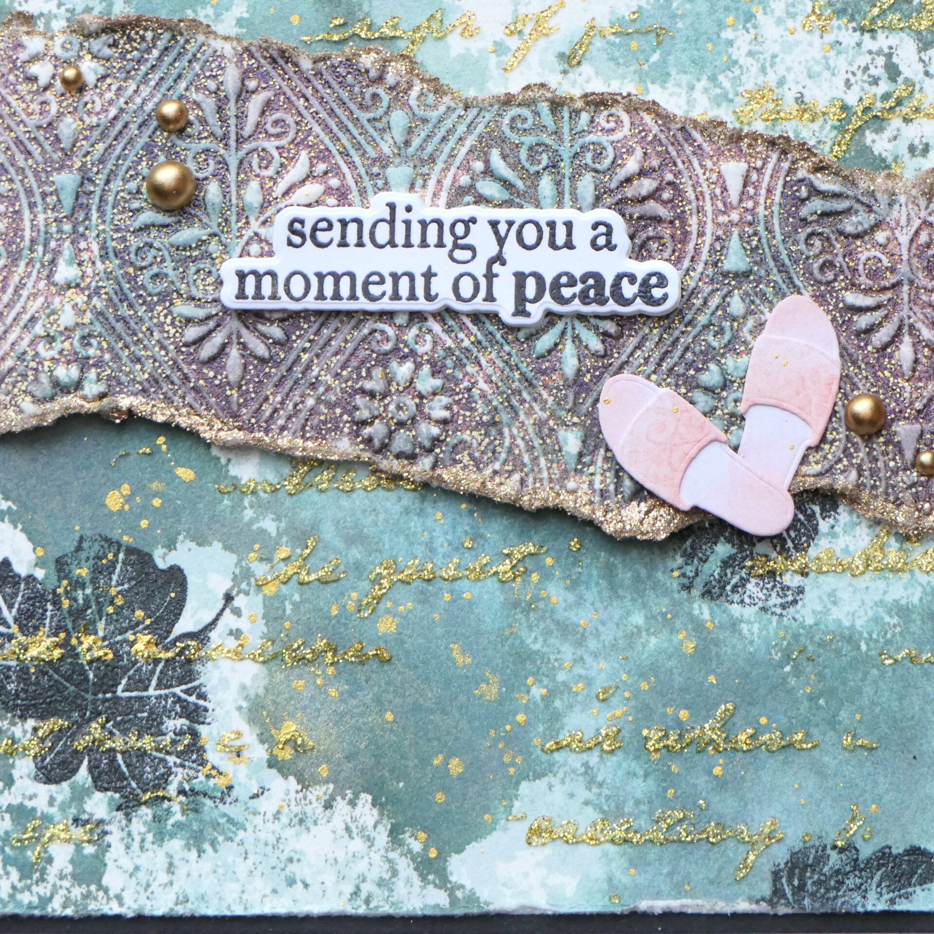
Then came the little torn piece of cardstock across the middle.
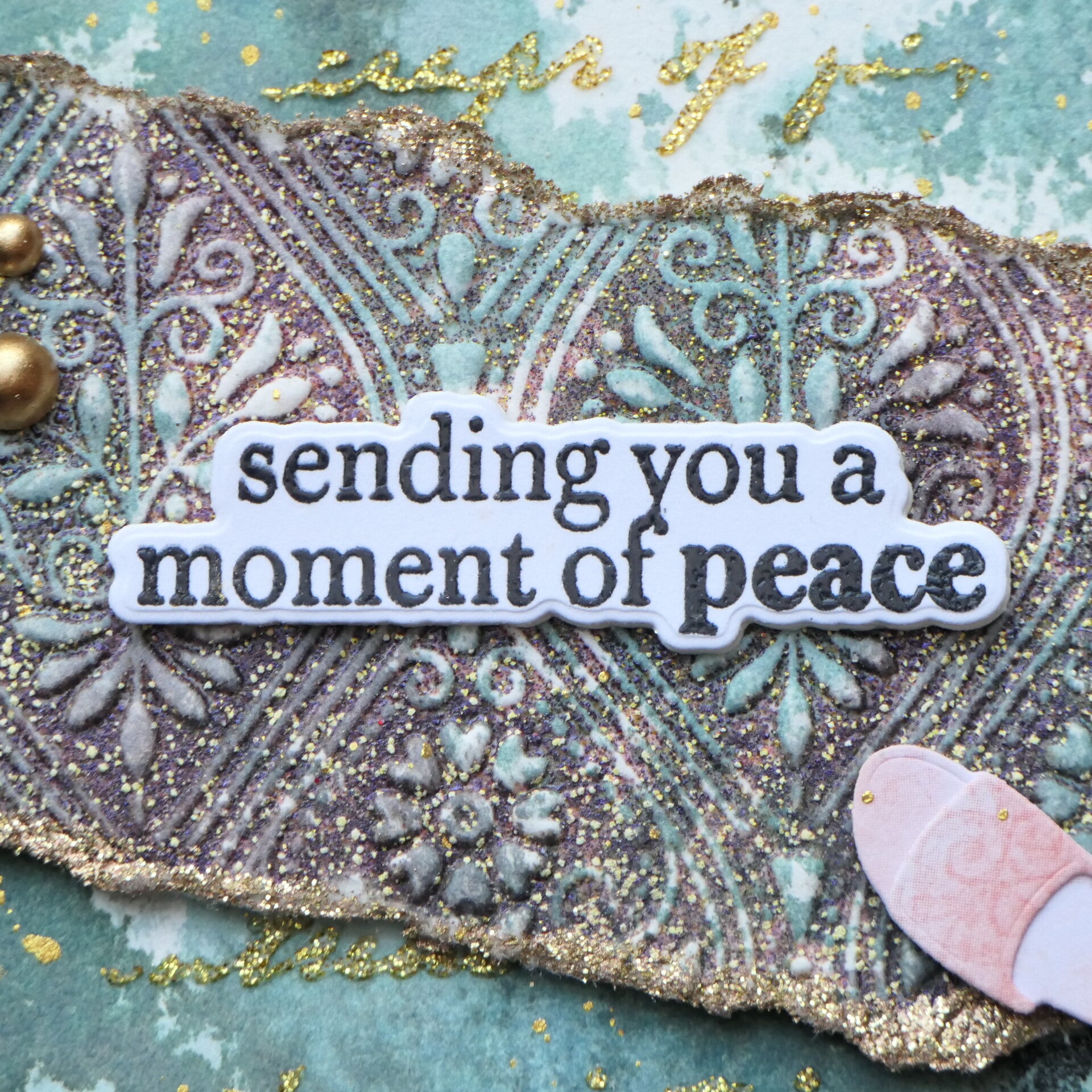
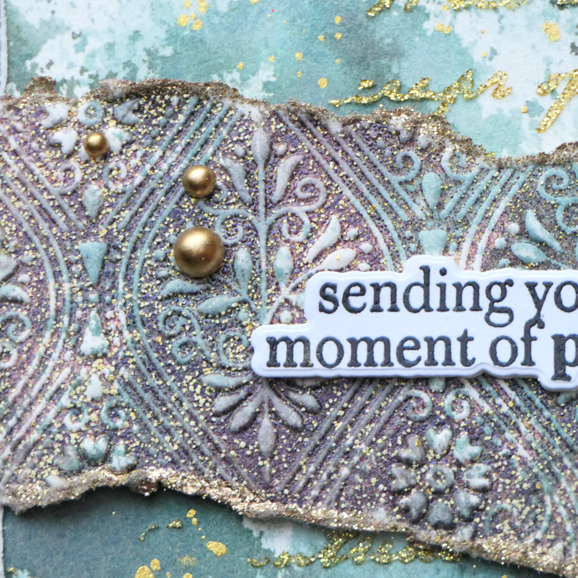
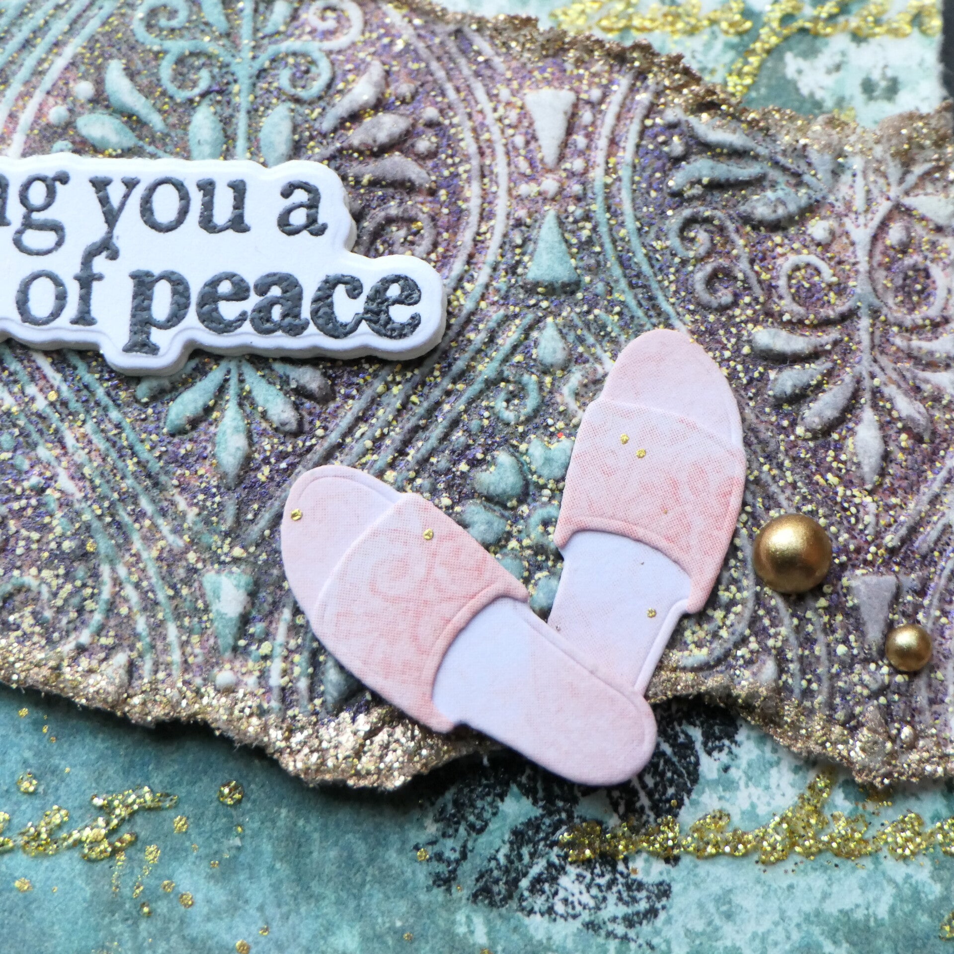
I had already ink smooshed this piece and let it dry completely. I used the Deco Damask Pattern 3D Embossing Folder, again adding embossing ink inside the folder before running it through my machine.
Then I added the same Coffee Grounds embossing powder.
Again, I deliberately left areas uncovered so the ink-smooshed colors could still show through. Most of the melted embossing powder settled into the little nooks and crannies of the embossed pattern, giving the piece a wonderful textured look.
I also added gold embossing powder to the torn edges.
And finally, I heat embossed the sentiment with clear embossing powder, which is probably one of the most common ways we all use heat embossing.
So there are quite a few different little heat-embossing moments on this card, but none of them is really shouting for attention.
And that was intentional.
Restraint Is Harder Than It Looks
The biggest challenge was actually stopping myself from covering the background.
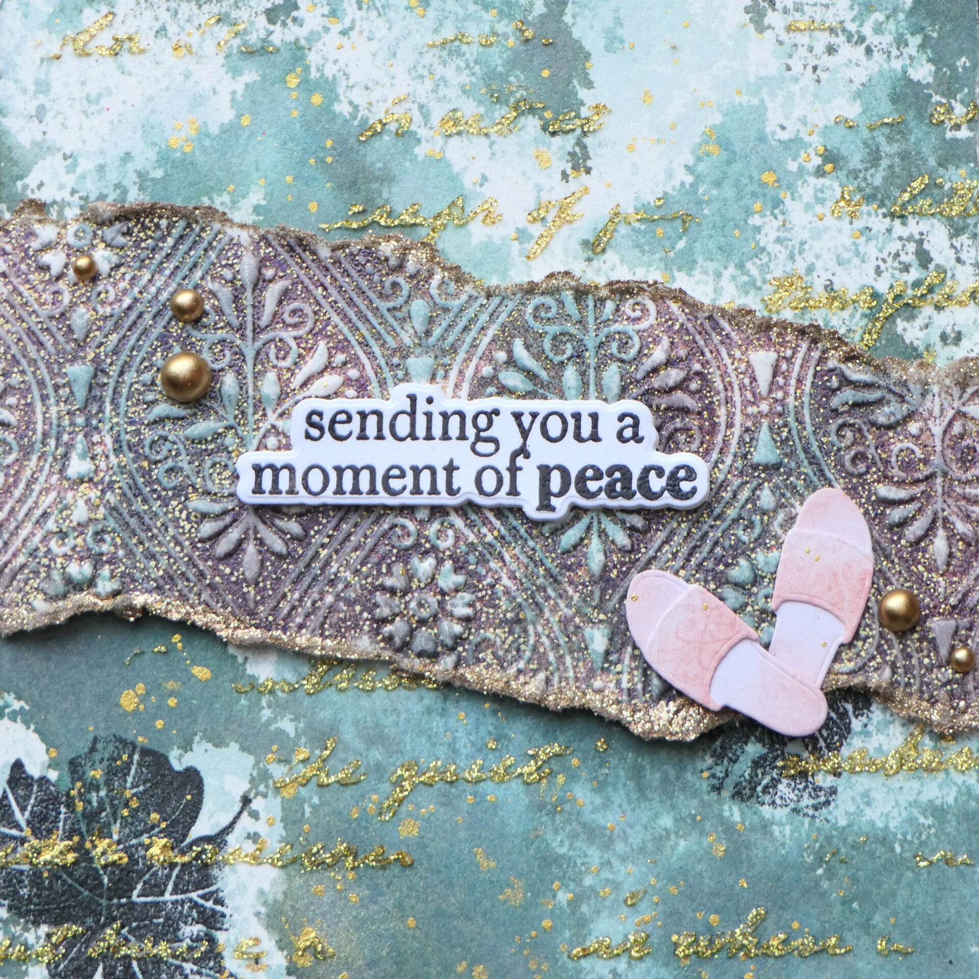
I even die cut the entire Cozy & Comfy Layering Die Set — pajama, slippers, eye mask and socks. And then I decided that was simply too much. The background was the important part of this card. I didn't want to cover it with a large focal point just because I had one available.
So I kept only the little pair of slippers.
Why slippers?
Well... I saw a rug. 😂
That little embossed strip reminded me of a textured rug, and the slippers sitting on it suddenly made sense to me. They also reinforce the sentiment, “sending you a moment of peace.”
A pair of slippers suggests exactly that feeling: getting comfortable, putting your feet up and taking a quiet moment for yourself.
And because they are small, they add a little story without taking over the background.
This card may not be the most beautiful card I have ever made.
But it is a valuable card.
It taught me to be more restrained and more intentional about what I put on a card. Instead of asking what else I could add, I had to ask what the card actually needed.
And because I used less, the elements I did use could shine more.
Final Thoughts
This class gave me much more than another heat-embossing technique.
I learned that I don't always have to use a technique in the most obvious way. Sometimes a small amount of texture, shine or dimension can have a surprisingly large impact.
I also noticed something about my own creative process.
More and more, I dare to move away from the exact theory or examples from a class and investigate what I can do with the technique myself.
I didn't want to simply repeat everything Svetlana had already shown us. I wanted to explore. To try smaller applications. To see what effect they would have.
And for me, that is growth.
I'm learning to take what someone teaches me and then make it my own.
And perhaps the biggest lesson from Card 2 is that a card doesn't always need more.
Sometimes the background has already done the hard work.
I just need to let it shine.
Used products
Card 2
- Deco Damask Pattern 3D Embossing Folder
- Craft Your Life Project Kit: Expressive Flora
- Paper Echoes Stencil
- Cozy & Comfy Layering Die Set
- Clear Embossing Powder
- Gold Glitter Relief Paste
- Coastal Mist Fresh Dye Ink
- Tranquil Reflections Fresh Dye Ink
- Satin Gold Pearl Dots
- Coffee Grounds Embossing Powder by WOW!
Affiliate Note
The links in this post are affiliate links. If you choose to shop through them, I may receive a small commission at no extra cost to you. Thank you so much for supporting my creative journey. 🤍
Some of the products used on these cards were part of the Cozy Comfort Retreat and are not currently available for purchase.
Thank you so much for visiting my blog and for following my AECP journey. I truly appreciate every visit and every comment.
With love and creative joy,
Angelique
Add comment
Comments