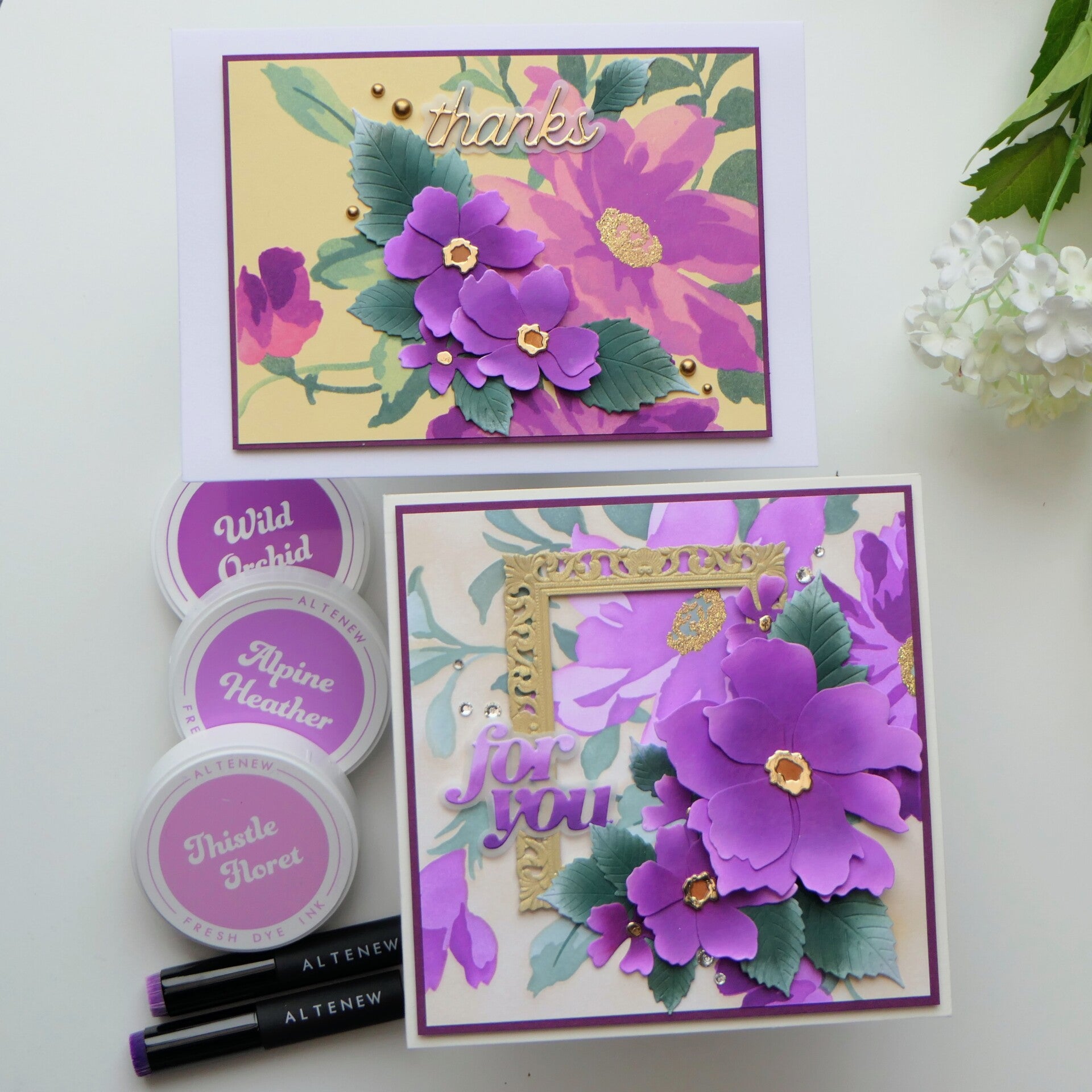
Sometimes one beautiful set is all you need to explore different ideas. For these two cards, I used the Craft Your Life Project Kit: Expressive Flora. It includes a stencil set, layering dies, an embossing folder, and stamps, but for these cards I used only the stencils and dies.
And what a beautiful floral set this is! I especially love that large flower in the stencil design.
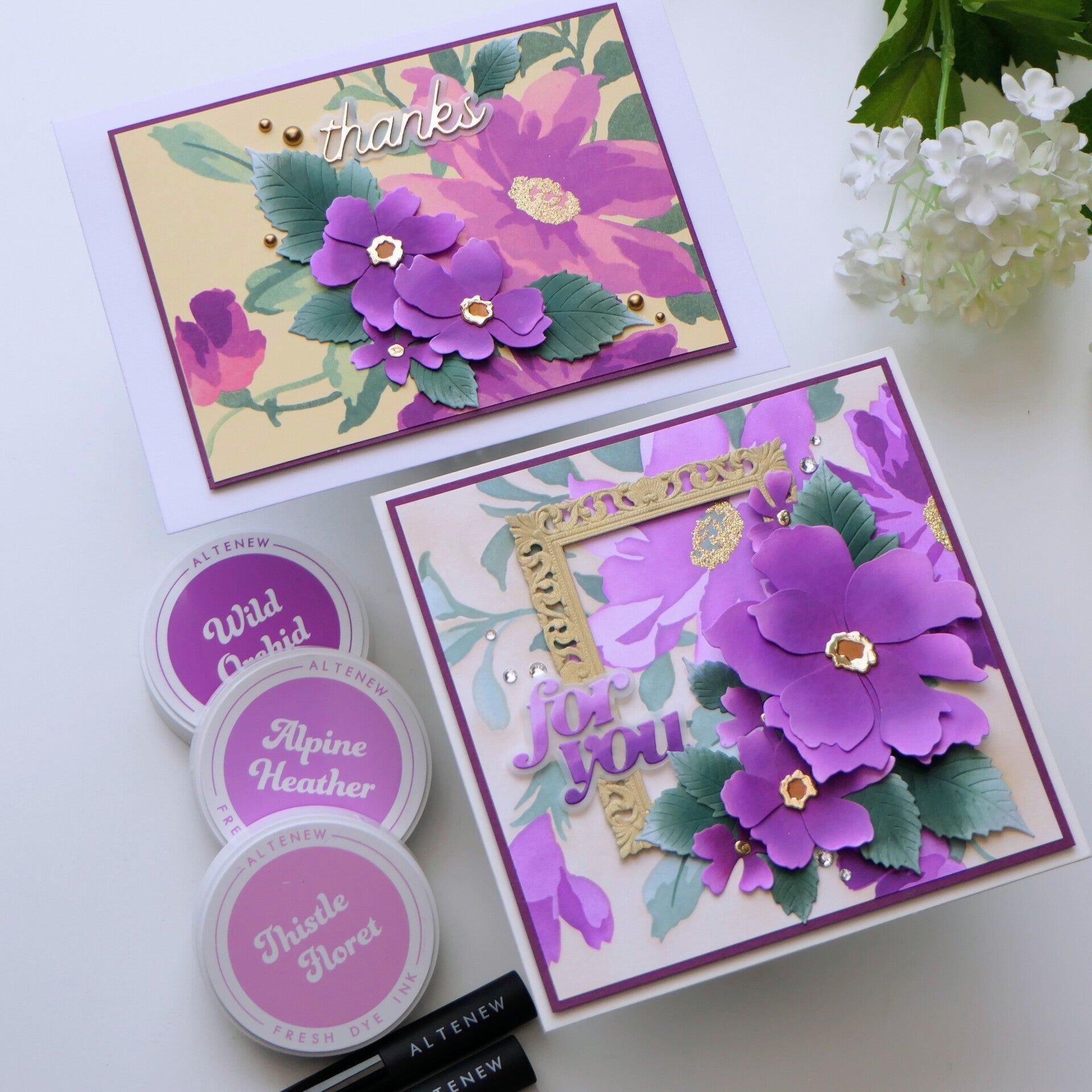
I started by creating two backgrounds with the same stencils and inks, but on different cardstock colors. One was made on white cardstock and the other on yellow cardstock. The difference was quite noticeable, even though I used the same inks. I love seeing how much the cardstock underneath can influence the final result! I also heat embossed the flower centers in gold to give them a little extra shine.
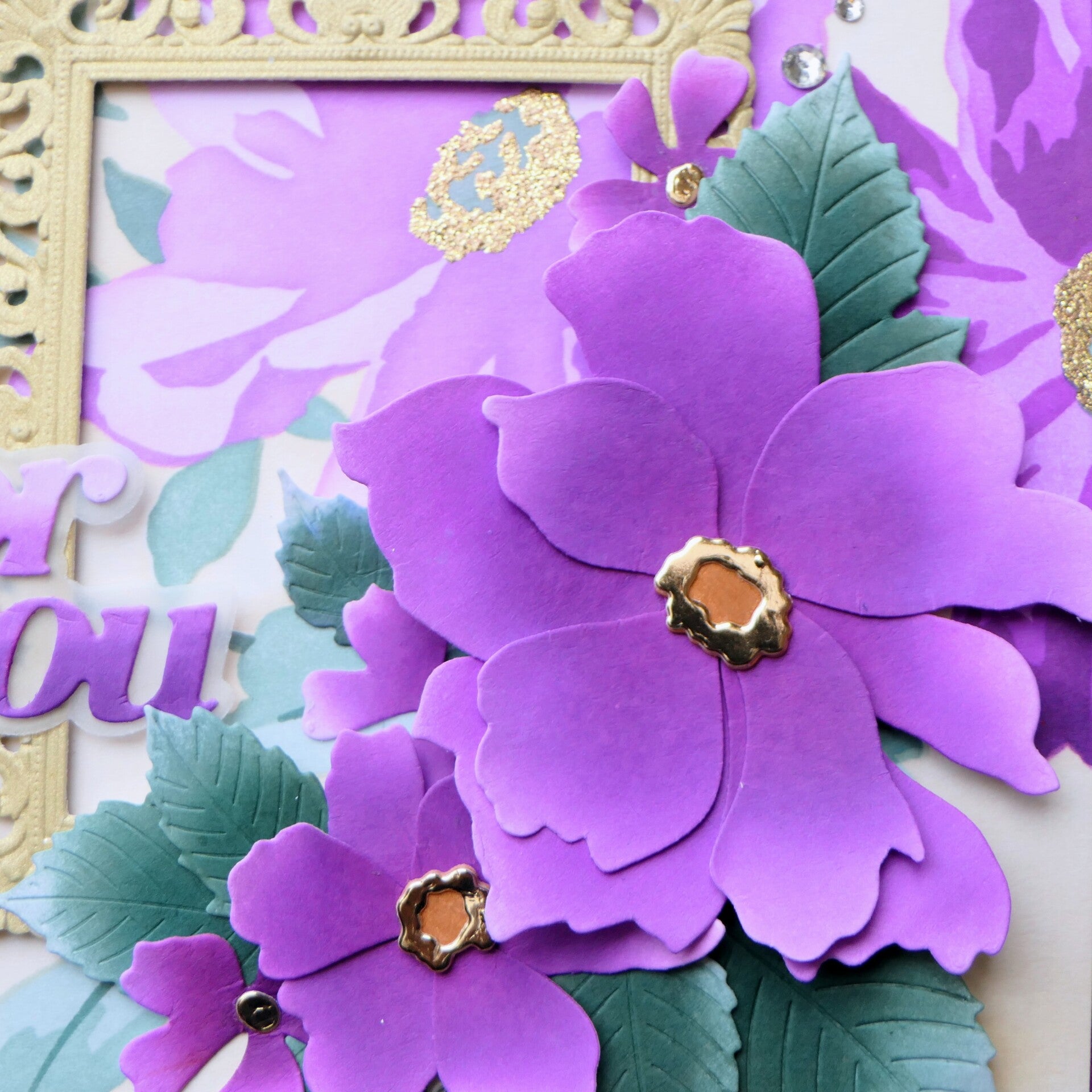
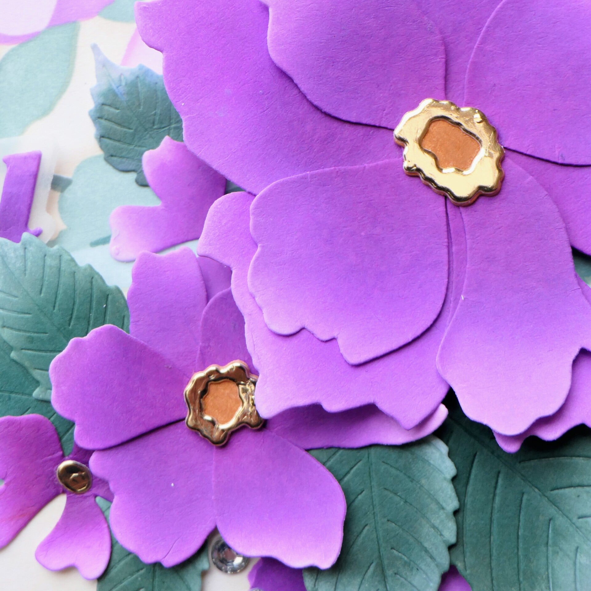
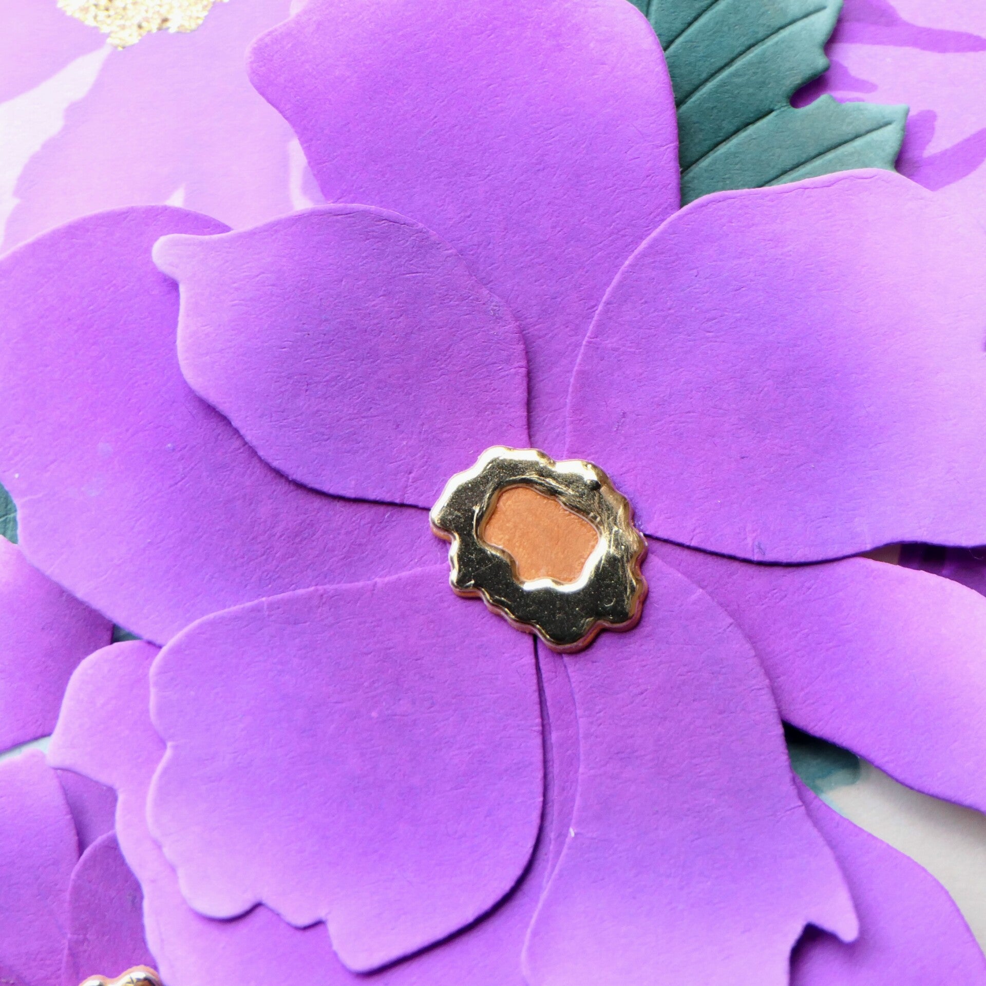
Next came the dimensional flowers. I made a whole bunch of them using the same purple shades, with gold rings around their centers. I couldn't resist adding leaves from the Grand Dahlia set, ink blended in the same green tones as the stenciled leaves. The flowers really needed those leaves to complete the arrangement.
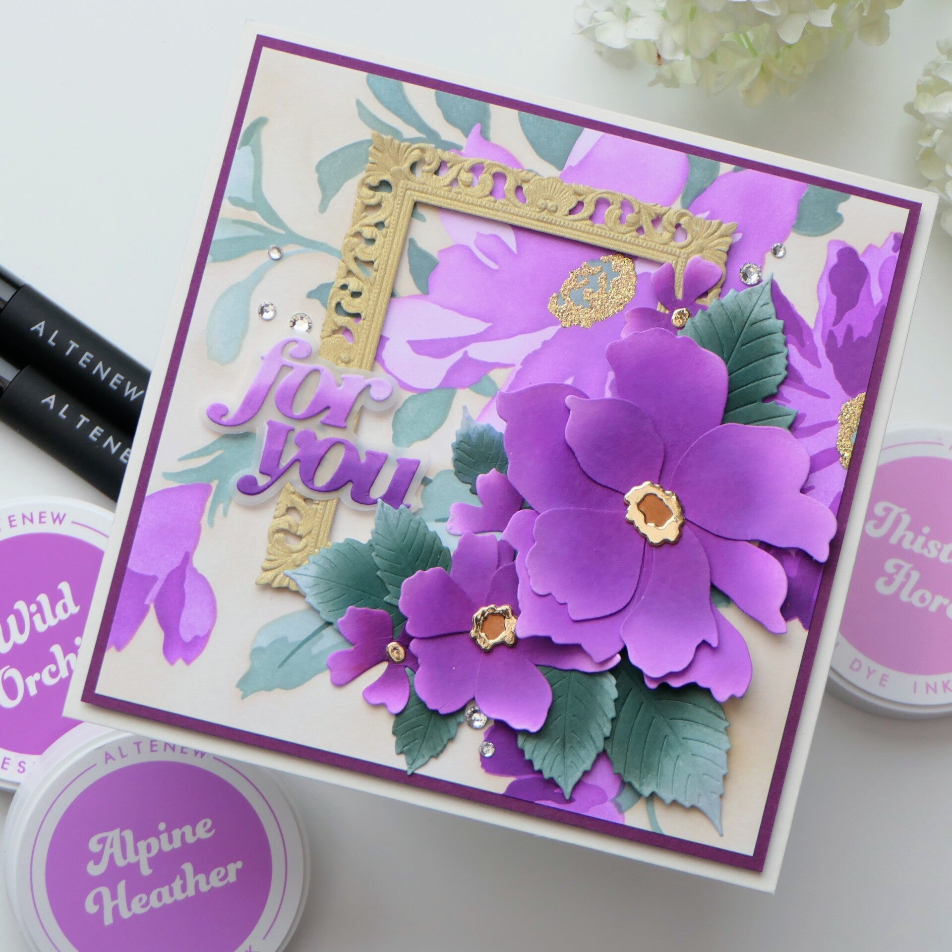
Card 1 — A Fuller Floral Design
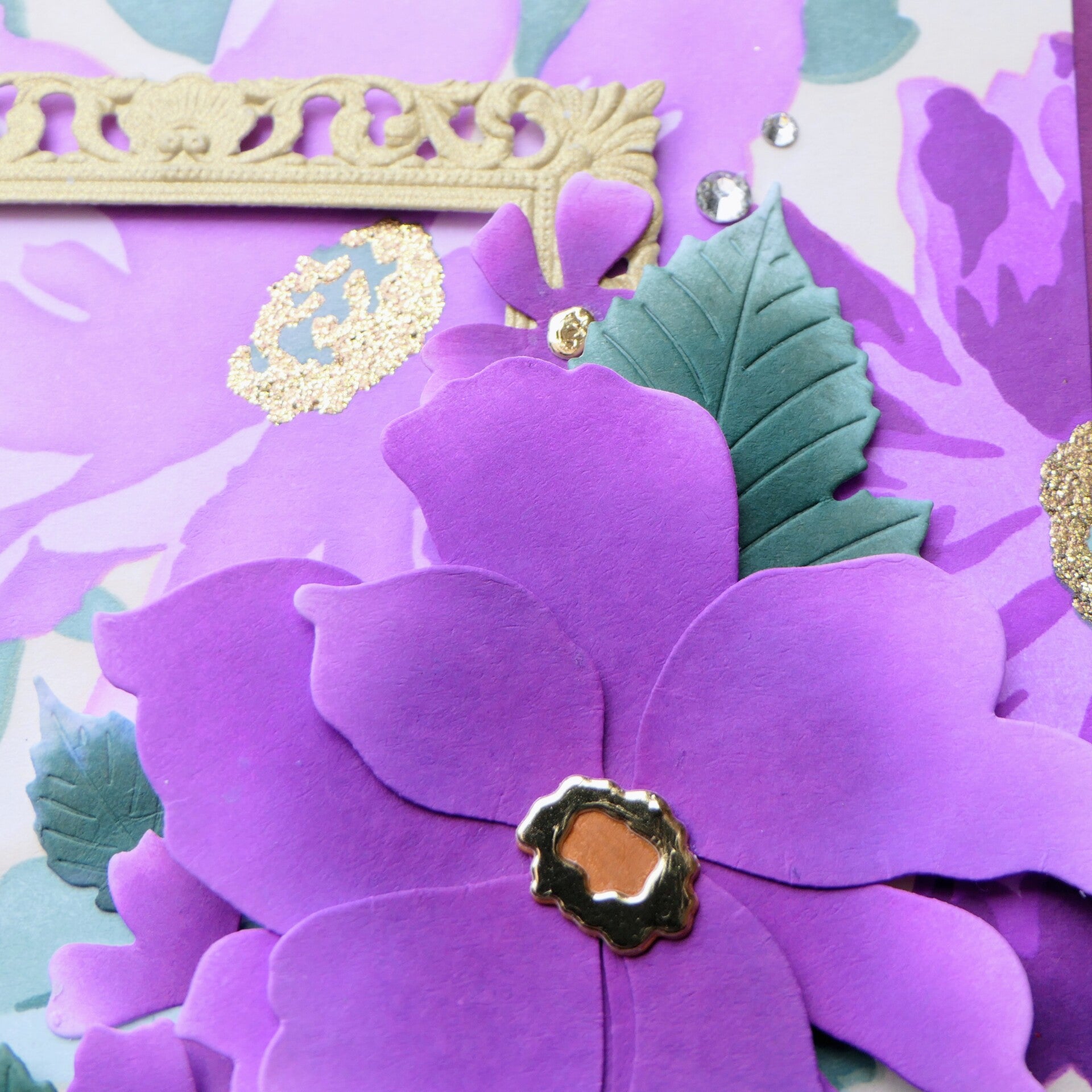
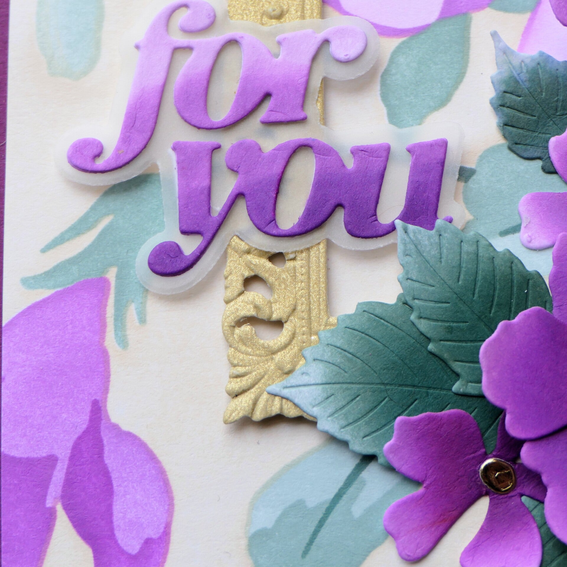
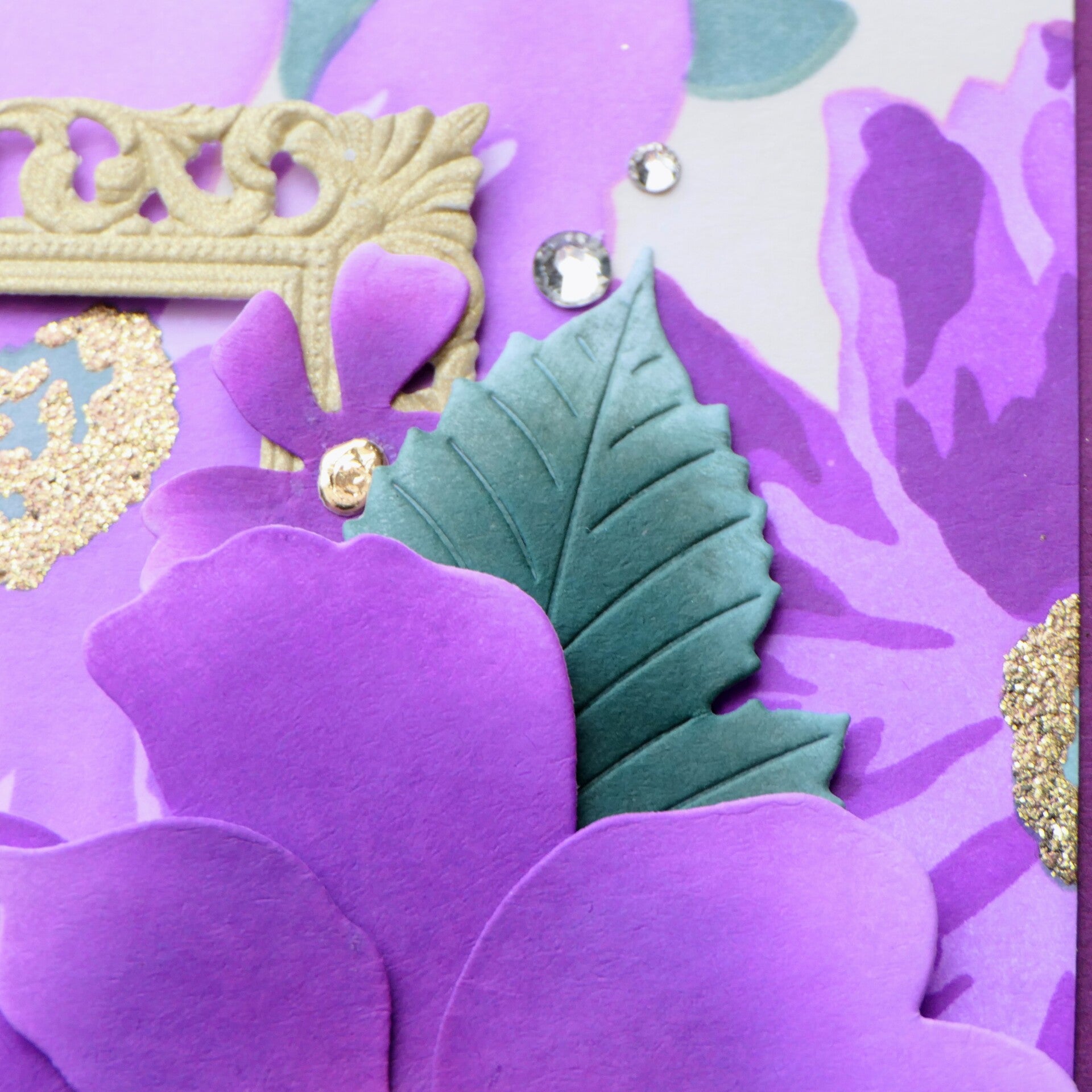
I started with the background on white cardstock and chose a square card for this design. I matted the background with dark purple and added a frame die-cut from gold pearl cardstock. I wanted some extra dimension and a little touch of gold, but without a shine that would compete with the flowers.
Then I built the arrangement with the layered flowers and leaves. The dimensional flowers overlap the large stenciled bloom, creating depth and making the design feel almost like a floral painting coming to life. I finished it with a sentiment on a vellum shadow and a few Clear Sparkle Dots.

Card 2 — Letting the Background Breathe
For the second card, I used the background made on yellow cardstock and chose a regular A7 card instead of a square one. This time I wanted to keep the design more open, so I used fewer flowers. They add a lovely pop of purple against the softer background without covering too much of the stenciled design.
A purple mat ties the card in with the first one, while the gold sentiment on vellum and a few Satin Gold Pearl Dots finish this card off.


I love how these two cards use the same set, colors, and basic ingredients, yet have such a different feel. One is fuller and more dimensional, while the other gives the background more room to shine.
And that was exactly what I wanted to explore: how much can the cardstock color, card shape, and placement of a few flowers change the result?
Now I'm curious: which one is your favorite — the fuller square card or the more open A7 design?
Used Products
Used on both cards:
- Craft Your Life Project Kit: Expressive Flora (stencils and layering dies)
- Grand Dahlia Layering Die Set (leaves)
- Warm & Cozy Sentiments
- Highland Flora Fresh Dye Inks
- Coastal Mist Fresh Dye Ink
- Shattered Shell Fresh Dye Ink
- Melted Butterscotch Fresh Dye Ink
Additional products:
- Crystal Clear Gem Sparkles — square card
- Satin Gold Pearl Dots — A7 card
Affiliate Note
The links in this post are affiliate links. If you choose to shop through them, I may receive a small commission at no extra cost to you. Thank you so much for supporting my creative journey. 🤍
Thank you so much for visiting my blog and for following my crafting journey. I truly appreciate every visit and every comment.
With love and creative joy,
Angelique
Add comment
Comments