Hello crafty friends,
Today I’m sharing a card I made for a monochromatic challenge. This was a particularly fun challenge for me because working with only one color family is something I rarely do.
At first, limiting myself to a single color felt a little restrictive. But as I started creating, I discovered how much variation you can achieve by simply using different shades and depths of the same color.
What I Learned
One of the things I enjoy most about challenges is that they encourage me to step outside my usual habits.
Normally I combine several colors and often build my card around those color combinations. This challenge asked me to approach cardmaking differently. Instead of relying on multiple colors for interest, I had to create contrast through light, dark, texture, shape, and layering.
It reminded me that a limited color palette doesn't have to feel limited at all.
My Card
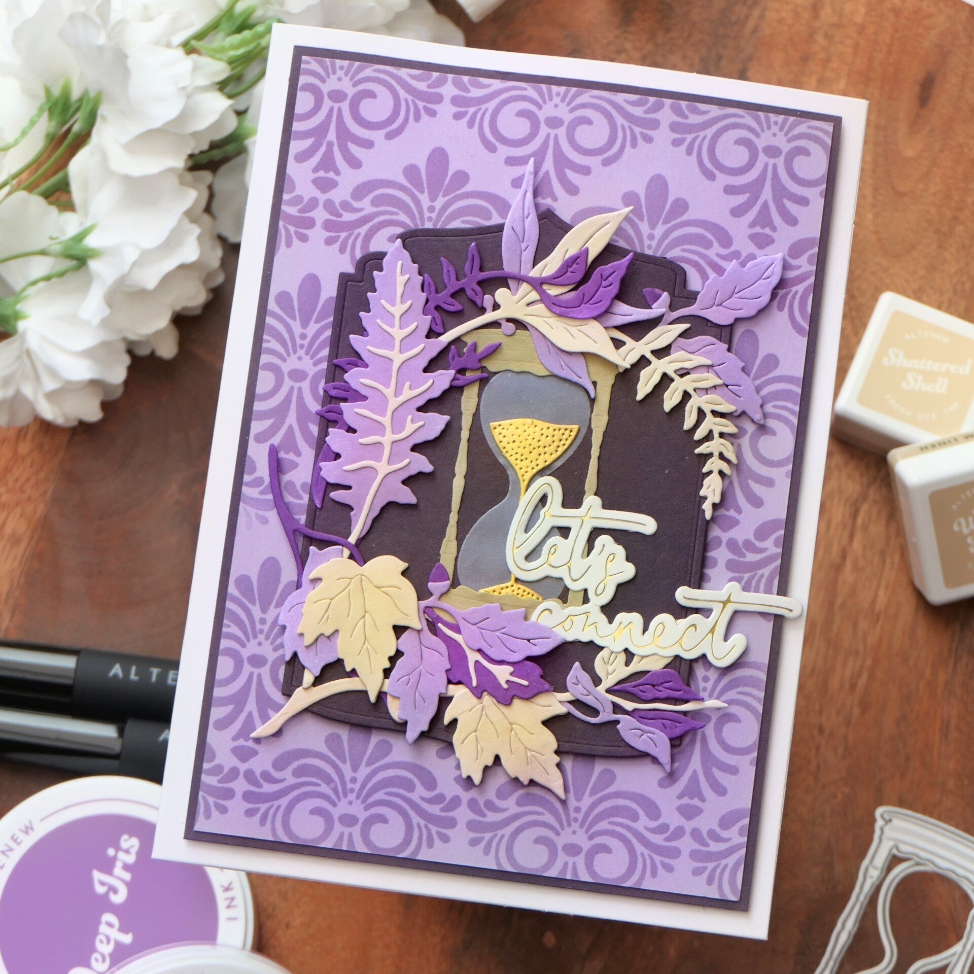
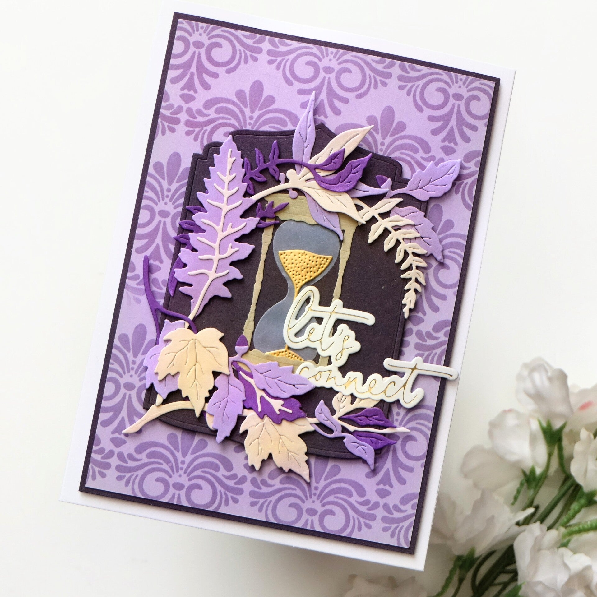
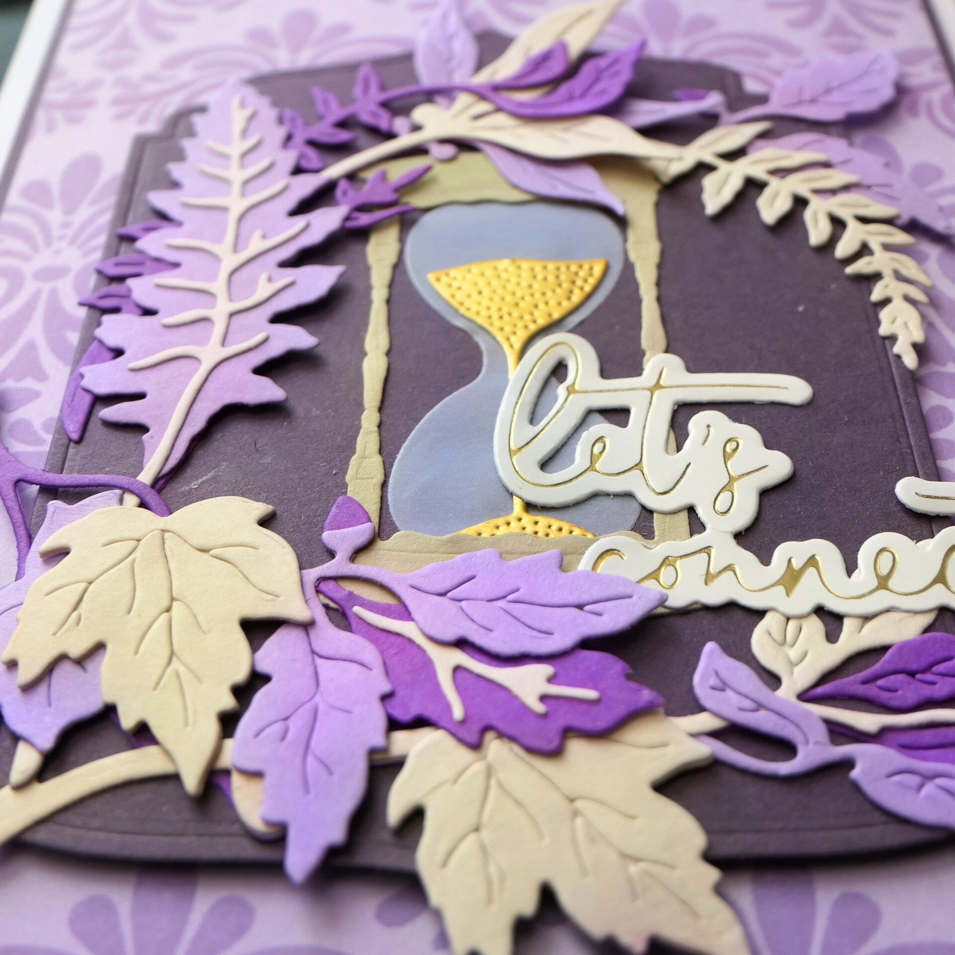
For this card, I chose purple as my main color. Purple often makes me think of positivity, creativity, community, and connection. Those ideas became the starting point for my design.
I created a patterned background using the Vintage Motifs Stencil and several shades of purple ink. To make sure the focal point remained visible, I added a dark plum mat layer behind the arrangement. This creates separation from the background and helps guide the eye toward the center of the card.
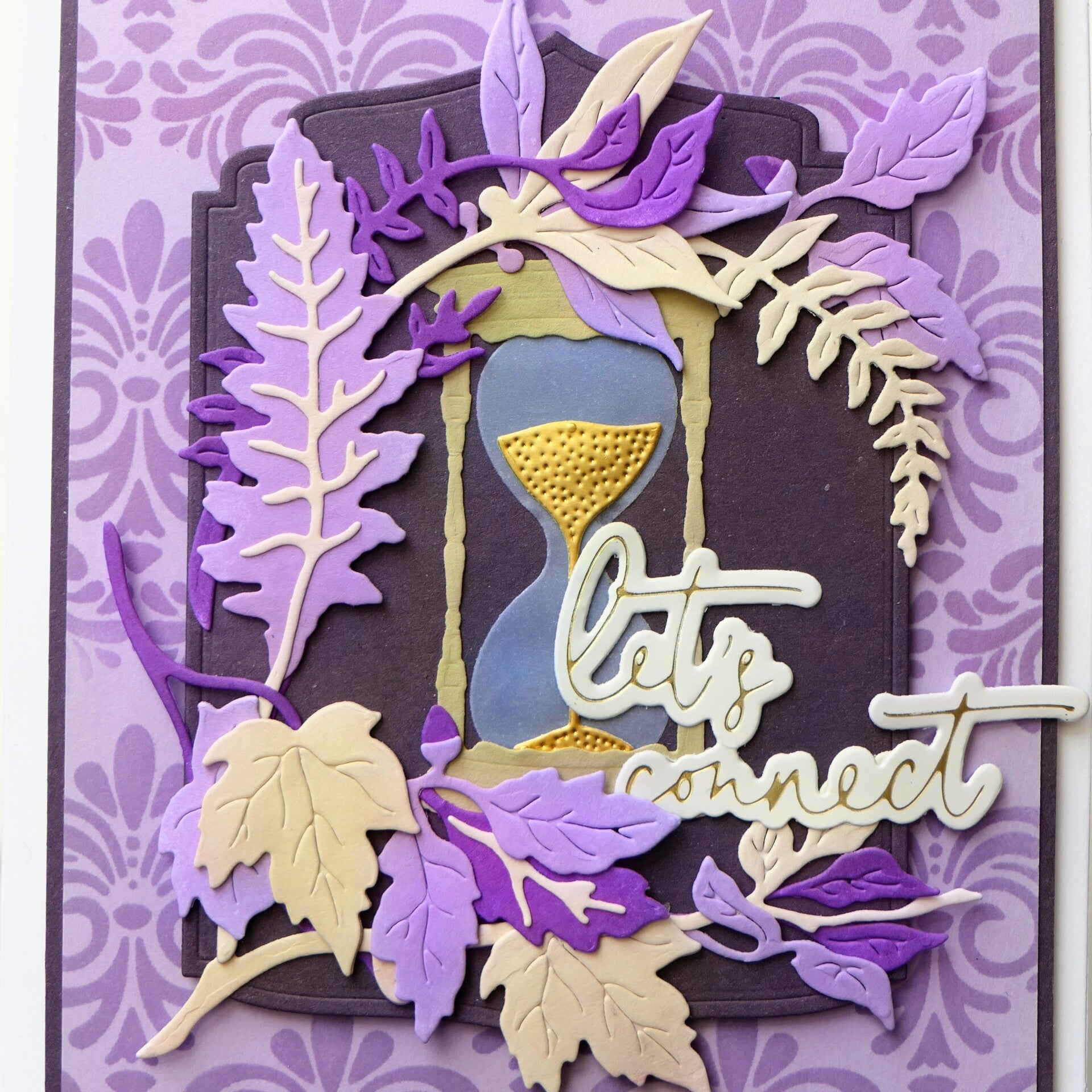
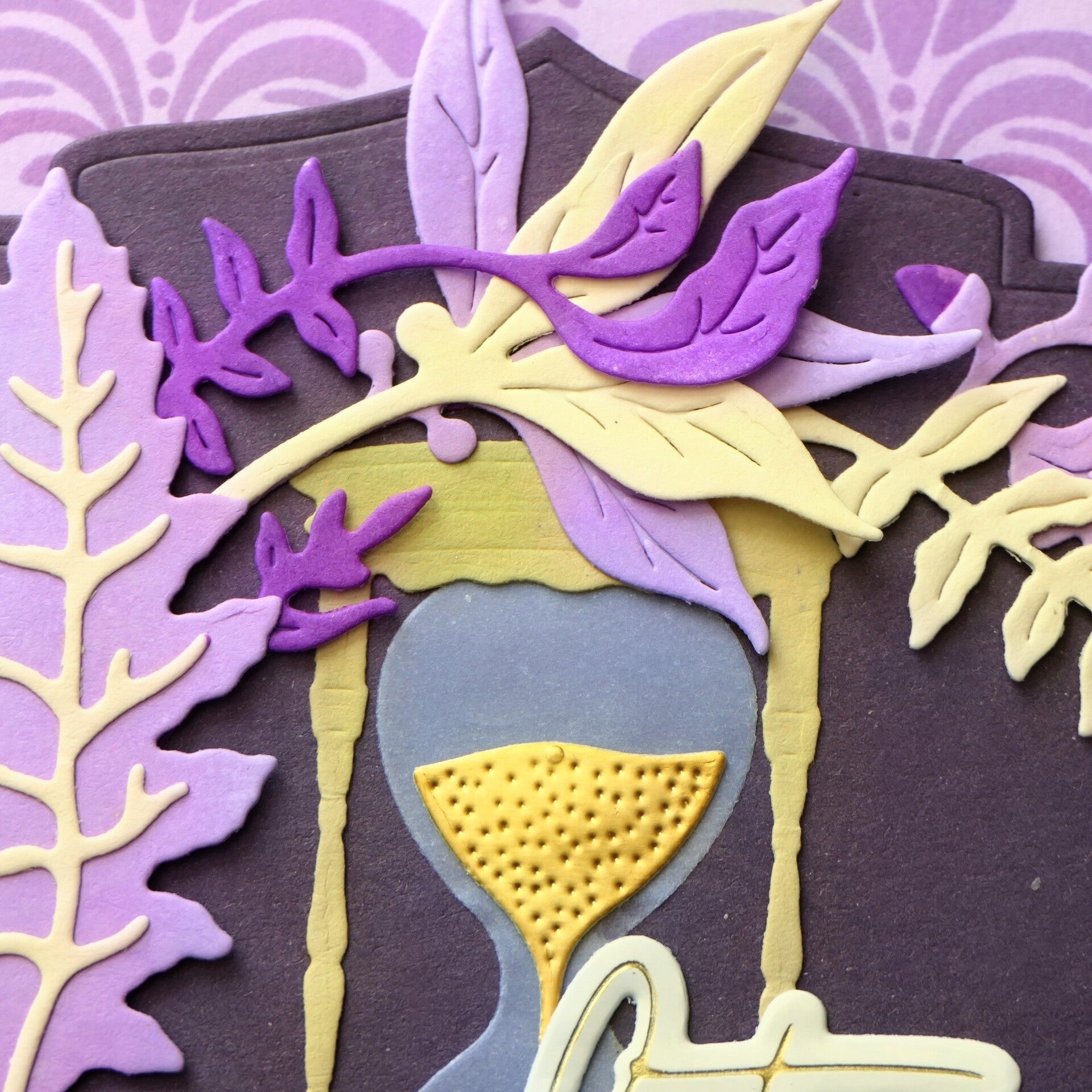
The layered leaves from the Creative Cuts EZ Arrangement Antique Leaves set create movement around the focal point, while the hourglass from the Timeless Sands Layering Die Set symbolizes time and connection.
That is also why I chose the sentiment “Let's Connect.” Together with the hourglass, it became a reminder that making time for one another is important.
Although the challenge allowed neutral colors and metallic accents, I used them sparingly. The soft cream leaves and touches of gold help break up the purple palette and give the eye places to rest without taking attention away from the overall monochromatic look.
I intentionally left off embellishments. With the detailed stencil pattern and layered die cuts already providing plenty of interest, additional embellishments felt unnecessary.
Reflection
This challenge reminded me that creativity often grows when we work within limitations.
By restricting myself to one color family, I found myself paying much more attention to contrast, layering, and composition. What started as a challenge became a very enjoyable creative exercise.
And perhaps that is exactly why challenges are so valuable. They encourage us to try something we might not choose on our own and often teach us something new along the way.
Altenew Products Used
- Creative Cuts EZ Arrangement Antique Leaves
- Vintage Motifs Stencil
- Ornate Nesting Die Set
- Timeless Sands Layering Die Set
- Shades of Purple Fresh Dye Ink
- Earth Tones Fresh Dye Ink Mini Cube Set
- Brushed Gold Metallic Cardstock (10 sheets/set)
Affiliate Note
The links in this post are affiliate links. If you choose to shop through them, I may receive a small commission at no extra cost to you. Thank you so much for supporting my creative journey. 🤍
Thank you so much for visiting my blog. I truly appreciate every visit and every comment.
With love and creative joy,
Angelique
Add comment
Comments