Hello crafty friends,
Today I'd like to share the next class in my AECP journey: Polychromatic Cardmaking, taught by the talented Nina Marie Trapani.
Color has always been one of my favorite design elements, so I was really looking forward to this class. Nina covered many different approaches to working with color, from monochromatic and pastel combinations to no-line coloring and watercolor techniques.
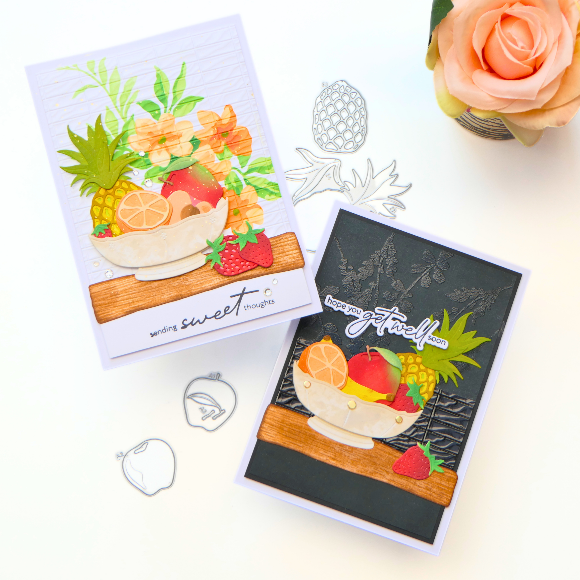
For my assignment, however, one lesson immediately caught my attention: creating a pop of color against a neutral/ white background. I decided to explore that idea a little further by creating not one, but two cards. One on a white background, just as shown in the lesson, and one on a black background to see how the same colorful images would behave in a completely different setting.
What I Learned
One thing I really enjoyed in this class was discovering that polychromatic doesn't simply mean using many colors. It is about making intentional color choices.
The lesson showed how bright colors become even stronger when they are surrounded by a calm, neutral background. That inspired me to experiment with exactly the same colorful fruit images on both white and black cardstock.
Although the focal images stayed almost the same, the feeling of each card changed completely.
It reminded me once again that color isn't just decoration—it is one of the strongest design tools we have.
My Cards
Card 1
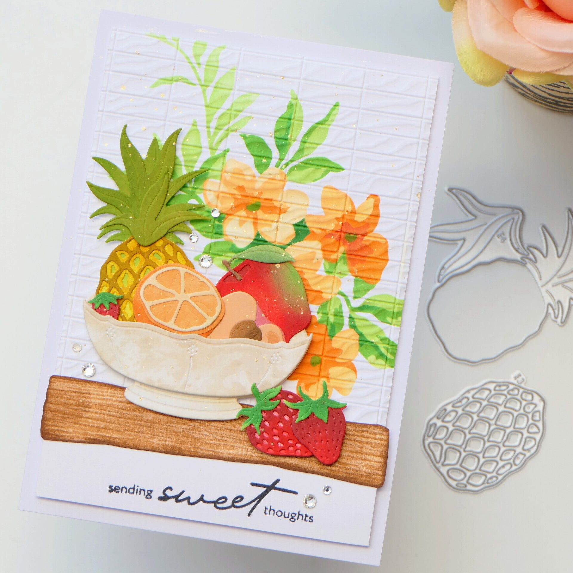
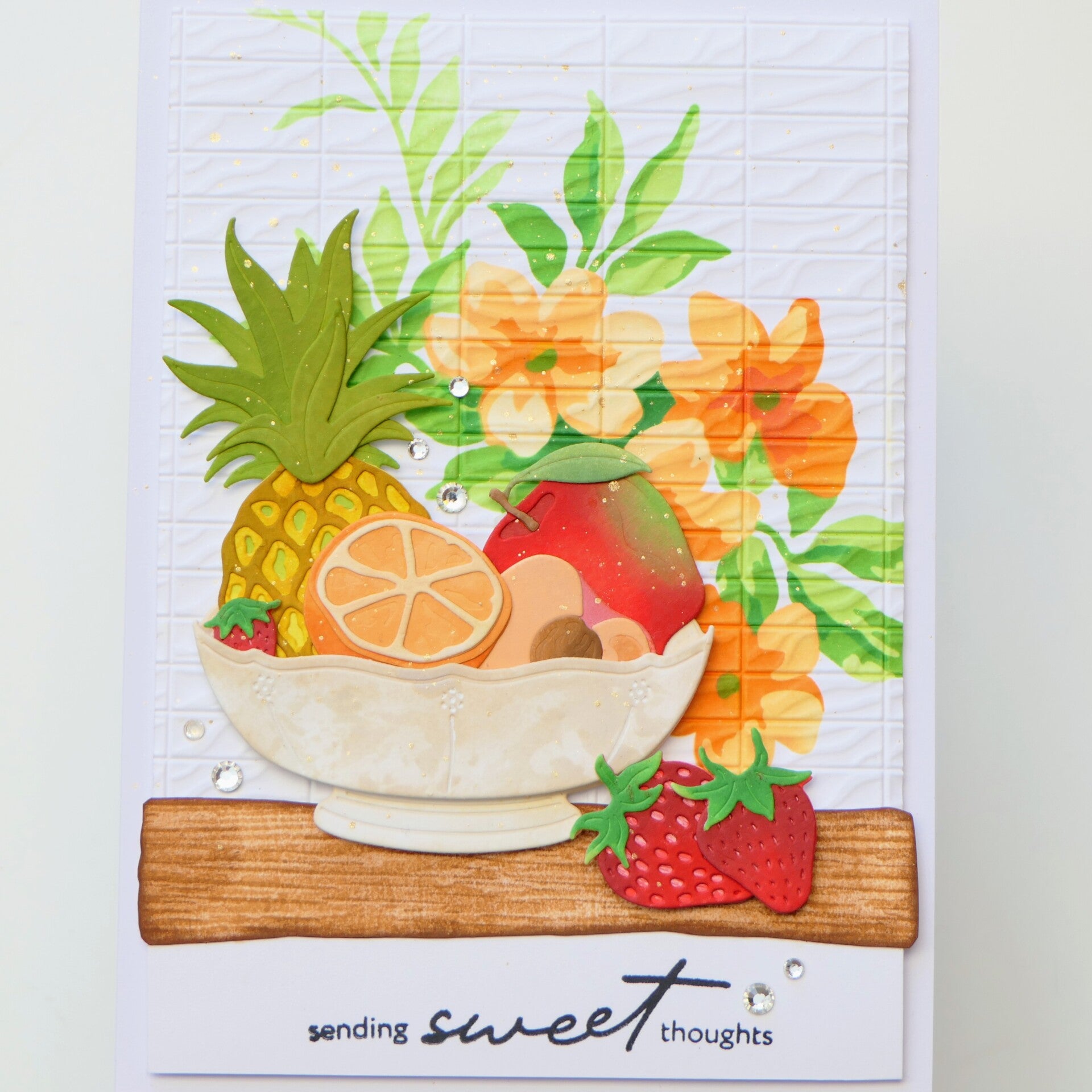
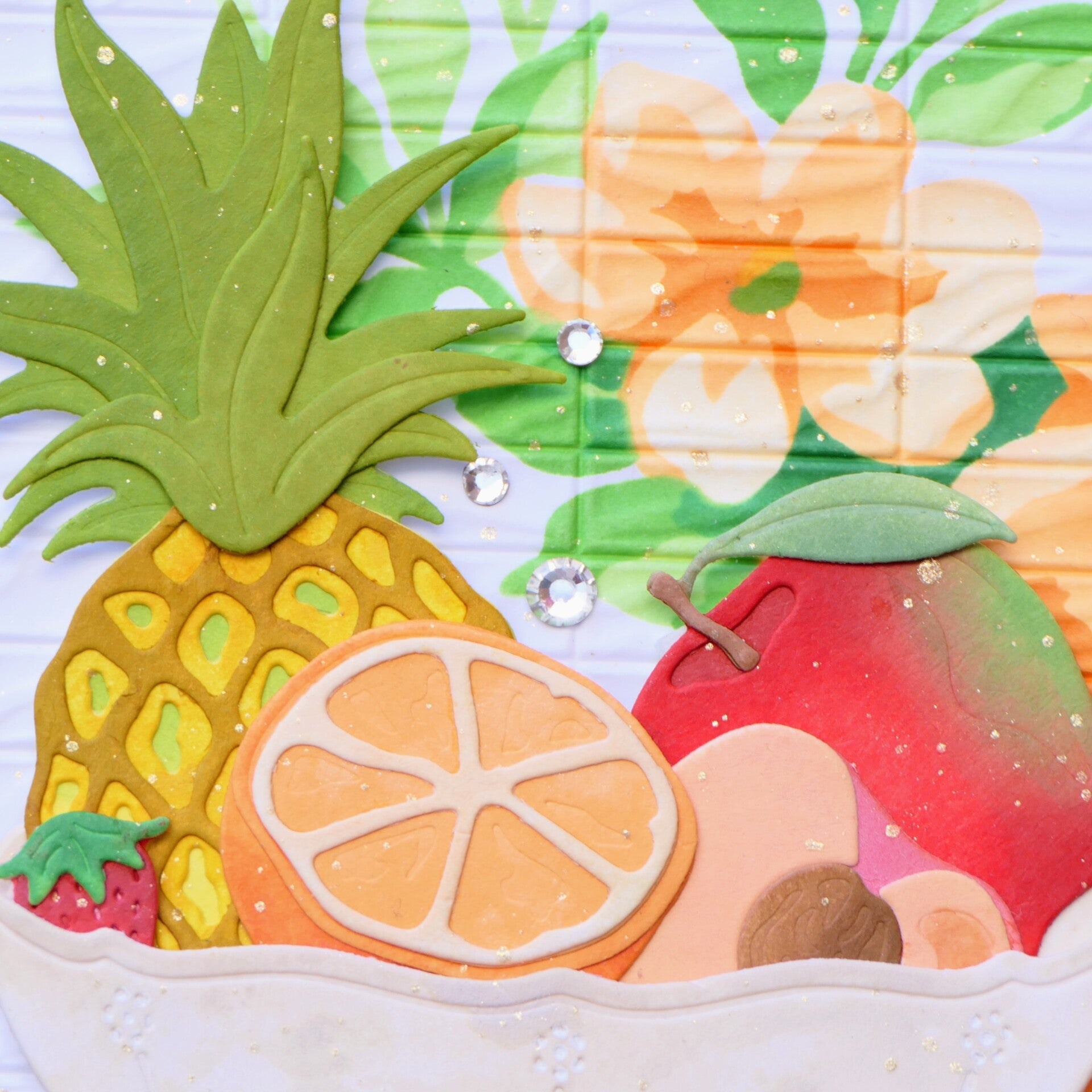
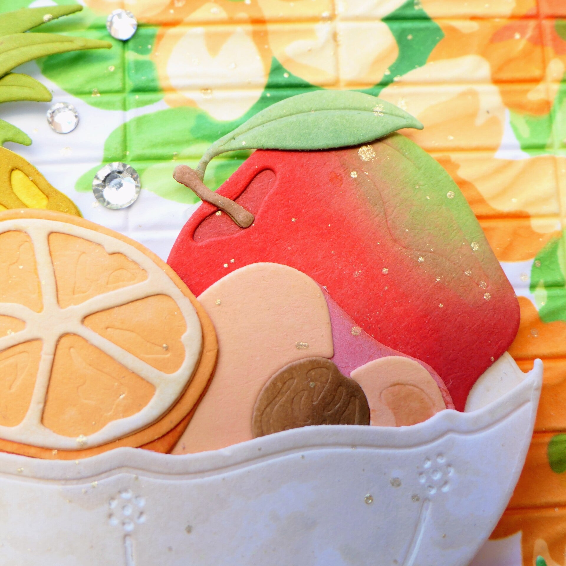
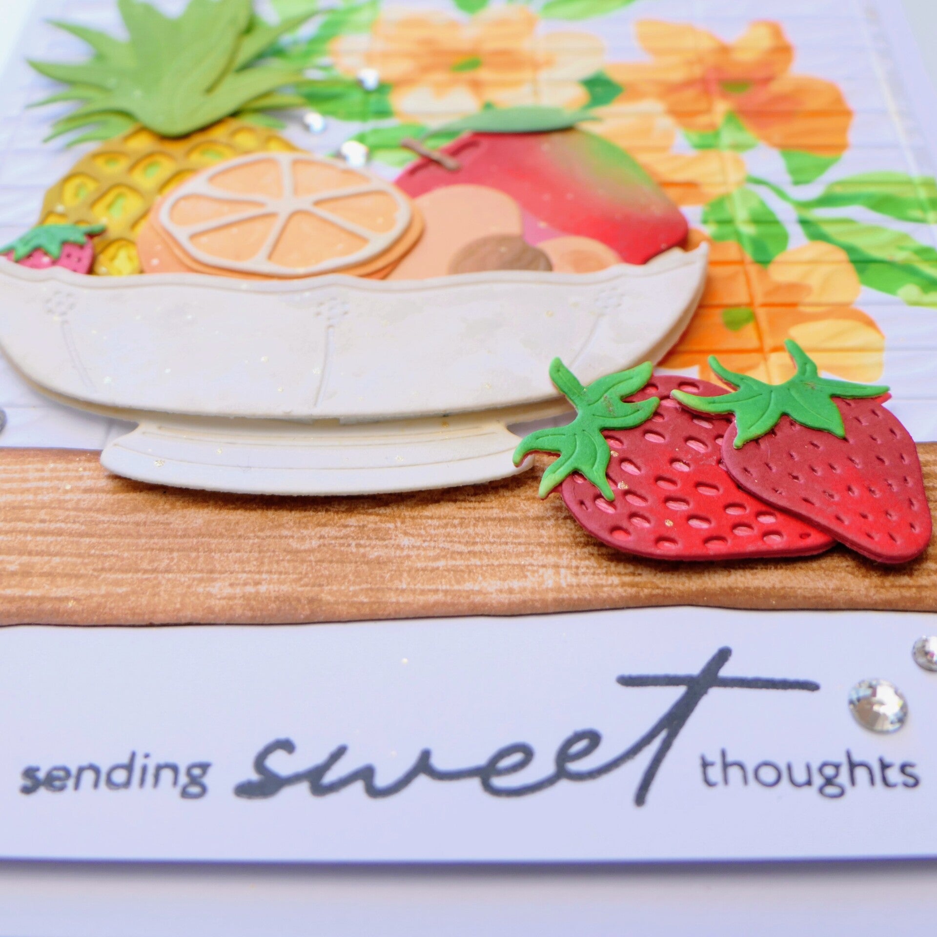
For my first card, I stayed close to the lesson by using a crisp white background.
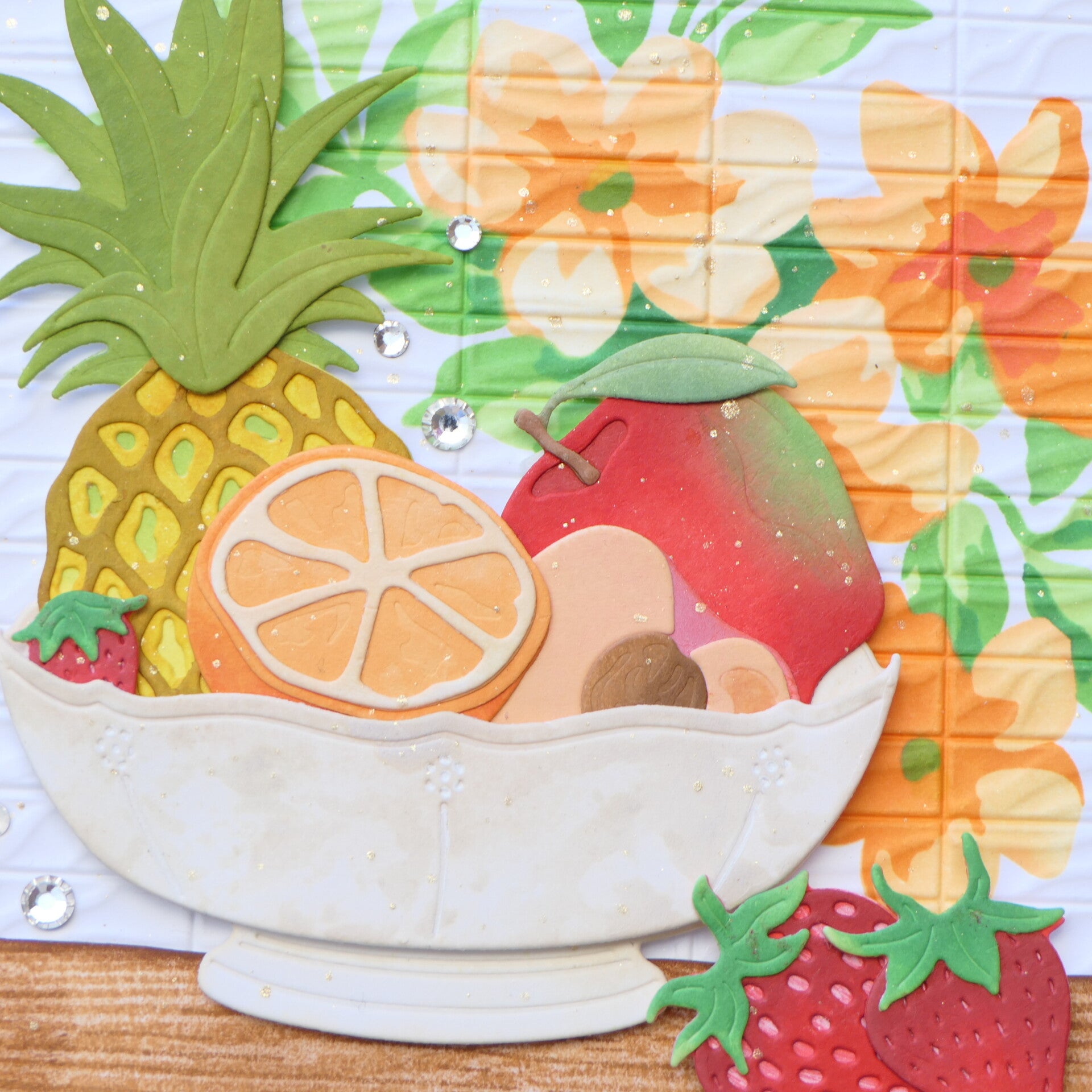
To add subtle interest without competing with the colorful fruit, I created a flower pattern in orange tints with the stencil set from the kit and then embossed it using the embossing folder from the kit that resembles kitchen tiles. The added texture softens the background a bit while keeping the focus exactly where I wanted it: on the fruit.
The bright colors immediately become the stars of this card, while the white background allows every piece of fruit to stand out. The wooden shelf grounds the composition and reinforces the fresh, cheerful feeling I wanted to create.
Card 2
After finishing the first card, I became curious.
What would happen if I kept the colorful fruit but changed only the background?
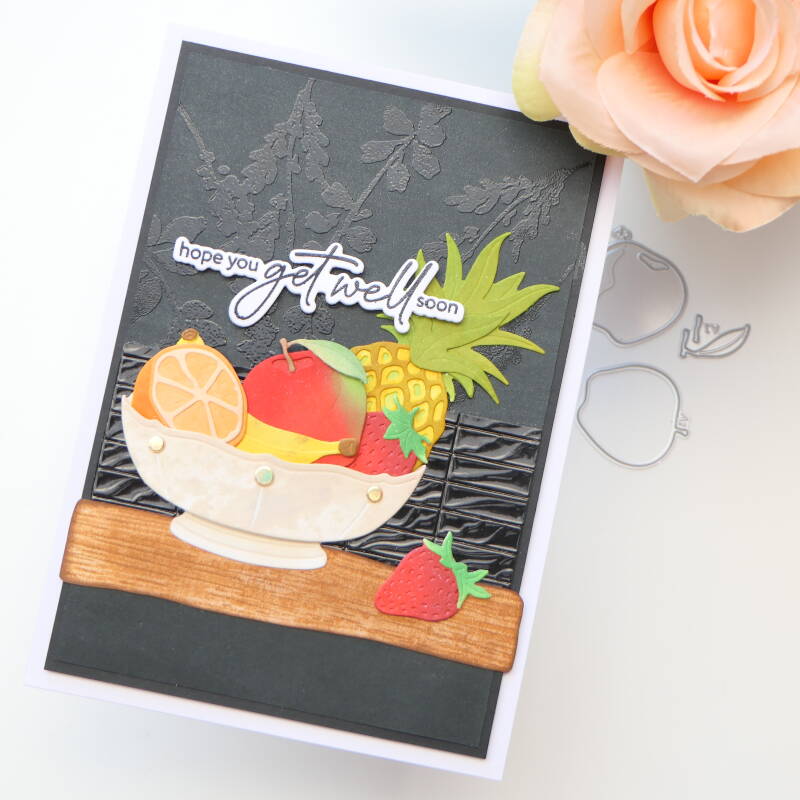
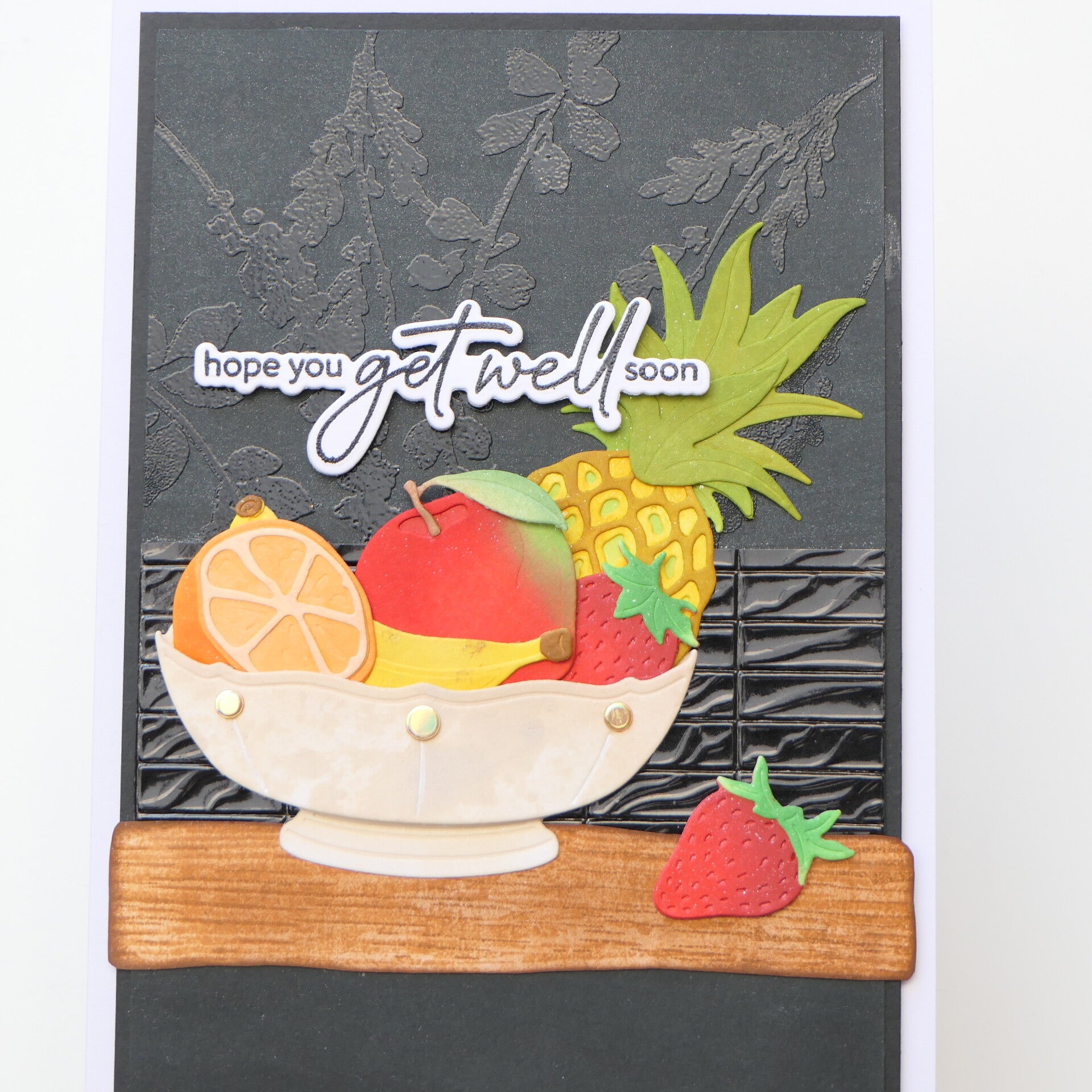
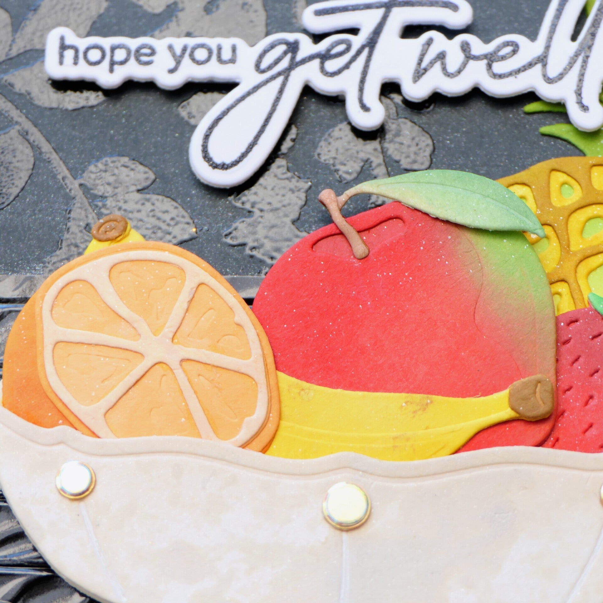
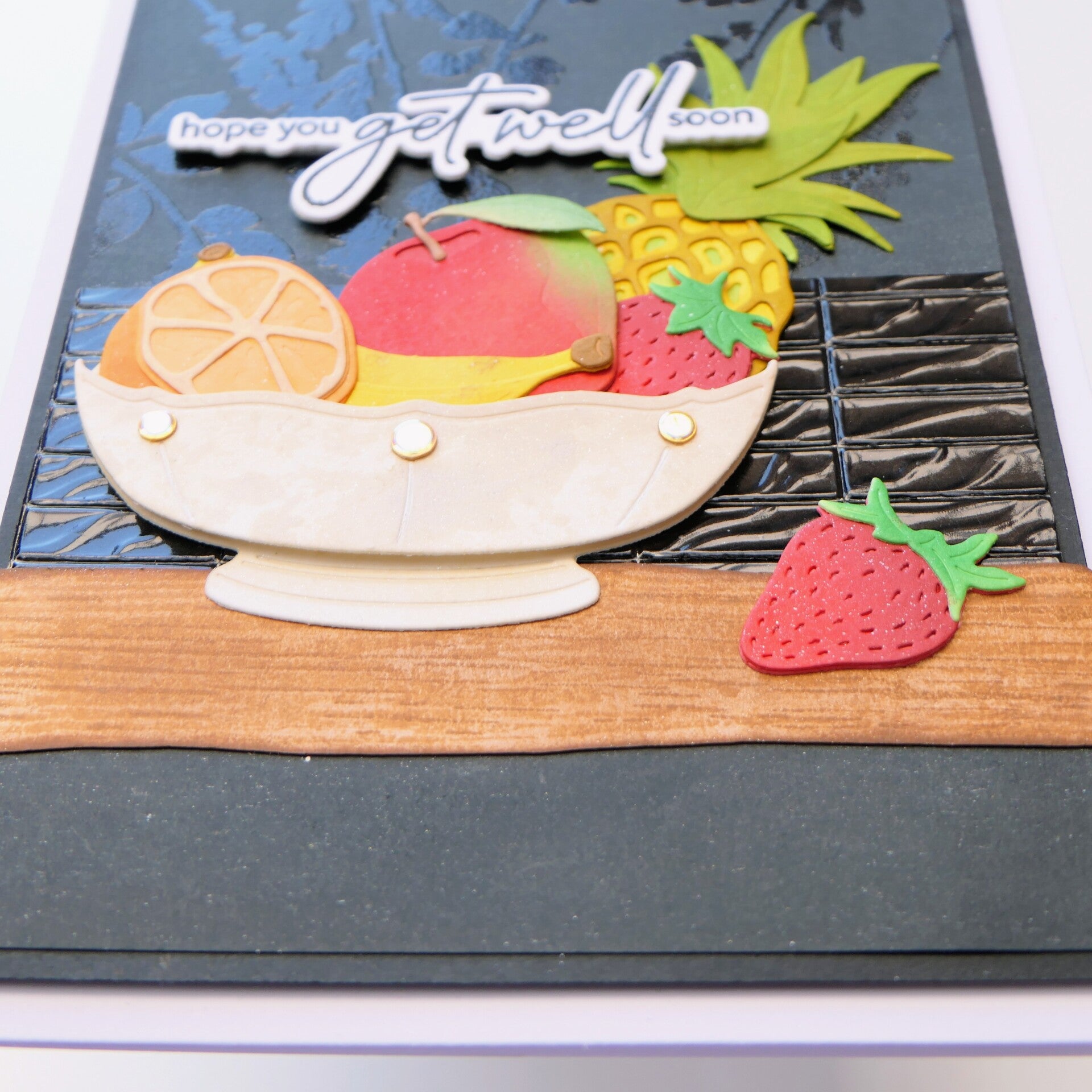
For this second card, I used black card stock with subtle heat-embossed stamped images in the background. I also embossed the black mirror card stock with the same kitchen tile embossing folder to create a connection between both designs.
The result surprised me.
Although the fruit is almost identical, the black background completely changes the atmosphere. Instead of feeling fresh and airy, the card becomes richer and more elegant. It was fascinating to see how changing only one design element could completely transform the feeling of the card.


Final Thoughts
This class reminded me that color isn't only something beautiful to look at—it tells part of the story.
Sometimes we don't need to add more techniques or more embellishments. Sometimes the strongest design choice is simply allowing the colors to do the talking.
Creating these two cards side by side made that lesson very clear for me. It was a simple experiment, but one that taught me a lot about how background choices influence the mood of a card.
That is exactly why I decided to make two cards instead of one. I wanted to understand the lesson, not just recreate it.
Used Products
- Craft Your Life Project Kit: Fruits and Flowers
- Strawberry Patch Layering Die Set
- Craft Your Life Project Kit: Honeycomb Haven (sentiment, Card 2)
- Earth Tones Fresh Dye Ink
- Pocketful of Sunshine Fresh Dye Ink
- Sun Kissed Delight Fresh Dye Ink
- Green Valley Fresh Dye Ink
- Delectable Delights Fresh Dye Ink
- Velvet Fresh Dye Ink
- Burnt Red Fresh Dye Ink
- Cotton Candy Fresh Dye Ink
- Dazzling Diamond Stellar Sequins
Affiliate Note
The links in this post are affiliate links. If you choose to shop through them, I may receive a small commission at no extra cost to you. Thank you so much for supporting my creative journey. 🤍
Thank you so much for visiting my blog and for following my AECP journey. I truly appreciate every visit and every comment.
With love and creative joy,
Angelique
Add comment
Comments
What a dramatic difference the background makes! I love the tile affect on the black. Beautiful still-life art.
Thank you so much for your sweet comment, Pam. I really appreciate it. ❤️ the difference in background really surprised me.