Hello, my crafty friends,
For my seventh class in Level 2 of the Altenew Educator Certification Program (AECP), I had the pleasure of learning from the very talented Therese Calvird in her class, Color Your Day.
This class was all about color: where we can find inspiration, how much color to use, how different colors work together, and how we can use different mediums to create different looks.
Therese also introduced the 70–20–10 color rule, where one color takes the main role, a second color supports it, and a third color is used as an accent.
What I particularly enjoyed about this class was that there wasn't one "correct" way to use color. We could work from a color wheel, take inspiration from a photograph, experiment with different mediums, and most importantly, learn how to make those colors work for our own project.
And, of course, I made two cards. Because apparently one card is no longer enough for me. 😂
Card 1 – Working with the Color Wheel
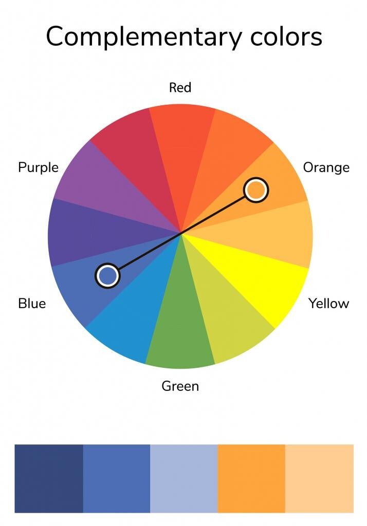
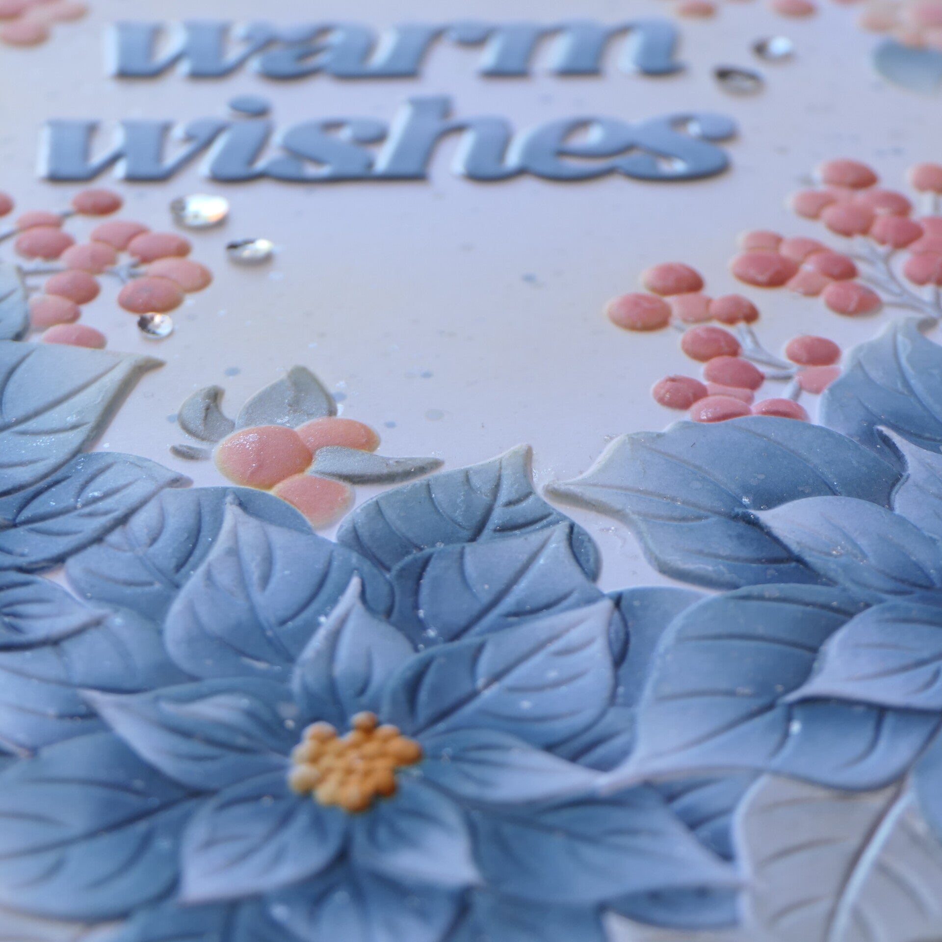
For my first card, I wanted to work directly with the color wheel and use the 70–20–10 rule.
I chose two complementary colors: blue and orange.
The blue became my dominant color. For the secondary color, instead of using a strong orange, I created a softer orange by combining Buttercream and Pink Diamond.
This was a deliberate choice.
The blue I used is slightly muted, and I felt that a bright orange would be too harsh next to it. By creating my own softer orange, I could keep the color combination harmonious while still using complementary colors.
The result is a combination I really love.
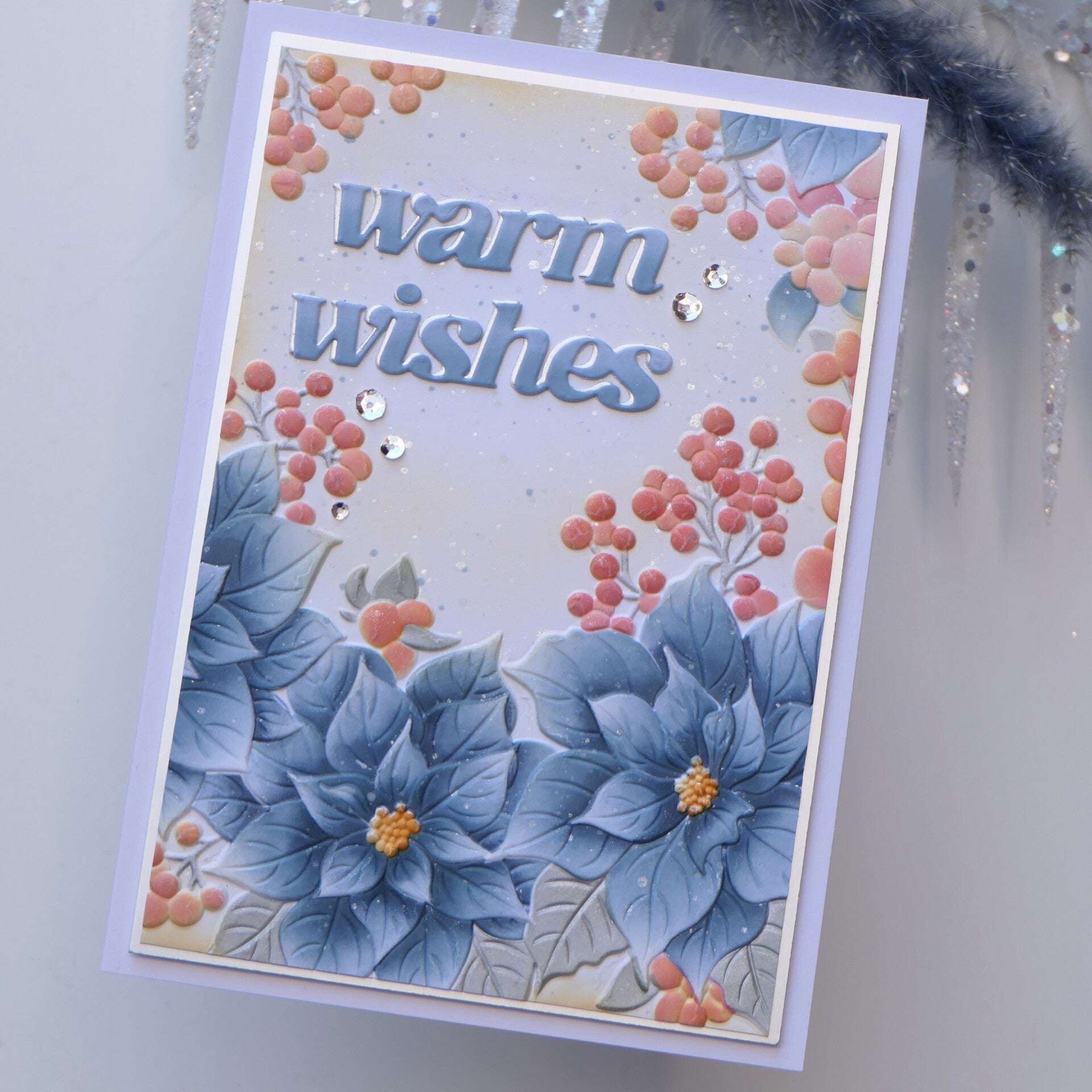
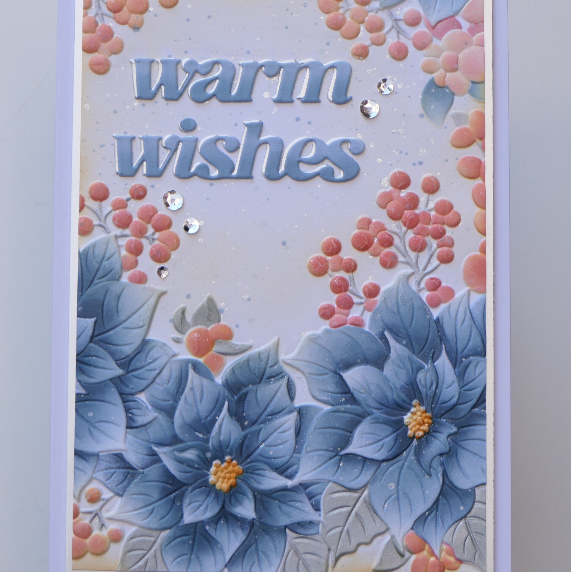
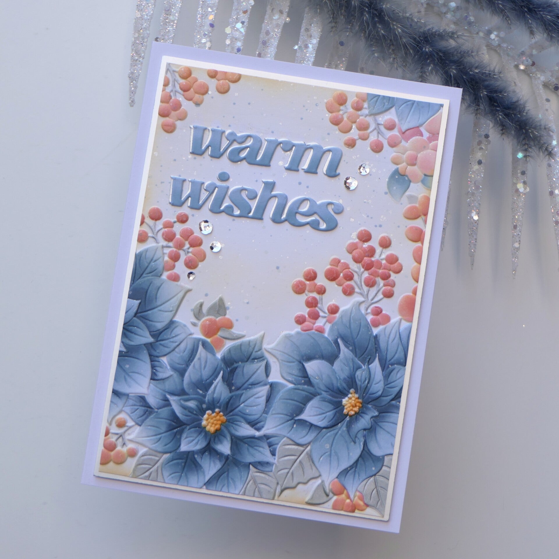
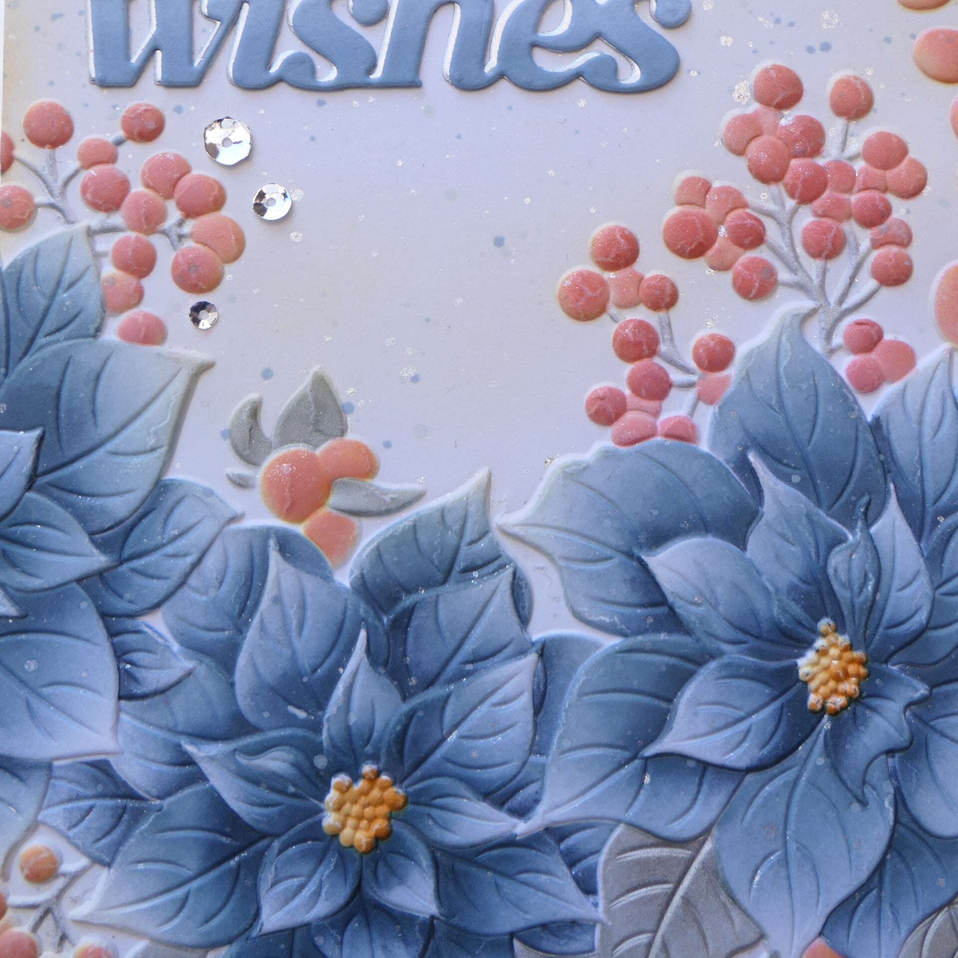
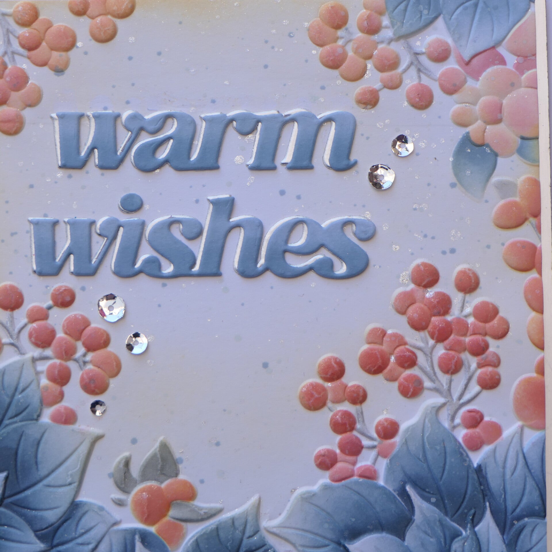
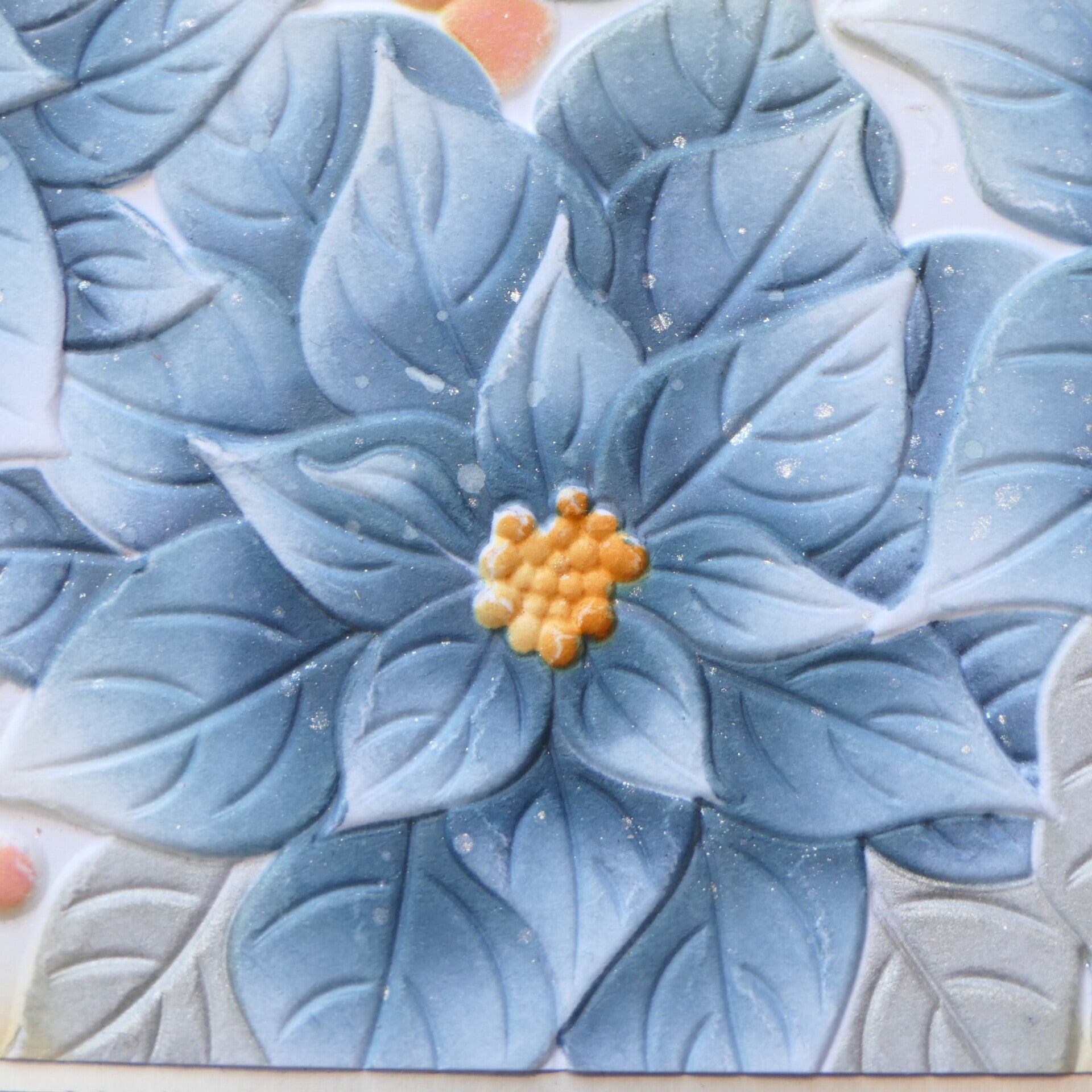
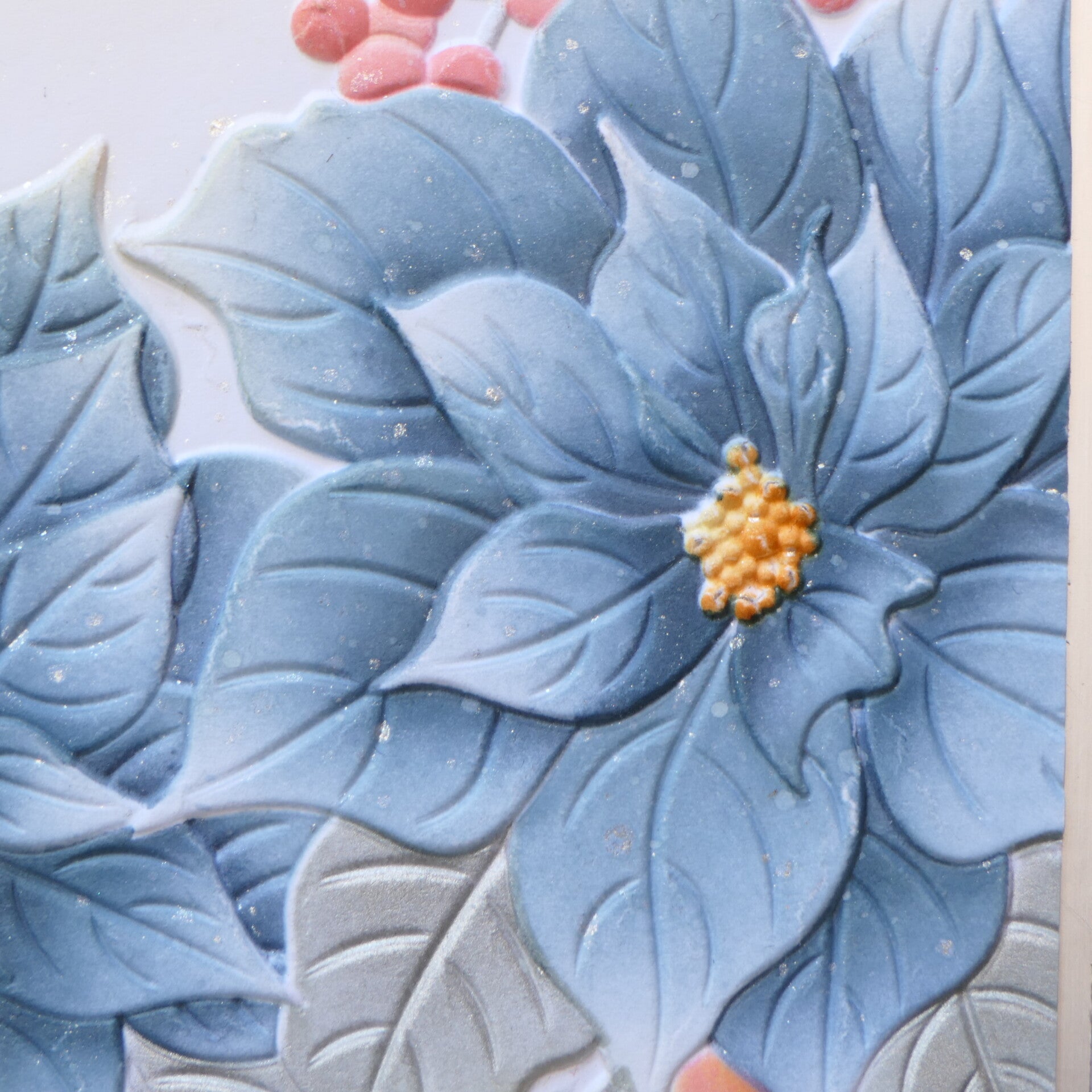
I used the Winterberry Poinsettias Embossing Folder & Stencils.
The stencils made it possible to build up the color while keeping the beautiful embossed details from the folder.
The blue became my 70% color, while the soft orange became the 20% color.
For the final 10%, I used silver pigment ink for the leaves.
I really like how the silver works as an accent without introducing another strong color. It adds just enough interest and a little bit of shine while allowing the blue and soft orange to remain the stars of the card.
What I Learned from the Color Wheel
Working with the color wheel gave me some new insights.
I have certainly used color combinations that happened to work well together before, but consciously looking at the relationship between colors gave me another way to approach a card.
It also showed me that I don't have to use every color at full intensity.
I can take a color relationship—in this case, complementary blue and orange—and adjust the intensity until it works for the card I have in mind.
And the 70–20–10 rule helped me avoid using too many colors.
Card 2 – Finding Color Inspiration in a Photograph
For my second card, I approached color in a completely different way.
Instead of starting with a color wheel, I used an inspiration photograph.
I have included the photograph in this blog because I think it is important to see where my color choices came from.
Rather than copying the photograph, I looked at the colors and used them as a starting point for my own card.
And this was probably one of my biggest lessons from this class:
You don't have to follow an inspiration palette literally.
You can take the colors you see, change their intensity, adjust the balance between them, and use them in a way that works for your own design.
That is exactly what I did here.
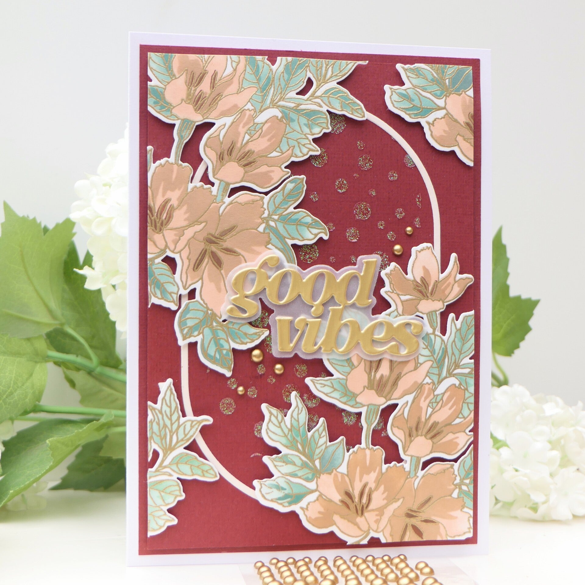
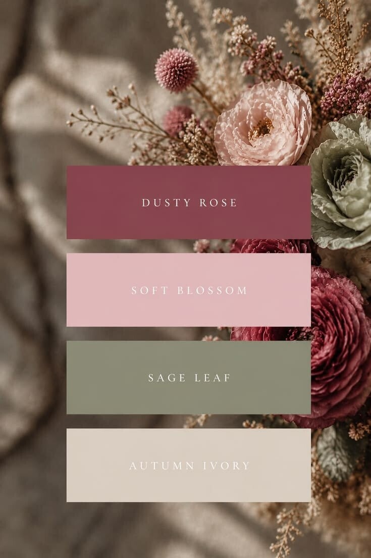
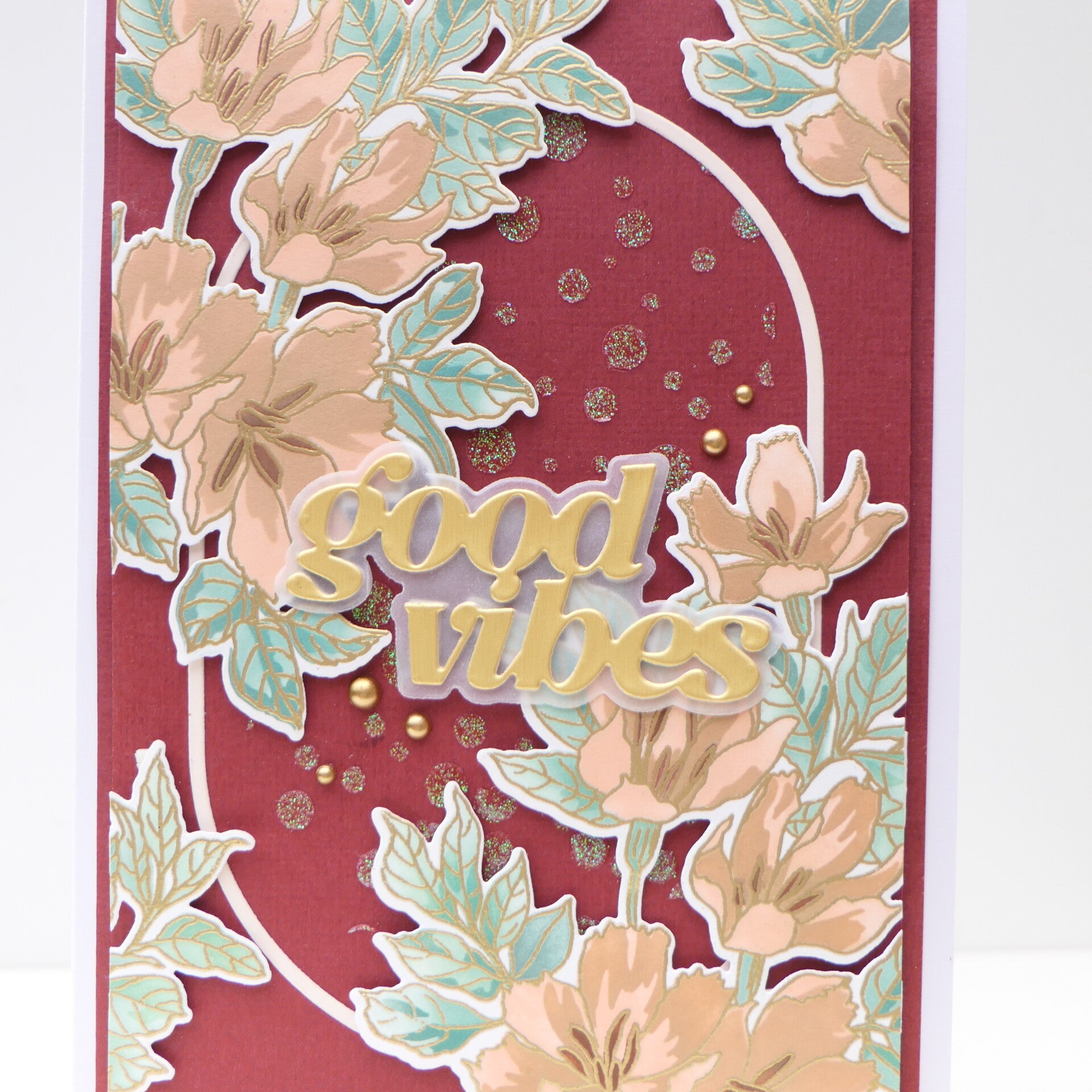
I used the colors from the photograph as my guide, but I altered them slightly to create a combination that felt right to me.
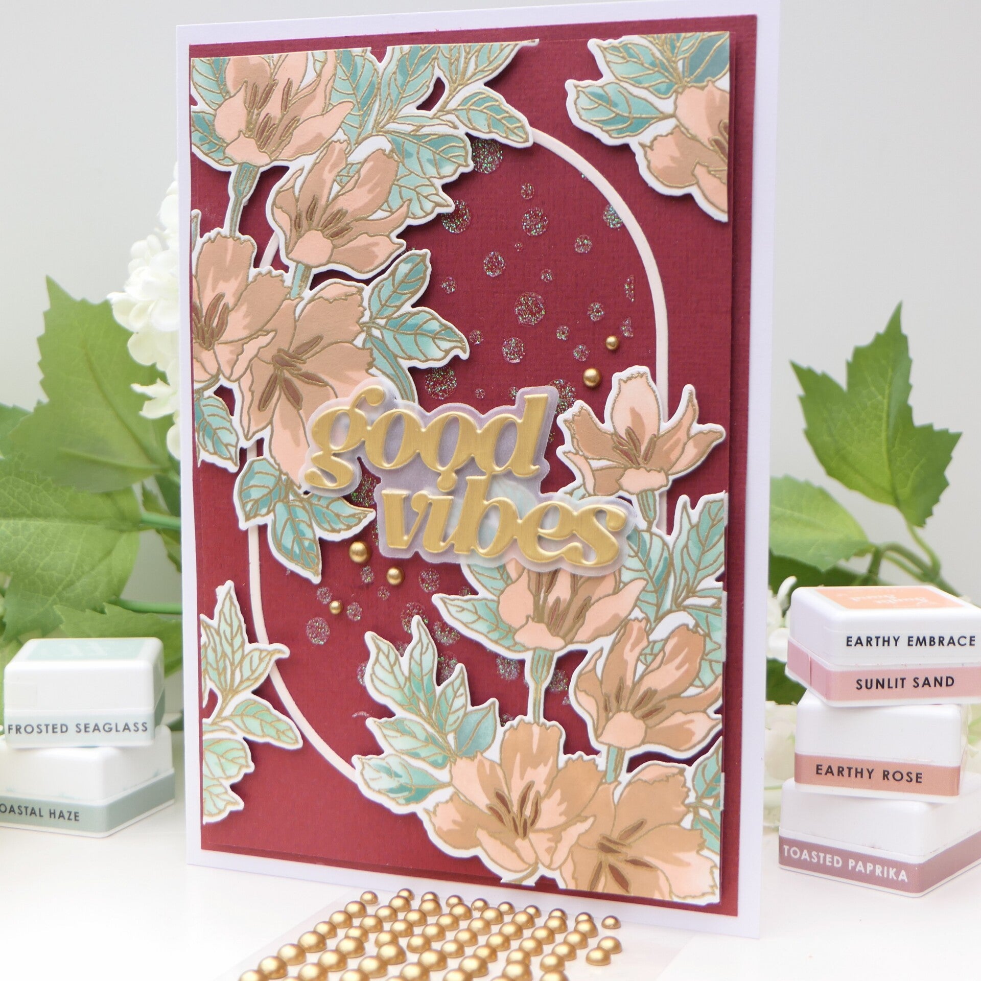
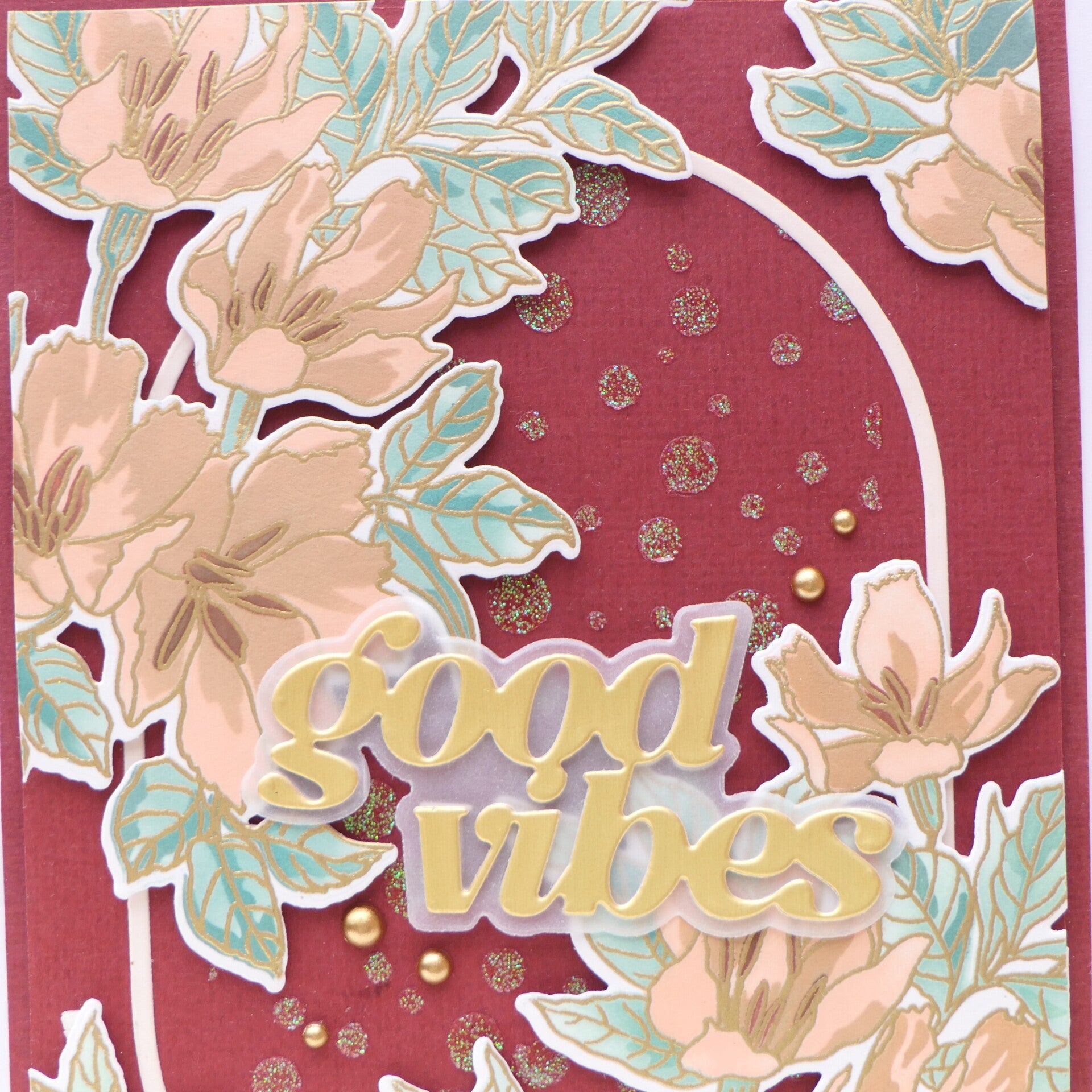
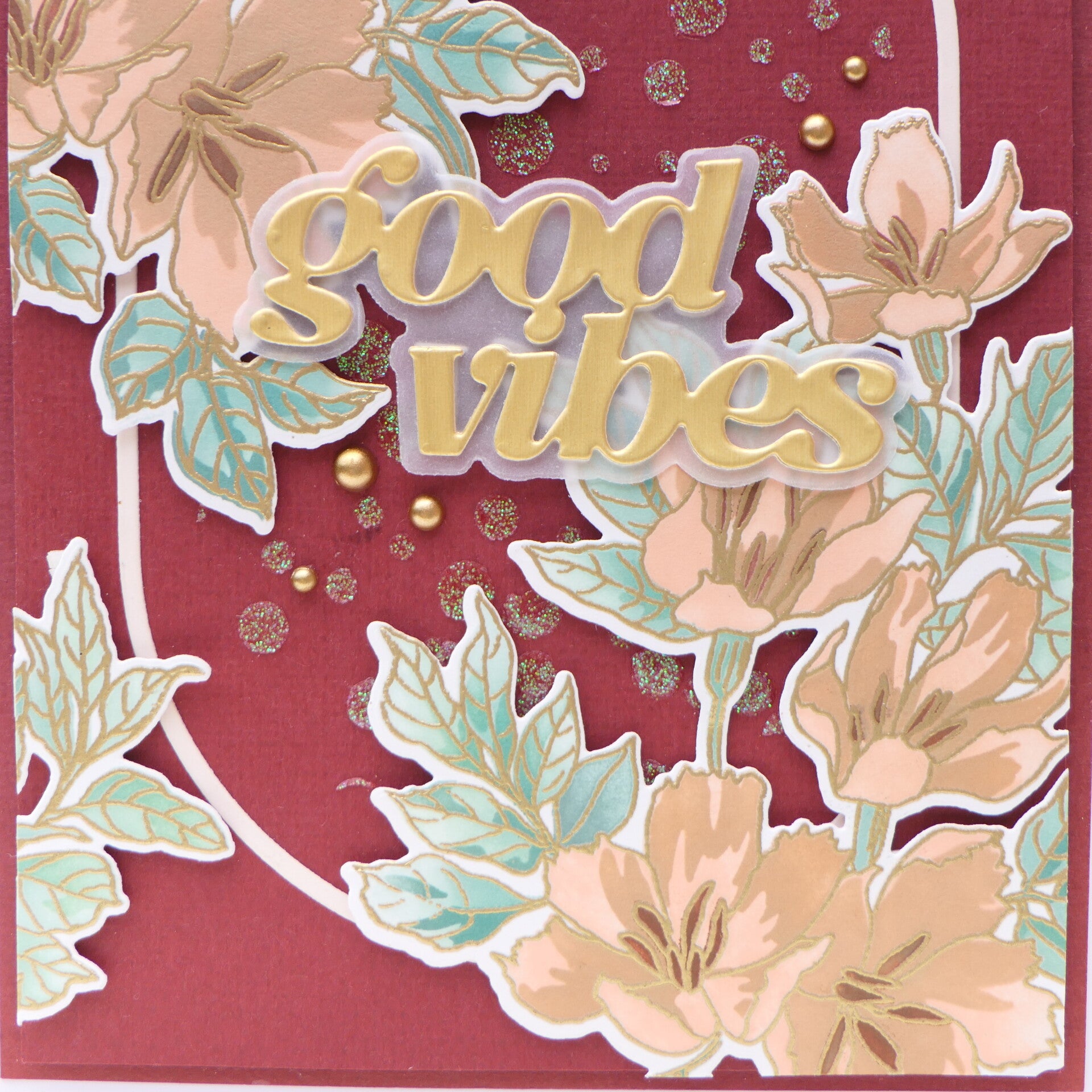
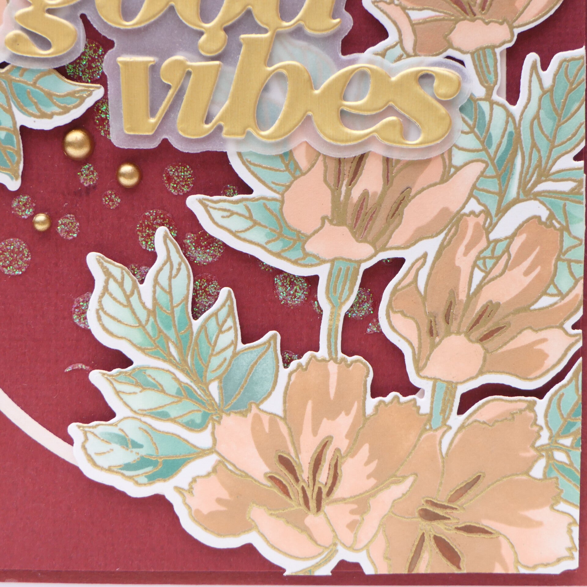
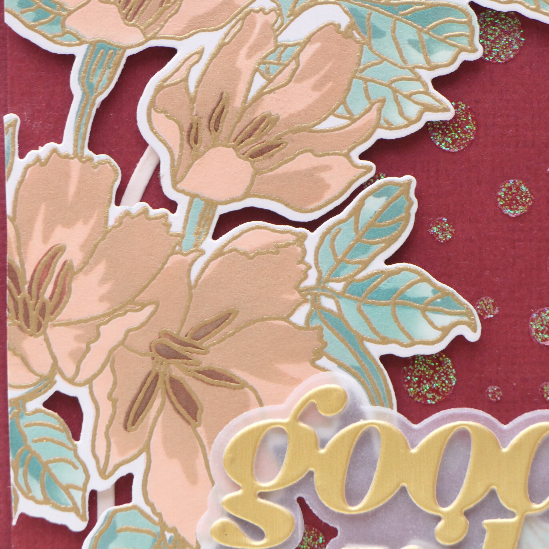
The flowers and foliage from the Build-A-Garden Harvest Bouquet became the main elements of the card.
For the background, I used the Tiny Bubbles Stencil.
This card came with an extra little challenge from an Altenew Fan Group weekend takeover by Carolin Rieger.
The prompt was to use the oldest and newest Altenew products you own together.
The important part was that "oldest" and "newest" referred to the production/release dates of the products, rather than how long I have personally owned them.
For my oldest product, I used the Tiny Bubbles Stencil, which dates from 2017.
For my newest product, I used the Build-A-Garden Harvest Bouquet, a 2026 release.
I thought it was fun to put these two products together and see how naturally an older Altenew design can work alongside something brand new.
And honestly, I love that Altenew products can give you that kind of continuity. An older stencil doesn't suddenly become unusable just because newer products arrive.

What I Learned About Color
This class gave me much more than a few color combinations to try.
Therese showed how color can be approached from many different directions. We can use a color wheel, a photograph, another piece of artwork, nature, or simply something that catches our eye.
We can also change the way we use color by changing the medium.
But perhaps the most important lesson for me was that inspiration is a starting point, not a set of rules.
With my second card, I learned that I don't have to reproduce an inspiration palette exactly. I can use the colors as a guide and then make adjustments based on what works for my own design.
That is something I want to remember.
A Lesson That Goes Beyond Color
Something else has been happening throughout my AECP journey.
With every class, I notice that my cards are changing.
I'm making decisions more deliberately and more calmly. I'm not adding something simply because I have a little empty space or because I have another product sitting on my desk.
More and more, I ask myself:
Does this element have a purpose?
And that applies to color too.
I don't need five different colors just because I have five different inks available.
I can choose a smaller palette and let those colors work together.
I can use one color as the star, another as support, and a tiny amount of a third colour to add interest.
That kind of restraint is something I am learning to appreciate more and more.
Final Thoughts
I absolutely enjoyed this class!
Color has always been an important part of my card making, but this class made me think about it in a more conscious way.
The color wheel gave me a practical tool for choosing colors, while the inspiration photograph showed me that I can take an existing palette and make it my own.
And I loved discovering that these approaches don't limit creativity—they actually open up more possibilities.
I also enjoyed the extra challenge of combining an Altenew product from 2017 with one from 2026. It was a fun reminder that products from different generations can work beautifully together.
Most importantly, I feel that I am becoming more intentional with my choices.
I'm still experimenting. I'm still learning. And I'm certainly not finished figuring out my own style.
But with every AECP class, I feel that I understand a little better why I make the choices I make.
And that is exactly what I hoped to get from this journey.
I can't wait to see what Class 8 will teach me!
Affiliate Note
The links in this post are affiliate links. If you choose to shop through them, I may receive a small commission at no extra cost to you. Thank you so much for supporting my creative journey. 🤍
Thank you so much for visiting my blog and for following my AECP journey. I truly appreciate every visit and every comment.
With love and creative joy,
Angelique
Add comment
Comments